The Moto X is better than it seems at first glance.
I'll admit that I didn't get the excitement about the Moto X when it launched. A so-called "Google phone" was something that people have speculated about since Google's purchase of Motorola closed last year. And yet, much of the breathless pre-release coverage (and several early reviews of the phone) seemed to treat the phone as special because Google was saying it was special, not because it was earth-shattering hardware in and of itself.
We're now about two weeks out from our first hands-on session with the phone. After living with it for a while, I get it—at least a little. There are still things about the phone that I don't understand, but I can see why people would walk into a store and walk out with the Moto X instead of a Galaxy S 4 or anHTC One or even an iPhone 5. It's the rare flagship Android handset that's greater than the sum of its specifications, even if in the end it's still just another Android phone with a couple useful extra features stacked on top.
But the Moto X doesn't need to melt anyone's face or sweep Samsung under the rug. The Moto X doesn't need to redefine the way we think about smartphones or show us Google's grand vision for Android's future. The Moto X just needs to reverse Motorola's decline, stop the bleeding, and show that Motorola and its parent company can put their heads together and put out a desirable Smartphone.
| SPECS AT A GLANCE: GOOGLE/MOTOROLA MOTO X | |
|---|---|
| SCREEN | 1280×720 4.7-inch (313 PPI) RGB AMOLED |
| OS | Android 4.2.2 |
| CPU | "Motorola X8 Computing System" (Dual-core 1.7GHz Qualcomm Snapdragon S4 with co-processors) |
| RAM | 2GB |
| GPU | Qualcomm Adreno 320 |
| STORAGE | 16 or 32 GB NAND flash |
| NETWORKING | 802.11a/b/g/n/ac, Bluetooth 4.0, NFC, LTE (bands are variable depending on carrier) |
| PORTS | Micro-USB, headphones |
| CAMERA | 10MP rear camera, 2MP front camera |
| SIZE | 5.09" × 2.57" × 0.22-0.41" (129.4 × 65.3 × 5.7-10.4 mm) |
| WEIGHT | 4.59 oz. (130 g) |
| BATTERY | 2200 mAh |
| STARTING PRICE | $199 with two-year Verizon, AT&T, Sprint, or T-Mobile contract |
Body and build quality
The short version: Finally, a flagship phone that feels great to hold. Where the Nexus 4, Galaxy S 4, HTC One, and others are all a little uncomfortable for one reason or another, the Moto X gives you a phone you can use one-handed, without ripping out all of the desirable features.
The long version: There are a few phones I've used—the HTC 8X, the BlackBerry Z10—that have earned my esteem specifically because they are really nice to hold. Both Windows Phone and BlackBerry 10 are still missing too many things for me to use either of those devices as a primary real-life handset for longer than a week or two (the amount of time I like to spend with review hardware, at a minimum), but in both cases I wished I could get phones exactly like them with stock Android installed instead. The Moto X comesvery close to being that phone.
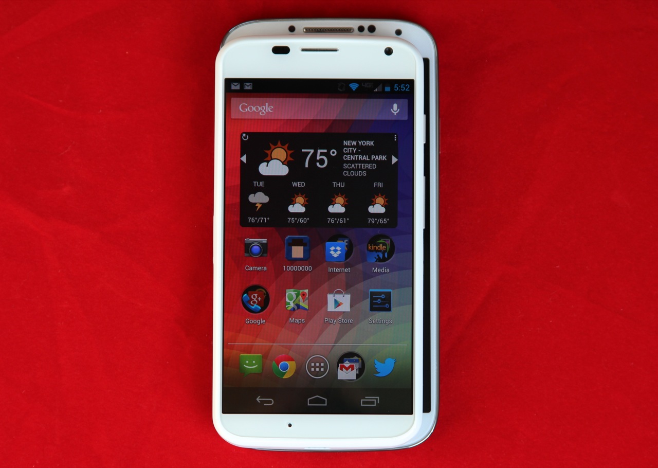
The Moto X is much smaller (and more pleasant to hold) than the 5-inch Galaxy S 4 (underneath).
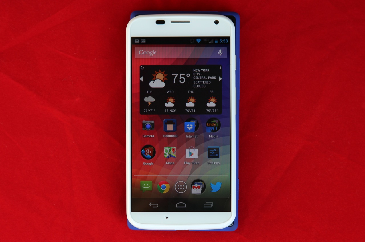
It's more similar to, but still slightly smaller than, the HTC 8X, despite that phone's smaller 4.3-inch display.
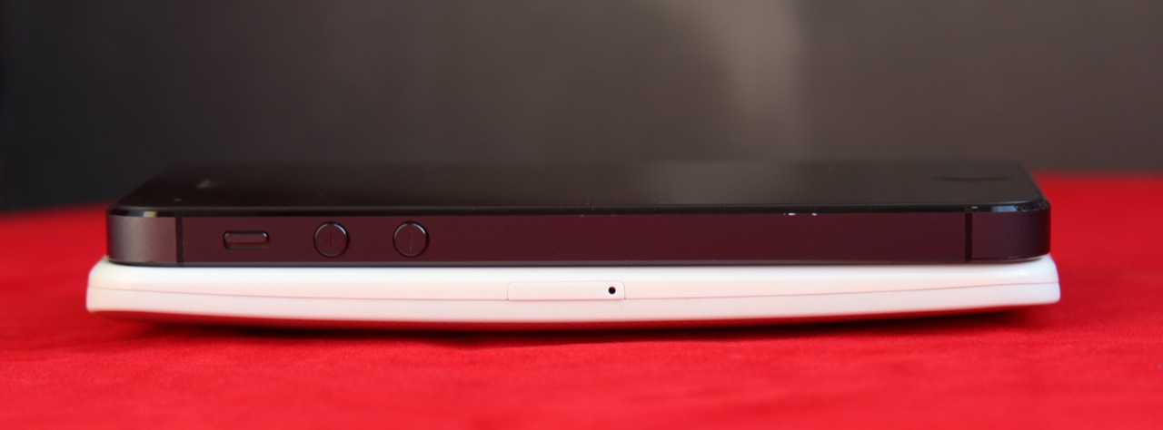
The Moto X is much thicker than something like the iPhone 5, though the curved back helps it to feel more comfortable.
The Moto X's 4.7-inch screen belies its size—the phone is actually very similar in width to the Z10 and the HTC 8X, even though those phones have smaller 4.2 and 4.3-inch displays. Compared to other Android phones with similar screens like the 4.65-inch display of the Galaxy Nexus, the 4.7-inch screens of last year's Droid Razr HD phones, or the 4.8-inch screen on the Galaxy S III, the Moto X is both narrower and shorter. It's still larger than an iPhone 5 by a fair margin, and it's thicker than some of its high-end Android competitors (0.41 inches at its thickest point, compared to 0.36 inches for the S 4 and 0.37 for the HTC One). Still, the phone's width and height combined with the curve of its non-removable back makes it one of the most comfortable-to-hold Android flagships you can buy right now.
Of the competing flagship phones, the One and its 4.7-inch 1080p display come the closest to matching the width of the Moto X (at 2.69 inches, compared to 2.57 inches), but the One's height and its top-mounted power button are less-than-friendly to one-handed users. Some Android phone screens are creeping up above six inches, and frankly it's nice to get something fast that doesn't include a warning about team lifting.
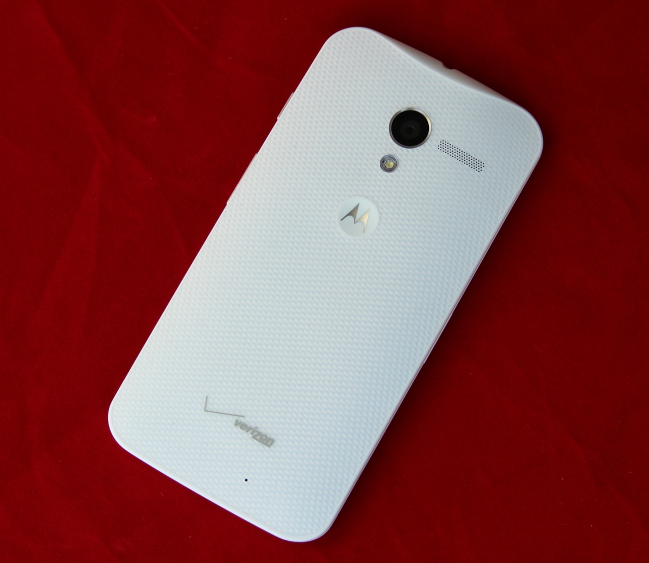
The back of the phone is matte plastic, which isn't slippery like the glossy plastic used on Samsung's Galaxy S 4 or the glass used by the Nexus 4. User-selectable cases in multiple colors will be available from AT&T when the phone goes on sale. Wood options will also be available at some point after the phone launches later this month, because wood accents are timeless and will never go out of style.
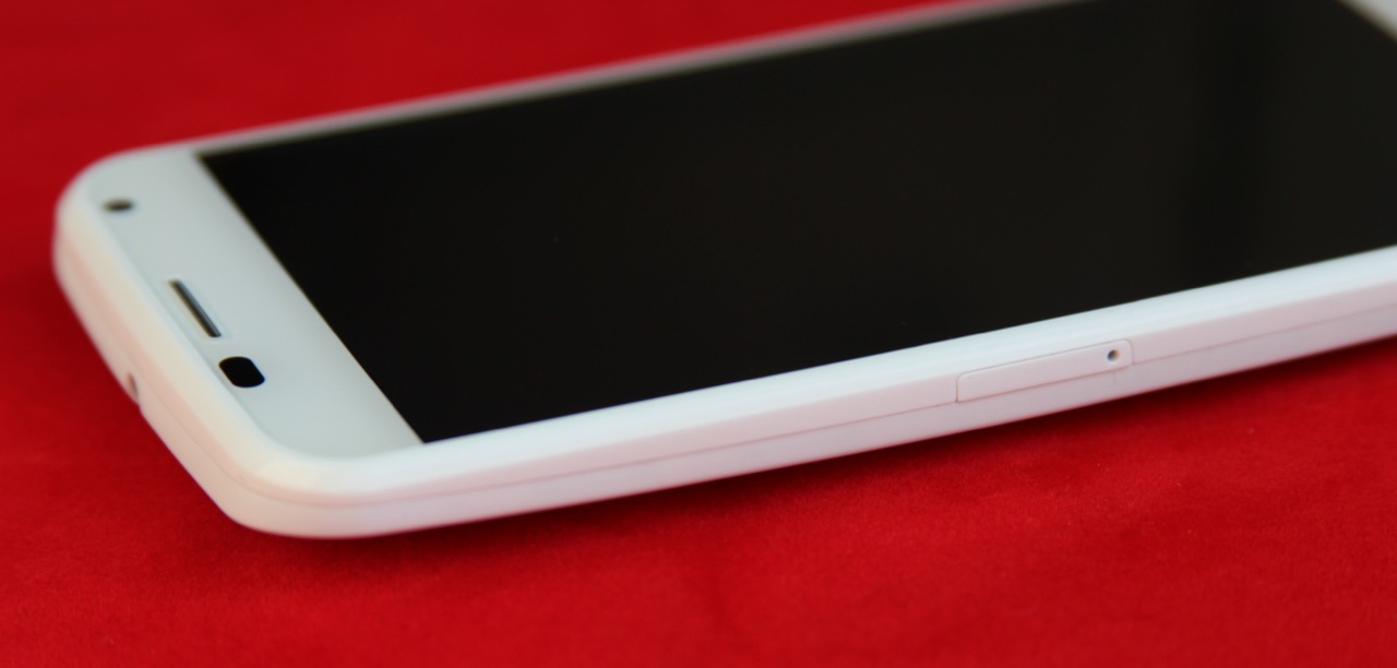
The SIM tray on the phone's left side isn't quite flush with the edge of the device.
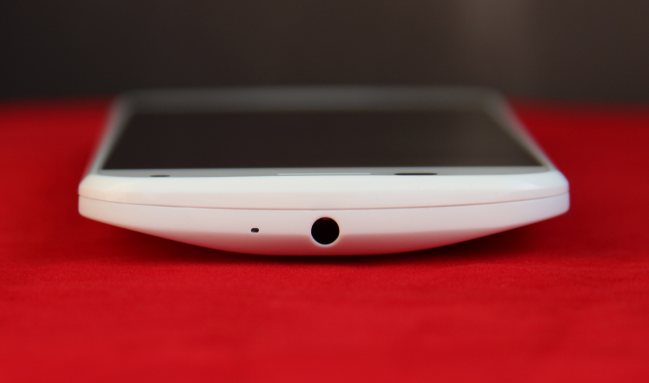
The headphone jack is mounted in the center on the top of the phone.

The power button is mounted above the volume rocker on the phone's right edge, where they're both thumb-accessible.
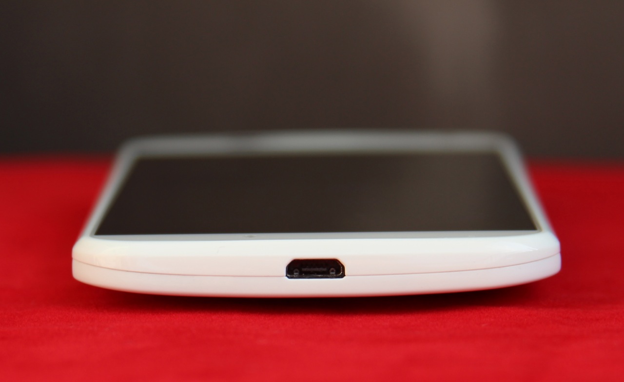
The micro-USB port, mounted in the center on the bottom.
The build quality of the phone's all-plastic body is decent but not exceptional. It feels sturdy in the hand and doesn't creak or flex like Samsung's phones can, but small imperfections keep it from playing in the same league as the HTC One or iPhone 5. The power and volume buttons feel just a bit too loose, the SIM card tray sticks out from the side of the phone just a bit too much, and the phone (at least in white, the color of our review unit) looks cheaper than it feels.
The difference between the Moto X and something like the HTC One is akin to the difference between the old white polycarbonate MacBook and the aluminum unibody MacBook Pros. Both feel like solid, well-made devices, but one is definitely made from superior materials.
The screen: Not all AMOLEDs are created equal
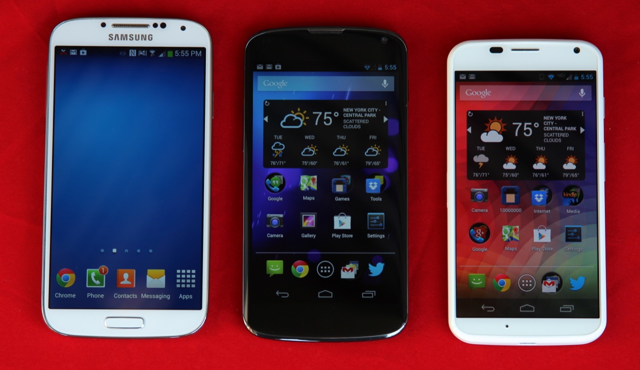 While we think 1080p phone displays are lovely and all, there are definitely diminishing returns when you start going above 300 PPI. From left to right, the 1080p Galaxy S4, the 720p Nexus 4, and the 720p Moto X.
The short version: You'll notice the Moto X's AMOLED display before you'll notice its 720p resolution. At least it isn't PenTile.
The long version: That 4.7-inch screen has a resolution of 1280×720, a spec that was much more common in flagship phones a year ago. The screen has a still-respectable 313 PPI, which pales in comparison to the 469 PPI of the One or the 441 PPI of the Galaxy S 4 but is nevertheless crisp and readable. The difference between a 720p smartphone screen and a 1080p smartphone screen is not the legibility of tiny text, but the crispness of that tiny text. By the time letters are too small to discern on the 720p display, you're going to want to zoom in for a closer look anyway. We'll use some pictures from our look at HTC's Droid DNA, the first 1080p smartphone screen we encountered, to demonstrate.
Small text is readable but slightly distorted on the Optimus G's 720p screen.
The same text, rendered perfectly by the 1080p Droid DNA.
The display's quality is ultimately more germane to this discussion than its resolution. The Moto X uses an AMOLED display, which suffers and benefits from most of the same things that most other AMOLED displays suffer and benefit from. On the one hand, the screen offers deep blacks and vibrant colors; on the other, those colors are inaccurate and sometimes too harsh. Whites and grays often take on a greenish or purplish cast. Outdoor visibility also suffers, and the Moto X's display looks washed out, even in indirect sunlight.
Where the Moto X differs from phones like the Galaxy Nexus and Galaxy S III is that its AMOLED screen doesn't use the problematic PenTile subpixel arrangement. The negative effects of PenTile are more visible at lower resolutions (and are basically gone once you move to a 1080p display like the Galaxy S 4's), but even at 720p you may notice slightly jagged text and uneven-looking images (see below).
 The Moto X's non-PenTile AMOLED display.
 The Galaxy S III's PenTile AMOLED screen.
The non-PenTile screen on the Moto X enables crisper text and more even colors. Note particularly the flat, uninterrupted white of the Google Play icon that looks almost rough on the Galaxy S III's PenTile display. At 306 PPI, the S III's screen is pretty close to the Moto X's in density, but the subpixel arrangement makes for a screen that's a little harder on the eyes after an extended period.
As with the build quality, the Moto X's screen is a little deficient compared to phones from other companies at the same price point. Still, Motorola and Google have chosen a screen that is good enough that Joe Smartphone probably won't be bothered by it. I would like to see more AMOLED displays come with color profiles like those included on the TouchWiz versions of the Galaxy S 4—research has shown that using that phone's display in Samsung's Movie or Photo modes will take the edge off of AMOLED's harsh colors, eliminating one of my biggest gripes about the display tech. Neither stock Android nor the near-stock version of Android on the Moto X includes such profiles, a situation we'd like Google to rectify.
Camera
 The Moto X's rear-facing 10MP camera, LED flash, and rear-facing speaker. The speaker sounds clearer than the one in the Nexus 4 and doesn't distort much even at high volumes, but it's still just a smartphone speaker.
The short version: Motorola has replaced the stock Android camera interface with its own simple, gesture-oriented version. Unfortunately, the camera itself isn't very good.
The long version: Before we evaluate the camera's quality relative to other shooters in this price range, let's talk about the interface, since it's one of the Moto X's few deviations from stock Android. Where the Android 4.2 camera keeps its menu settings arranged in a circle that you can invoke by long-pressing the screen and Android 4.3 moves those settings to an arc, the Moto X camera works mostly with gestures and swipes.
The interface is simple: tap anywhere to take a picture. Swipe to the right to pull out a menu of settings, including HDR, exposure controls, and a couple different shooting modes (panoramic shooting is here, but Photo Sphere doesn't appear to have made the jump). Swipe to the left to jump into the Gallery app and look at all the pictures you've just taken. A "quick capture" mode also allows you to engage the camera by rotating the phone twice in rapid succession—it works even when the phone is in standby, and it may be quicker for you than opening up the camera app the usual way. I found this interface both easier to use and easier to get used to than either of the stock Android camera interfaces. Let's hope it migrates to stock Android in the next release.
The shots that the camera produces are acceptable but not exceptional, bearing in mind that many smartphone snaps are destined for Twitter or Instagram or some other place where DSLR quality would be buried by image resizing and compression algorithms anyway. Many of the shots we took were tinged with a vaguely purplish color, and you'll want to make sure you keep the lens clean and free of fingerprints and smudges. Much more so than in other phones we've used, dirty glass can drastically reduce the quality of your shots (I can honestly say that this is something I've never had to worry about with any other camera phone). The results are the same whether you're shooting indoors or outdoors, with or without HDR enabled.

The iPhone 5 on a sunny day.

The HTC One, which is a little overexposed but still captures good color and detail.

The Nexus 4, which captures a washed-out looking image with poor blues.

And the Moto X, which coats everything in a purple sheen.
 The Moto X again, this time with a fingerprint on the glass. It takes everything that was wrong with the previous shot and magnifies it.
The iPhone 5 inside. A little warm, but mostly clean and accurate.

The HTC One does a better job with white balance here.

The Nexus 4 once again gets the colors all wrong.

And the Moto X adds its characteristic purple tint.

Finally, the Moto X with a fingerprint on the lens glass, which makes the purple tint worse and softens the image drastically.
Software: Stock Android with a twist

If you prefer Google's Android UI, you've come to the right place.
The short version: Aside from the new camera interface, the Moto X runs Nexus-style stock Android with three major additions: active notifications that you see even when the phone is in standby, a "touchless control" feature that allows you to give voice commands to the phone without actually touching it, and whatever preinstalled applications and services your carrier decides it wants to install.
The long version: The Moto X almost pointedly runs Android 4.2.2, as if to drive home the assertion that Motorola won't get special treatment just because it happens to be owned by the company that makes Android. Android 4.3 is such a minor update (at least when it comes to big user-facing features) that the phone doesn't really feel like it's missing anything (and Bluetooth 4.0 support has been included anyway), but it's noteworthy that a company owned by Google isn't shipping a phone with the latest version of Android installed. Verizon's involvement may be a factor, since even Nexus phones on the Verizon network require validation that the other versions aren't subject to.
The good thing about Google's involvement is that the Moto X runs the closest thing to stock Android that you'll find on a major phone from a major OEM on all the major carriers. Google's standard UI is clean, refined, fast, and visually consistent, claims that few of Google's Android partners can make about their own custom skins. We did notice occasional signs of stutter just after turning the phone on or while performing tasks in the background, but even compared to Android 4.1 running on last year's Droid Razr Maxx HD, the difference is night-and-day.
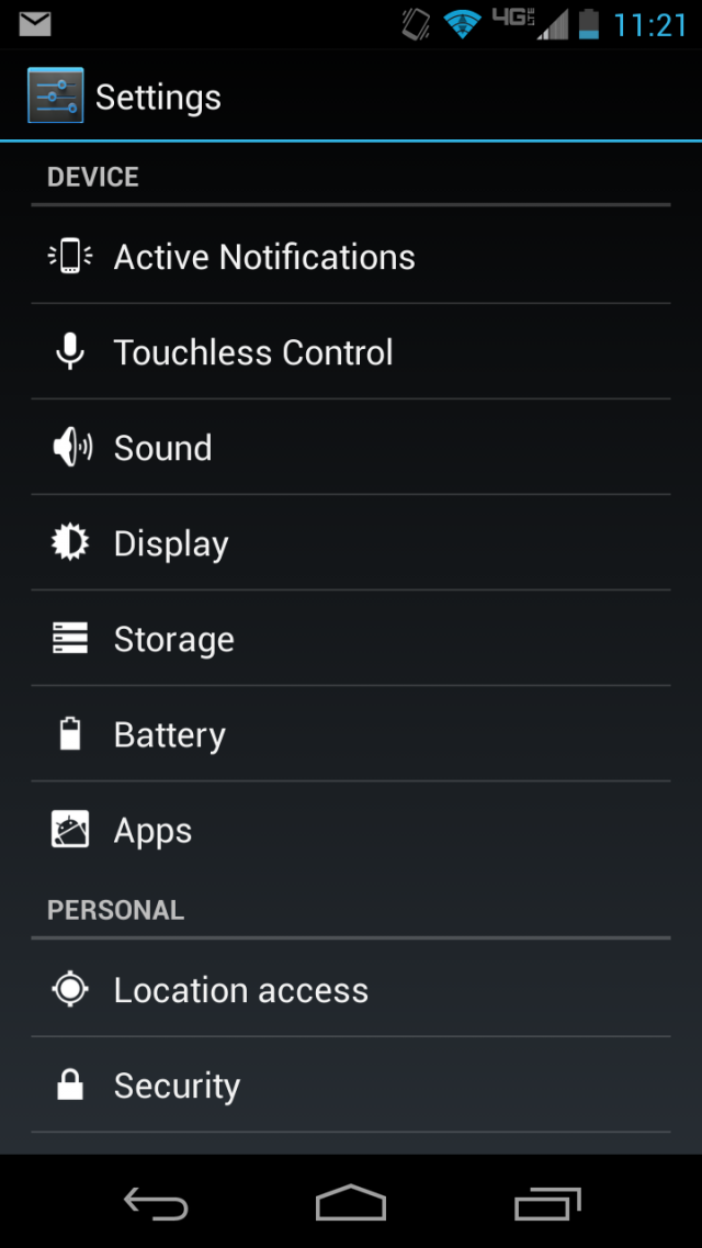
Without a thorough familiarity with Android, you probably can't even tell the difference between the stock Android settings and the Motorola-specific ones.
Even Google and Motorola's additions to the operating system are visually consistent with the rest of Android's default icons and typefaces. Extra Settings menu items fit right in with the standard ones, and the quick setup wizards for Moto X-specific features like the active notifications and touchless controls resemble similar wizards elsewhere in Android. Unfortunately, one difference between stock Nexus-style Android and Android on the Moto X is the presence of carrier-preinstalled applications and services. As is typical, many of these can be disabled, but none of them can be totally uninstalled. The other added software features are much more useful.
Active notifications
Active notifications are designed to reduce the amount of time you need to spend unlocking and poking at your phone. Using the default settings, a very basic white-on-black interface will pop up to show you the current time and notifications that you've enabled. This screen, which is styled to match the phone's Android operating system but actually runs on the separate low-power "contextual computing" coprocessor, will show up every time you move the phone—pulling it out of your pocket, for example, or picking it up off of a table. If you see a notification you want to interact with, press down on the unlock icon and swipe up. If you just want to get to the standard Android lock screen, either swipe down or hit the phone's power button as you would on any other handset.
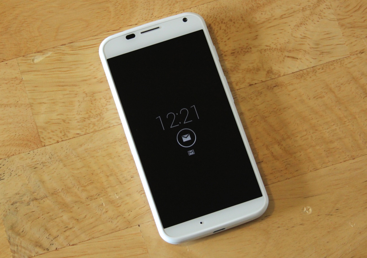 The phone's AMOLED screen lights only the few pixels needed to display the clock and the icons. Between that and the low-power coprocessor, we didn't notice the feature sucking down an undue amount of battery life.
Active notifications work best for the kind of people who habitually pull their phones out just to see what time it is or if they've received any pressing e-mails or text messages (most apps that support notifications, like Twitter and Facebook, can use the active notifications feature with no extra modification from their developers as long as they've been enabled in the feature's settings menu). If that doesn't describe you, you might not get much out of the feature—all it really saves you is a single button press. I also found that the feature was a bit too eager to turn on. Bumping the table that the phone was on was usually enough to activate it.
Aside from the option to enable and disable active notifications for all of your installed applications, the feature comes with a few other settings you can use to tailor its functionality. For example, the default settings include an (adjustable) window between 11:00pm and 6:00am during which the phone won't show you active notifications. If you want more privacy, you can also hide notification details (things like the subject lines of the e-mails you're receiving) if you've protected your phone with a PIN or password lock, or you can disable the active notifications feature entirely.
Touchless control

The second of the Moto X's two coprocessors is for voice processing, and that's where the "touchless control" feature comes in. It takes the same Google Now-powered voice commands available on any Jelly Bean phone and lets you access it by saying "OK Google Now," Google Glass-style. Even when the phone is in standby, the low-power coprocessor is always listening for your voice. The phone will reliably spring to life as long as you speak clearly and it's only a few feet away from your face.
The feature is off by default, and when you activate it you're asked to move to a quiet room and record the "OK Google Now" activation phrase three times to train the phone to the sultry sound of your voice. In theory, the phone isn't supposed to respond to anyone but you after being trained, but this training exercise ultimately proves to be futile. Yes, the phone responded quickly and consistently to my voice as long as the phone wasn't too far away, but it also responded about a third of the time to my fiancée's voice. At least for now, Moto X users will be susceptible to the same type of trolling that Google Glass users are. You'll want to take steps to make your phone less vulnerable to voice-activated hijacking.
If you have your screen locked with any kind of password (I say "if," but under no circumstances should you be using a phone that isn't protected with a PIN or other password), the phone will turn on when you say "OK Google Now" and it will register the subsequent command that you give it. However, it will force you to input your password before processing the command. You can also disable the "launch when display is off" feature or just disable touchless control entirely. If you prefer convenience to security, you can turn on a "call when locked" feature that will allow you to make phone calls without unlocking the phone even if you're using a password, but this feature is off by default and we recommend that you keep it that way.
Google Now continues to be a capable personal assistant. It's pretty good at understanding and interpreting most of the things you say—the only things I consistently had trouble with were names that weren't stored somewhere in my contacts list. I was able to perform Google searches, find pizza places, and look up pictures of cats without issue, and SafeSearch will protect you from automatically seeing potentially objectionable images (as I found when I said "OK Google Now, show me pictures of butts"). The touchless controls are a logical extension of what Google Now already does, and we wouldn't be surprised to see the "OK Google Now" voice activation phrase introduced on other Android handsets in the near future, even if other hardware lacks the low-power coprocessor that makes the feature usable in standby mode.
Internals and performance: Good GPU, OK CPU
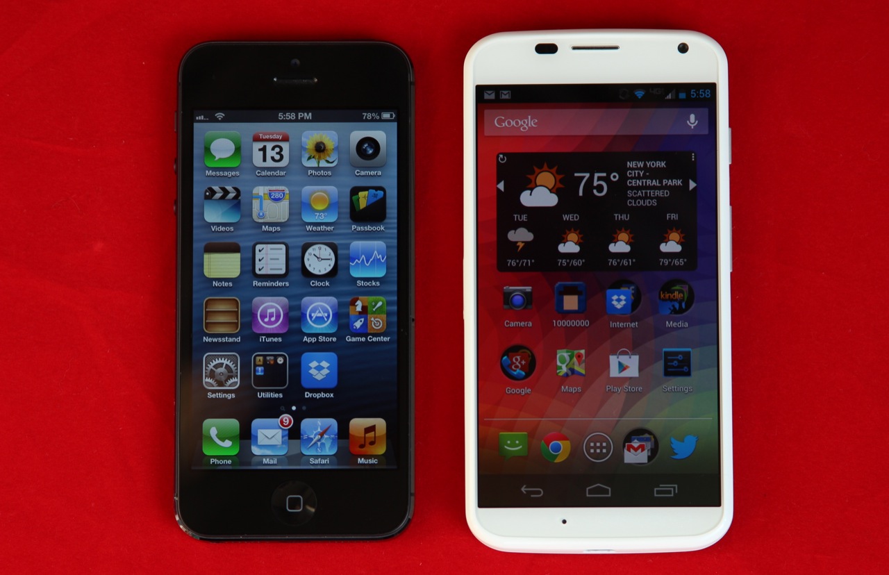
The Moto X takes an approach to performance that is distinctly Apple-esque.
The short version: You need to know two things about the Moto X's "X8 computing system": it's a Snapdragon 600 with two CPU cores instead of four, and it comes with low-power coprocessors that drive the active notification and touchless control features. 802.11ac is a nice addition to the standard LTE and Bluetooth 4.0 connectivity options.
The long version: Google and Motorola will tell you that the Moto X (and the new Droid handsets) are powered by the "Motorola X8 computing system," which as we've discussed is a fancy and sort-of-misleading name for a combination of chips. Two of the X8's eight "cores" are the coprocessors that enable the software features we discussed in the previous section, and the rest of them are part of a Snapdragon system-on-chip (SoC) like the one you'd find in most high-end and midrange US smartphones.
The interesting thing about those coprocessors is that because they aren't actually part of the main SoC, Google says they can be paired with other chips in other devices. If the company wanted to enable active notifications and the rest on a cut-rate low-end phone or a beefy 10-inch tablet, there's apparently nothing in particular tying them to the Snapdragon that powers the Moto X. Expect more fun branding games if this implementation starts to catch on.
Moving on to that Snapdragon SoC, we don't have much to report that we didn't already cover in our Moto X performance preview. The chip is branded as an S4 Pro, a label that is becoming more ambiguous as it's applied to more SoCs (see also: the 2013 Nexus 7). The easiest way to explain the chip in the Moto X is to say that it's a Snapdragon 600 with two Krait 300-based CPU cores instead of four.
While there's less CPU power on tap here, the Adreno 320 GPU goes toe-to-toe with the version in the Snapdragon 600. This approach to processing power—a fast GPU combined with a "good enough" dual-core CPU—is the same one that Apple has taken with its A5 and A6 SoCs, and it keeps battery life relatively high while maintaining good graphics performance.
You'll miss those two CPU cores for processor-intensive tasks, but browsing and general performance are still very fast, and the Moto X proves itself to be a capable gamer. The CPU performance is actually very comparable to the A6 in the iPhone 5, and the GPU performance is quite a bit faster (though the Apple A6 is a year old at this point, and a new iPhone is expected soon). If you need the fastest phone, a Snapdragon 600 (or, soon, Snapdragon 800) phone will be the one you want, but Motorola is offering a more-than-acceptable amount of power here.
As for the rest of the internals, the Moto X is as good as any flagship smartphone: 2GB of RAM and 16 or 32GB of (non-expandable) storage are standard, as is Bluetooth 4.0 and LTE connectivity. 802.11ac Wi-Fi support is an unexpected but welcome surprise; the Galaxy S 4 and HTC One both offer it, but otherwise we're still seeing 5GHz 802.11n as the best available option in many phones, tablets, and laptops. The Moto X offers one bi-directional wireless stream, giving it a maximum theoretical throughput of 433Mbps.
One small issue that may or may not trip up early adopters: I consistently received error messages when trying to enable Bluetooth Internet tethering using the Verizon SIM provided with the review unit. Whether this is Motorola's or Verizon's fault is unclear, but others seem to be having the same problem.
Battery life
The Moto X uses a 2200 mAh battery that Motorola and Google say should be good for "up to 24 hours" in "mixed usage." Just what represents mixed usage is left to the imagination, but based on my usage, the phone will have to spend quite a bit of time turned off and in your pocket to achieve this number. Even in active usage, I didn't have trouble making it from morning to evening without needing to plug in, but the phone was usually down to 10 or 15 percent by the time I went to bed. I never needed that midday change that I sometimes take with my Nexus 4, but that "mixed use" figure isn't indicative of what you'll get if you're using the phone regularly throughout the day.
In continuous usage with the phone set to 50 percent brightness and the auto-brightness sensor turned off, the phone played this relaxing video of a waterfall for about nine hours and 30 minutes, which compares favorably to the seven hours we got from the Google Play edition of the HTC One and the seven hours and 32 minutes we got from the Nexus 4 running Android 4.3.
Not the king of the hill, but worth a long, hard look
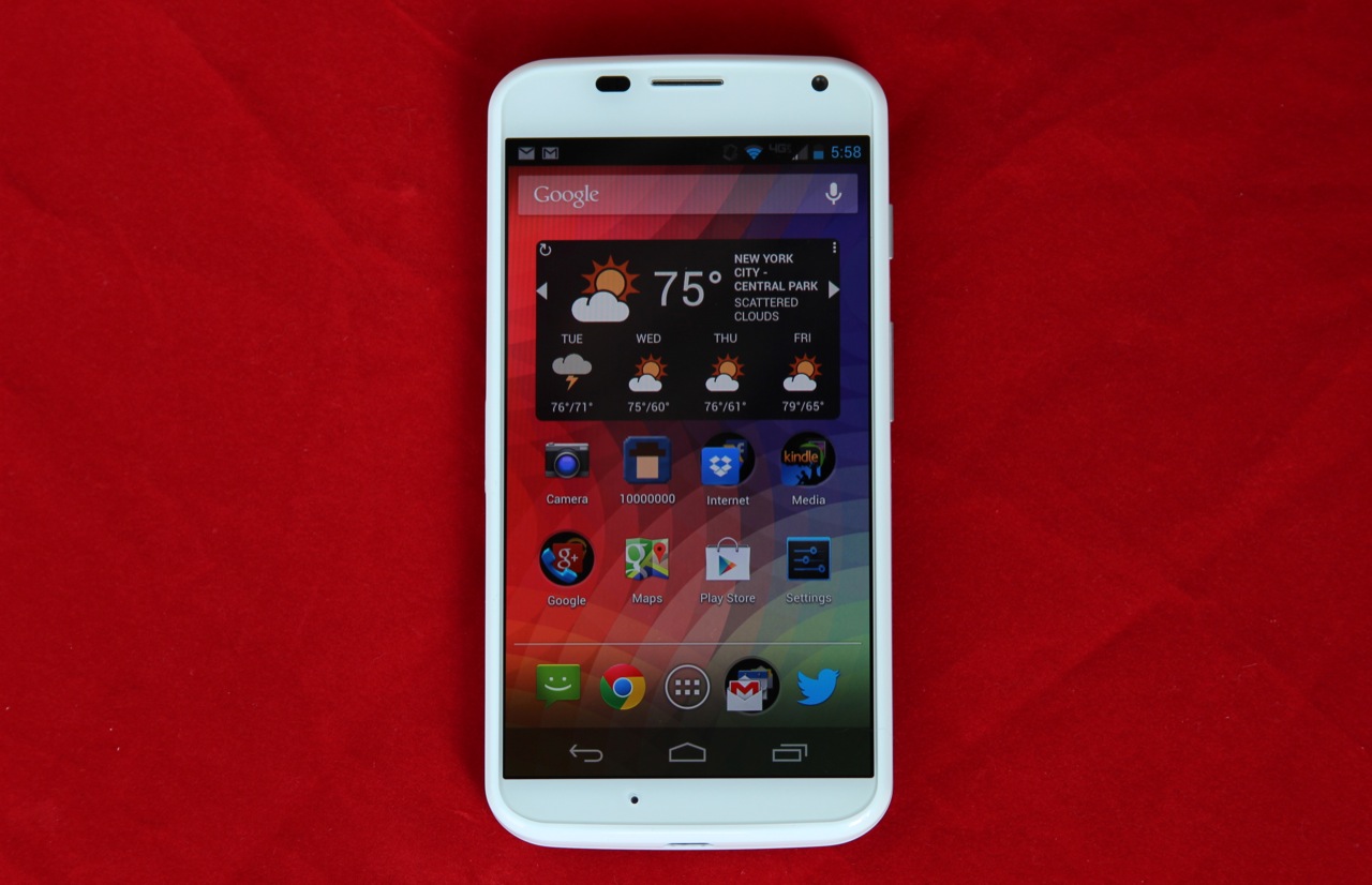
The Moto X.
After two weeks of use, I've come to like the Moto X. I don't understand any assessment of the phone that calls it some kind of game-changer, but it's a very amiable, approachable handset. It feels good to hold and use, and the active notifications in particular are something I'll miss when I go back to my iPhone 4S. It doesn't offer all the specs of its contemporaries, but the Moto X is worthy of consideration because it's a decently sized, mostly well-built phone with a few useful tweaks. It's also only a point release away from being Nexus-style stock Android. We suspect this will appeal to Verizon customers in particular, who can use neither the Nexus 4 nor either of the Google Play edition phones on their network of choice (the Moto X can't beat any of those phones in the spec race, but it will run circles around that old Verizon Galaxy Nexus you're carrying).
One of my initial criticisms of the phone still stands, even if the rest of the phone manages to hit that elusive "good enough" target: the price. Motorola will sell you a Moto X for the same price as a Galaxy S 4 or HTC One, big-name phones with a sizable leg-up in specifications. We mention the specifications not because every consumer on the planet needs a 1080p display and a top-of-the-line quad-core CPU, but because Motorola and Google aren't really passing any savings on to the consumer. I've seen it argued that the phone's much-ballyhooed made-in-the-USA label is contributing somewhat to that inflated cost, but there's no concrete data that can confirm or dispute that stance.
In any event, Motorola has built a smartphone that seems well-attuned to the things that normal people want and need, but they haven't given it a price to match. It's true that Apple sells the similarly specced iPhone 5 at the same price, but the fact of the matter is that even under Google's aegis, Motorola doesn't have the brand strength or consumer goodwill that Apple does (I can't think of another company that could move 31.2 million phones this late in their flagship's life cycle). In an ideal world, Google and Motorola would upend the US smartphone market with Nexus-esque off-contract pricing somewhere between $300 and $400 unlocked. More realistically, it wouldn't be unreasonable to sell this phone for $99 on-contract instead of $199.
If you're in the market for a new Android phone right now, we would still ask you to consider a Galaxy S 4, HTC One, or even a cheaper phone like the Galaxy S III before we'd recommend the Moto X. However, as a beginning, as the first step in some longer journey, Google and Motorola's first "true" joint effort is intriguing. It's a confident step forward. It makes me interested to see where Motorola will be a year from now, and that's something I haven't said in a while.
The good
- A flagship Android handset that isn't allergic to one-handed use
- Mostly solid build quality with a plethora of color options
- Good-enough 720p AMOLED screen, improved somewhat by its lack of PenTile
- Great graphics performance, respectable CPU performance
- Near-stock Android, if that's what you're into
- Active notifications and touchless controls are both genuinely useful additions
- Good battery life
- 802.11ac
The bad
- Average camera that's very susceptible to smudges
- AMOLED still has issues with color accuracy and white balance
- This isn't a Nexus—you'll have to deal with carrier-preinstalled apps, and updates will probably have to jump through most of the same hoops that they would on a non-Google phone
The ugly
- Google and Motorola are using a lesser SoC and a lower-resolution screen, but they're not passing those savings on to you
No comments:
Post a Comment
Let us know your Thoughts and ideas!
Your comment will be deleted if you
Spam , Adv. Or use of bad language!
Try not to! And thank for visiting and for the comment
Keep visiting and spread and share our post !!
Sharing is a kind way of caring!! Thanks again!