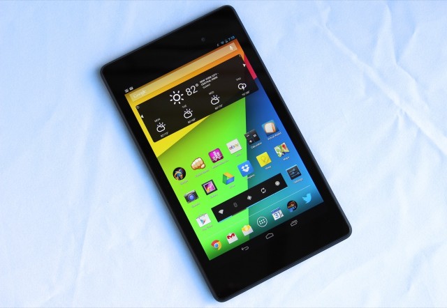
It's the same size, but everything else about the new Nexus 7 is totally different.
Just over a year ago, Google released its first Nexus tablet. The 2012 Nexus 7 wasn't perfect by a long shot, but it was the kick in the pants that the Android tablet ecosystem needed at the time. Up until that point, the best Android tablets (and we use that term loosely) were trying to pretend like they weren't even Android tablets. Among the Galaxy Tabs and Motorola Xooms of the world, no one tablet really did well enough to merit the attention of developers or users. The Nexus 7 also redefined what people could expect to get for $200—an entirely usable (if not cutting-edge) general-purpose tablet without performance-sucking third-party skins or OEM-exclusive app stores.
Since then, the seven-to-eight-inch tablet category has gotten much more competitive thanks to lower prices from Amazon and a new, smaller iPad from Apple. Since it launched, praise for the original Nexus 7 has also gotten more muted, as storage-related performance degradation has set in and made the tablet feel slower than it did at first. With this follow-up, Google and Asus don't just have to provide a decisive answer to the iPad mini—they also have to quell doubts about their tablet's longevity. Luckily for us, they've managed to do both.
Body and build
| SPECS AT A GLANCE: 2013 NEXUS 7 | |
|---|---|
| SCREEN | 1920×1200 7.02" (323 PPI) IPS LCD |
| OS | Android 4.3 Jelly Bean |
| CPU | Quad-core 1.5GHz Qualcomm Snapdragon S4 Pro |
| RAM | 2GB |
| GPU | Qualcomm Adreno 320 |
| STORAGE | 16GB or 32GB (non-upgradeable) |
| NETWORKING | 802.11a/b/g/n, Bluetooth 4.0, NFC, optional LTE (700/750/850/1700/1900/2100MHz), HSPA+ (850/900/1900/2100MHz/AWS), GSM (850/900/1800/1900MHz) |
| PORTS | Micro-USB, headphones |
| CAMERA | 5MP rear camera, 1.2MP front camera |
| SIZE | 7.87" × 4.49" × 0.34" (200 x 114 x 8.65 mm) |
| WEIGHT | 10.23 oz. (290 g) |
| BATTERY | 3950 mAh |
| STARTING PRICE | $229 |
| PRICE AS REVIEWED | $269 |
The short version: The 2013 Nexus 7 is more compact and, overall, feels a little better put together than last year's model. This is plastic done right. Adjustments to the tablet's weight and measurements make it easier to hold in both portrait and landscape modes.
The long version: The 2013 Nexus 7 is an all-black, mostly plastic slab with a 7-inch 1920×1200 display on the front. There's also a 1.2MP front-facing camera set slightly right-of-center above the screen, a 5MP camera with no LED flash on the back, and stereo speaker grilles on the back of the tablet at its top and bottom. A new notification LED will slowly pulse at you from the bezel below the screen, but the tablet still lacks any sort of vibrator motor for notifications (or haptic feedback). The Nexus 4 and Nexus 10 both support this feature, so its continued omission from the Nexus 7 is a little puzzling, even if it isn't in any way deal-breaking.
Other new features include built-in support for the Qi wireless charging standard, HDMI output through the micro USB port via the Slim Port standard (adapter sold separately), wireless display support via the Miracast standard, and 4G LTE support on Verizon, AT&T, and T-Mobile in the US (as long as you buy the LTE-equipped model, which is slated to go on sale in the coming weeks). Many of these features made an appearance in the Nexus 4 when it was launched late last year, and they're all welcome (if mostly niche) additions to the Nexus 7.
The new Nexus 7 sports both reduced thickness (0.34 inches, compared to 0.42 for the last Nexus 7 and 0.28 for the iPad mini) and weight (10.23 ounces, compared to 12 for the last Nexus 7 and 10.88 for the iPad mini) relative to last year's model. These measurements make the tablet feel better in your hand, but the best part is that Asus was able to shrink these measurements while also upping its build quality game. There's none of the creaking or flexing you might associate with an all-plastic tablet at this price point. The old Nexus 7 merely felt good for the price; the new one feels just plain good, though the aluminum construction of the ($100 more expensive) iPad mini still edges it out by just a bit.
It's the subtle changes that really show how Asus has improved the design. For instance: in the year or so that I've owned it, my 2012 Nexus 7 has made two trips to the ground. It survived both falls, but each time the silver trim that surrounds the display has separated slightly from the back of the tablet. It snapped back into place without issue in both cases, but it's a fit-and-finish deficiency that's not present in the more expensive Nexus 10 or either iPad.
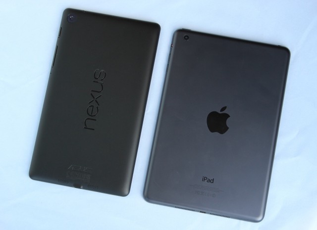
The new Nexus 7's finish is reminiscent of the iPad mini's, except it's soft-touch plastic instead of aluminum.
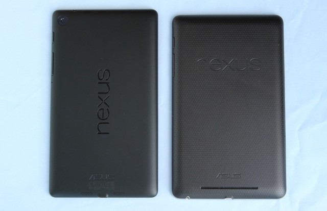
We can't deny that we miss the unique texture of last year's Nexus 7 (right), though.
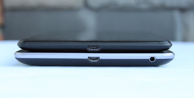
The old Nexus 7 (bottom) is decidedly huskier than the new one (top). Also note that the tablet's headphone jack has migrated to the top of the device.
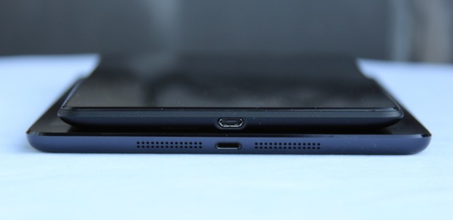
It's more comparable in thickness and height to the iPad mini, though the Nexus is still narrower.
The 2013 Nexus 7 also has a plastic rim around the screen that can be pried away from the back of the tablet to expose its innards, but the rim was recessed compared to last year's model. Drop the 2012 Nexus 7, and the tablet's silvery edge is likely to absorb the blow and come apart from the rest of the tablet. Drop the 2013 model, and the edges more likely to absorb the impact are on a piece of the back of the tablet (and thus are less likely to separate from the screen).
The back of the tablet is now a flat black "soft-touch" plastic that lacks the pleasant texture of last year's model. The tablet doesn't have the slippery, glossy plastic feel of one of Samsung's phones or tablets (the Nexus 10 notwithstanding), but it's not quite as grippy as either its predecessor or its larger relative. In practice, the tablet is quite easy to hold in one hand or two, but the decision to make the tablet both narrower and taller than the previous Nexus 7 makes it easier to hold in portrait and landscape modes.
For instance, the narrower side bezels make it more comfortable to really grip the tablet in the palm of your hand like so:
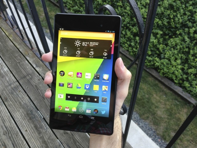
Even in my relatively large hands, I couldn't hold the old Nexus 7 like this without straining.
Or, if I need to, I can use my thumb to interact with onscreen elements while the tablet is balanced against my pinky, much as I do with the larger Android Smartphones. Since the bezels are thinner, it's more difficult to rest my thumb against the side bezel without also accidentally brushing the screen, but it's still possible.
Neither tablet is particularly fatiguing to hold in one hand for extended tablet-ing sessions, but I feel like I have a better grip on the newer Nexus. I'd call this an improvement, though whether you do depends on how you hold your tablet most of the time.
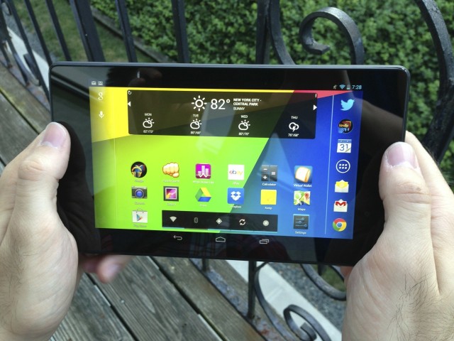
Holding the tablet in landscape mode is also more comfortable, thanks to the sort-of-awkward-looking but functional top and bottom bezels.
The tablet has larger top and bottom bezels, which make the new Nexus 7 easier to hold in landscape mode than the old model as long as you're using two hands. Because of its light weight, you can still hold the tablet with one hand in landscape mode for a while, but the elongated design can be a bit difficult to balance. The alignment of the Nexus logo on the back of the tablet really drives this newfound love for landscape mode home—if you'll recall, the original Nexus 7's home screen wouldn't even work in landscape mode out of the box until an update enabled it. The adjusted bezel thickness makes the tablet look a little awkward, but in actual use we'd call it an improvement over the prior model. It's proof positive that "plastic" doesn't always have to mean "cheap."
A great screen at any price
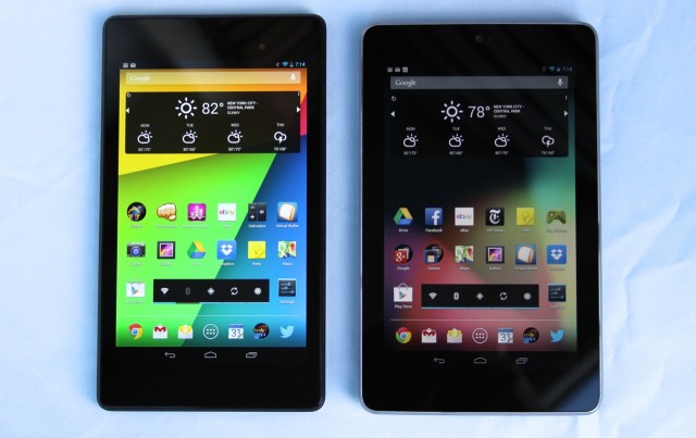 The 2013 Nexus 7 (left) has a 323 PPI screen, compared to 216 PPI for the old version (right).
The short version: The 1920×1200 display has much brighter colors than last year's 1280×800 panel, and at 323 PPI, it outdoes both the 300 PPI Nexus 10 and 264 PPI Retina iPads. Until there's a Retina iPad mini, no other small-tablet screen comes close.
The long version: Our review of the first eight-inch Windows 8 tablet really drives home the importance of the screen to the smartphone and tablet experience. Use a crappy screen, and it doesn't matter how good the rest of your tablet is—the user's experience is going to be bad.
There are two big things to consider when evaluating a tablet's screen: the resolution (and thus, pixel density) of that screen and the actual quality of the screen itself. In both respects, the new Nexus 7 beats the pants off of its predecessor and the iPad mini.
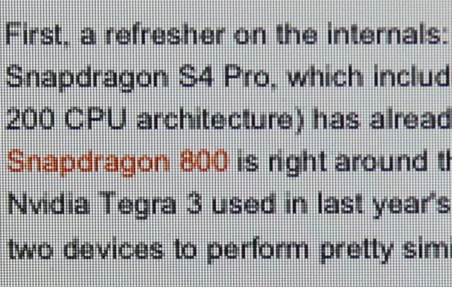
The iPad mini's individual pixels are easy to discern when you get close up.
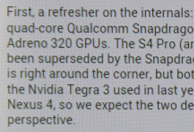
It's not too hard to do it with last year's Nexus 7, either, though text already looks a bit smoother.
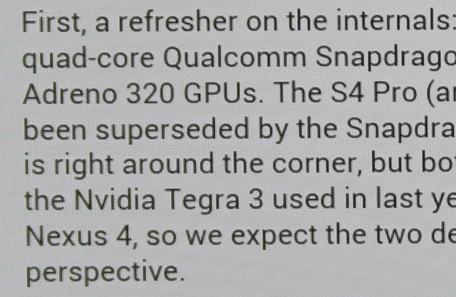
Even very close up, it's difficult to resolve individual pixels on the new Nexus 7's display.
The new Nexus 7's screen is very similar in pixel density to that of the Nexus 10, and it has most of the same virtues and drawbacks. Text across almost all apps is universally crisp and clear, as you can see in the pictures. Images that have been optimized for high-resolution, high-density screens are also clear and crisp, though images that haven't been optimized will be slightly blurry as they are on the Nexus 10, the Chromebook Pixel, and the various Retina-equipped Apple products.
Everyone will have different opinions about pixel density and how much it matters. Plenty of people are perfectly happy with the iPad mini's 163 PPI density, though I think it's a little pixelated (especially for text—I spend most of my tablet-time reading either webpages or e-books). To my eyes, there's a line just above 200 PPI—right around the screen density of the 2012 Nexus 7—after which additional improvements to tablet screens are nice but not necessary. I can tell the difference between the 2012 Nexus 7's 216 PPI and the higher PPIs of the Retina iPad, the Nexus 10, and the 2013 Nexus 7, but it's that line between the iPad mini and the 2012 Nexus 7 that will probably make the biggest difference to the most people.
Internals and performance: The CPU, GPU, storage, and Wi-Fi
The short version: The 2013 Nexus 7 is sort of like a slightly faster Nexus 4 in a tablet-sized body. These internals aren't the newest on the block anymore, but they're still very quick. The new tablet runs circles around last year's model, and there doesn't appear to be any heat-related speed throttling like in the Nexus 4. Faster storage and support for TRIM in Android 4.3 should help prevent performance degradation over time.
The long version: We've already taken a quick look at the new Nexus 7's performance, which is delivered by a 1.5GHz quad-core Qualcomm Snapdragon S4 Pro, its 400MHz Adreno 320 GPU, and 2GB of DDR3L memory. We'll throw some fresh charts at you in a moment, but there's something we need to clarify first.
In our previous article, we noted that the 2013 Nexus 7 was consistently faster than the Nexus 4 despite the fact that the two ostensibly share the same system-on-a-chip (SoC). We posited that the differences came down to three things: additional optimizations in Android 4.3, differing thermal constraints, and faster RAM. All three of these are true—the Nexus 4 gets a measurable performance boost from Android 4.3, the new Nexus 7 doesn't appear to have the speed throttling problems that the phone continues to have, and the Nexus 4 uses slightly slower LPDDR2 rather than DDR3L. There's one more issue: these two Snapdragon S4 Pros are not in fact the same chip.
Sleuthing by AnandTech's Brian Klug found that the 2013 Nexus 7's SoC had a part number of APQ8064-1AA, compared to APQ8064 for the Nexus 4's SoC. That extra 1AA denotes a chip that is essentially a lower-clocked Snapdragon 600, complete with the newer and slightly more efficient Krait 300 CPU architecture. The Snapdragon 600 SoCs we've seen so far have been 1.7GHz and 1.9GHz variants, but because of the lower 1.5GHz clock speed, Qualcomm has apparently decided to fudge its branding a bit and slap the older S4 moniker on what is actually a newer chip.
Even with all of these changes, it's not far off the mark to call the 2013 Nexus 7 a Nexus 4 in a tablet's body. It's faster than the Nexus 4 in many small ways, but most importantly it's much more powerful than last year's Nexus 7. It even frequently challenges the beefier Nexus 10. And the iPad mini's two-and-a-half-year-old Apple A5? It's not even close.
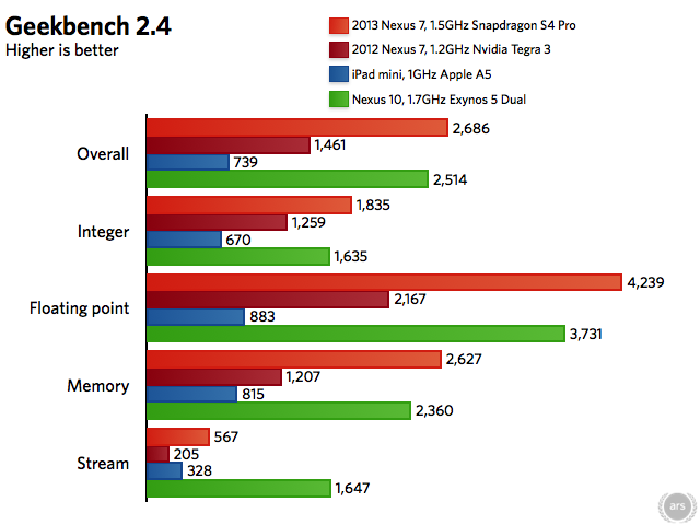
All Nexus devices are running Android 4.3. The iPad mini is running iOS 6.1.3. Browser benchmarks are in Chrome on Android, and in Safari on iOS.
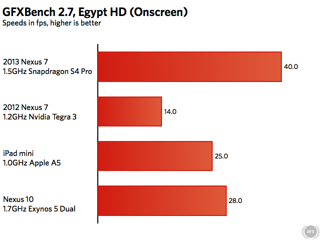
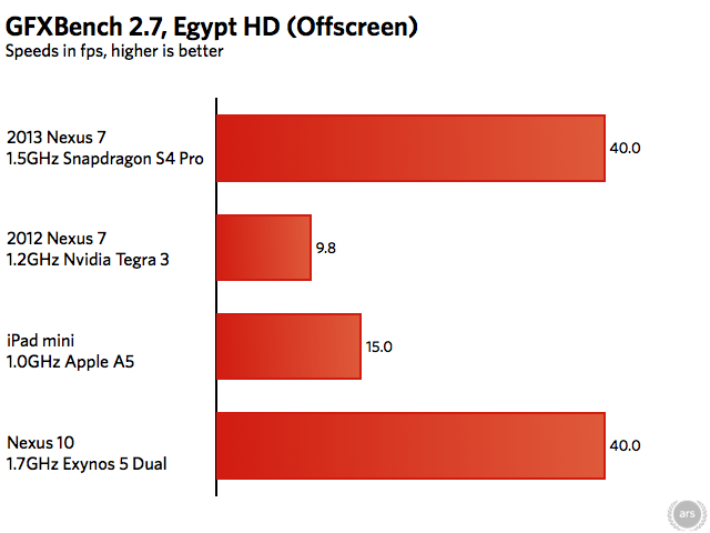
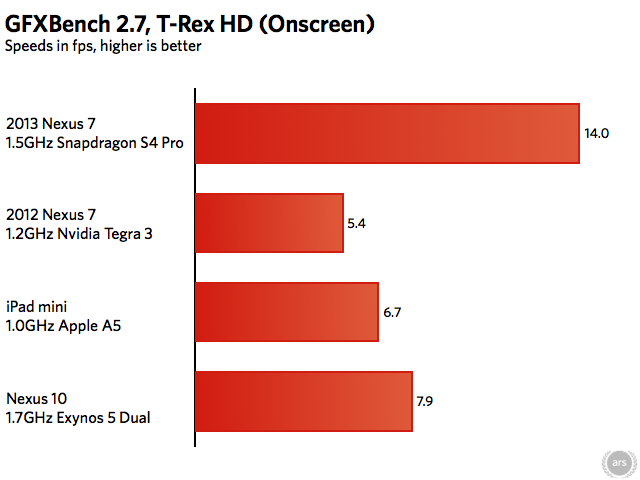
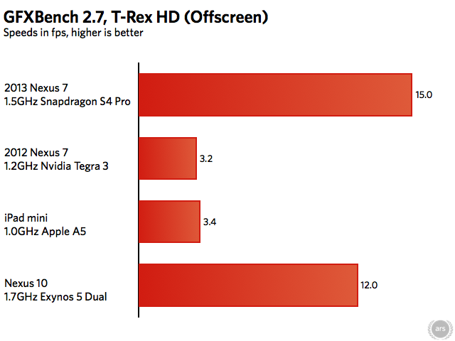
The old Apple A5 in the iPad mini does a pretty good job given its age. The two Cortex-A9 CPU cores can't stand up to four Krait 300 cores, but in GFXBench the dual-core PowerVR SGX543MP2 GPU is still well-matched to that tablet's 1024×768 display (see the Onscreen tests). Even with a $100 smaller price tag, though, the 2013 Nexus 7 can boast a much better-looking high-resolution screenand superior graphics performance despite the fact that some of the Adreno 320's power is spent driving those extra pixels.
Especially when making comparisons between iOS and Android, these benchmark numbers are only part of the story. Apple has long used its tight integration between hardware and software to squeeze more performance out of less hardware—the iPad mini with its dual-core Apple A5 and 512MB of RAM holds up better against the new Nexus than you might think from looking at the spec sheet.
To make the best apples-to-Apples comparison possible, we loaded up the Ars and New York Timeshome pages and timed them to get an idea of how quickly each tablet could pull the pages down over our 5GHz 802.11n connection (2.4GHz for the old Nexus 7). In between runs, all browser tabs were closed and the browsers were forcibly quit to keep caching from affecting the results. Loading times are measured from the time "Go" is pressed on the keyboard to the time to last page element loads. Each page was loaded at least three times and the results were averaged.
| DEVICE | ARS HOMEPAGE | NYT HOMEPAGE |
|---|---|---|
| 2013 Nexus 7 | 2.50 seconds | 4.72 seconds |
| 2012 Nexus 7 | 5.75 seconds | 6.15 seconds |
| 2012 iPad mini | 4.05 seconds | 5.51 seconds |
The new Nexus 7 is unquestionably the fastest tablet on the (dining room) table here, but the iPad mini actually acquits itself pretty well. Apple's small tablet is noticeably faster than last year's Nexus 7, and compared to the new Nexus 7 it's not quite as slow as the gaping chasm between their numbers in the benchmark charts would suggest. It's also worth noting that there was sometimes less variance between runs on the iPad than on the Nexus tablets, which could load the Times homepage in four seconds in one run but in six seconds the next (we ran the Times test in particular a few more times on both Nexus tablets to make sure we were getting a representative average).
Moving on to storage performance, we noted last week the new Nexus 7 boasts NAND flash speeds that can more than double the speeds of the older tablet. This difference can get even larger depending on whether you had the 8GB model of the tablet that was introduced in June or the higher-end 16GB and 32GB models. The flash memory isn't quite as quick as the Nexus 10, but the storage shouldn't be nearly the bottleneck it was last year.
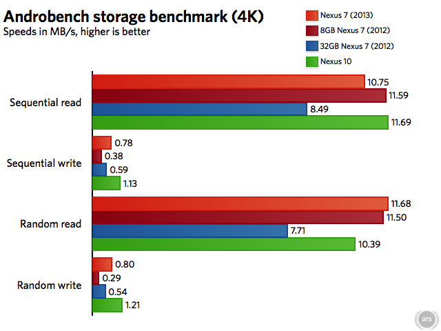
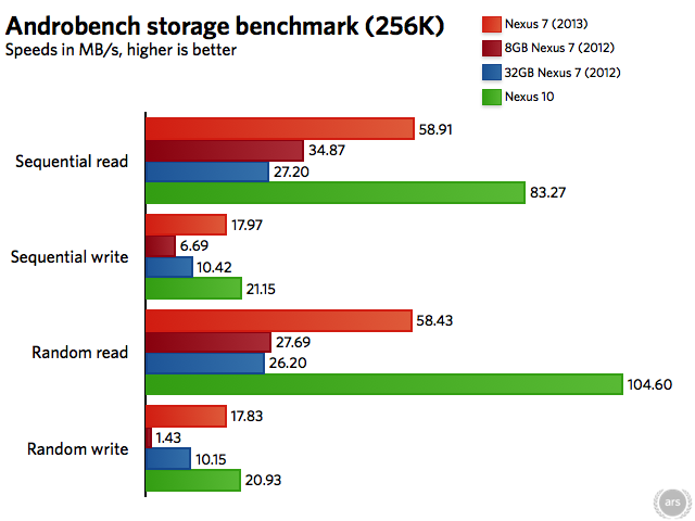
But what about performance over time? Android 4.3 adds a crucial feature that should help stave off the performance degradation that has soured some people on the original Nexus 7: TRIM. Though we've explained it more fully elsewhere, the short explanation is that the TRIM command cleans up previously used flash memory after the operating system marks a file as deleted. Without TRIM, storage blocks that are reported to the OS as "empty" can actually still have previously deleted data in them, and this takes more time than writing to a block that is truly empty. Thus, without TRIM's so-called garbage collection, performance slows over time as all of your storage blocks fill up with junk that isn't being cleaned up.
Word on the street is that the Android 4.3 update also enables TRIM for older devices like the Nexus 7 and Galaxy Nexus, so users of those devices may see performance improve post-update as the feature kicks in and begins its garbage collection. Anecdotally, I can say that my year-old 8GB 2012 Nexus 7 certainly feels more consistent after the Android 4.3 update, but we'll be attempting to quantify these improvements in our proper Android 4.3 review later this week.
Finally, let's briefly touch on Wi-Fi performance. The new Nexus 7 supports both 2.4GHz and 5GHz 802.11n—the tablet appears to support one two-way stream, giving it a maximum theoretical connection speed of 150Mbps. Using the iPerf network performance testing tool, we found that the 2013 Nexus 7's Wi-Fi performance wasn't too far short of the Nexus 10's on a 5GHz 802.11n network, even though that tablet supports two 802.11n streams for a maximum theoretical throughput of 300Mbps. Unfortunately, the extant iPerf apps for iOS are mostly unusable garbage, so the iPad mini has to sit this one out. We'd expect speeds similar to the new Nexus 7, given that they share similar specs.
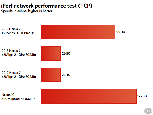
All tablets had a clear line of sight to the 802.11ac AirPort Extreme base station, which they were about ten feet away from.
Camera and speakers
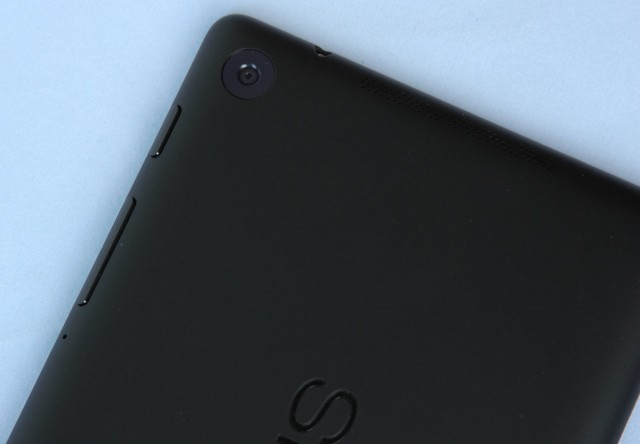
The rear-facing camera. Also note the top of the tablet, where one of the speaker grilles rests.
The short version: They say that the best camera is the camera you have with you, but if the camera you have with you is the Nexus 7, your pictures are going to be OK at best. The speakers, on the other hand, are drastically improved. They're perfectly capable of filling a room with not-half-bad sound.
The long version: The new Nexus 7's 5MP rear-facing camera (which joins its 1.2MP front-facing camera) checks a box that the original Nexus 7 couldn't check, but like most tablet cameras it's a step or three below the shooters you'll get in even a mid-range smartphone these days. There's no LED flash, and colors indoors and outdoors tend to be a bit washed out. The Nexus 10 and iPad mini both do a slightly better job.

In a well-lit room, the iPad mini can take somewhat grainy photos that still have good white balance and color.
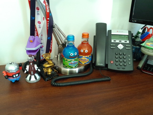
The Nexus 10 adds a decidedly greenish cast to the same scene in the same lighting, but the result is still fairly clear.
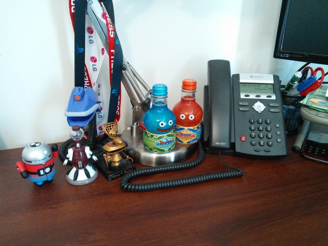
The 2013 Nexus 7's camera adds considerable noise and color shift (note the purple robot that is now blue) to the same shot.

Moving outdoors, the iPad mini's camera loses detail in the leaves but does a good job with color and isn't too confused by the different light levels (the shaded patio versus the well-lit bushes and neighboring apartment building)

The Nexus 10 likewise does a pretty good job here. Still a bit soft, but colors and exposure are fine.
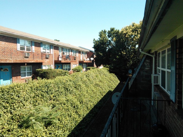
The Nexus 7 takes the same scene and really washes the colors out—both the green bushes and the blue sky suffer here.
The camera is there in a pinch. If the Nexus 7 is the difference between having a camera and having no camera, it will take passable Facebook pictures. But your smartphone (and even other tablets) will probably do a better job.
It's much easier to find nice things to say about the tablet's speakers, which are surprisingly good given the tablet's size and price. The old Nexus 7 had stereo speakers, but they were placed right next to each other under a single grille on the back of the tablet. They didn't get very loud, and they didn't sound very good.
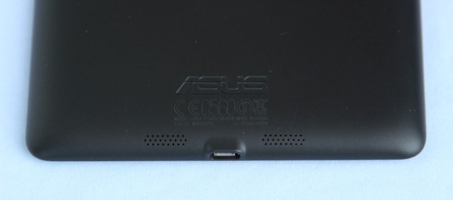
The other speaker is located at the bottom of the tablet near the micro-USB port.
The new Nexus 7 still keeps its speakers on the back of the tablet (a move sure to disappoint fans of the front-facing speakers in the Nexus 10 or HTC One), but they've moved apart—one speaker now sits at each end of the tablet. The sound quality is actually quite passable, and while there's some distortion at higher volume levels, the speakers are loud enough to fill a room or small apartment with sound even at 50 percent. The speakers will do a fine job by themselves if you're watching a video without headphones or listening to some music in the kitchen. The iPad mini's speakers boast a similar volume level, but the sound is a bit tinnier and the Nexus boasts a bit more bass.
The one downside is that the way the speakers are positioned makes them easy to cover with your hands while the tablet is in landscape mode. If you're holding the device while you watch something, you'll need to be careful not to obstruct them.
Battery life
Google says that the new Nexus 7 should get about nine hours of "active use," a full hour longer than last year's. We managed to stream videos to the new Nexus 7 for about six hours on a full charge, compared to five hours and 24 minutes for the old version streaming the same video at the same settings (both tablets were running Android 4.3).
Streaming video is a little on the heavy side as far as general-usage tasks go since it generates a lot of network traffic, but even so, it's clear that you can expect slightly better battery life out of this year's Nexus 7 despite the nicer screen and faster internals. Our experience browsing the Web and using lighter apps like Google Drive and Twitter leads us to believe that Google's nine-hour estimate is on the high end of realistic.
The Android tablet app situation
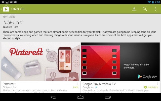
Google continues to push developers to make Android tablet apps by featuring them prominently in Google Play.
The short version: Due in part to the original Nexus 7 and the Nexus 10 (as well as steady improvement by Google), there are more tablet-friendly Android apps out now than there were last year. However, in many cases you'll still have to make do with blown-up phone apps, and iOS continues to have a wider selection of games and niche apps (and these apps are generally more functionally and aesthetically consistent with other apps and the rest of the OS).
The long version: We dedicated a sizable portion of our original Nexus 7 review to an evaluation of the platform's tablet apps, mostly because even a year ago the Android tablet app situation was pretty dire. Most Android tablets up to that point—Samsung's Galaxy Tabs and Asus Transformer tablets among them—hardly flew off the shelves. Most developers simply couldn't be bothered to write tablet-specific Android apps, because the audience wasn't there.
Now Android tablets are finding their footing, and both Nexus 7s and the Nexus 10 give developers some targets to rally around. Let's take the Kindle app, for example, since we spent a lot of time with it in the original Nexus 7 review. Then, the version you could get on an Android tablet was essentially an upscaled version of the phone app. It showed. Margins and font size adjustments were only adjustable within a limited range, and the Kindle app for Amazon's own Kindle Fires was more flexible and feature-rich. Since then, the Kindle app has gotten much more flexible, and a few other high-profile apps I use (eBay, Netflix, Hulu Plus) have similarly gotten more tablet-friendly since the release of the original Nexus 7. Google's own apps, like Gmail and Google Drive, are also pretty good.
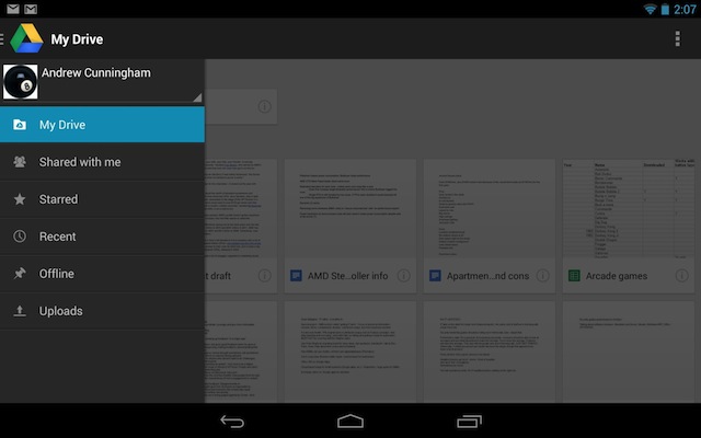
Apps like Google Drive make good use of sliding panels and menus to fill a 7-inch tablet's screen without making things too crowded.
That said, plenty of problems remain. We singled out Dropbox, Spotify, and Twitter for Android shortly after the release of the Nexus 10 last year, and they haven't evolved much in the last eight months. Lower-profile apps, like the one I use to access my bank account, are still most likely targeted toward phone-sized screens (and often Android 2.3 phone screens, at that). You're going to run into plenty of stuff designed for a four-inch phone screen that has simply been stretched to take up a seven-inch tablet screen. While that doesn't look quite as bad as a phone app on a ten-inch tablet screen, it doesn't make for the most consistent, aesthetically pleasing user experience. The Android tablet app ecosystem is better now than it has ever been, but it was always working from a deficit. The iPad's app selection remains superior.
What small tablets should aspire to be
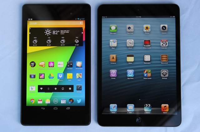
You can easily describe the new Nexus 7 as "great" without having to add "for the price."
Great hardware isn't everything. If you're used to iOS, have a lot of money and data wrapped up in Apple's ecosystem, or prefer the wider selection of higher-quality third-party apps, an iPad mini is by no means a bad choice. If you're on the fence between an Android tablet and an iOS tablet, though, the new Nexus 7 is the only reason you need to jump off that fence and take a trip to Android-land.
The new Nexus 7 takes what was good about the original model (a low price, stock Android, and decent build quality and specs for the price) and addresses almost all of its shortcomings. The tablet is now much faster, feels more sturdy in the hand, shouldn't suffer from particularly bad performance degradation over time, and has a gorgeous screen that can go toe-to-toe with any tablet from any manufacturer at any price point.
It's too bad that Google and Asus couldn't keep the price down at the previous $199 level. Some of that $30 increase can be seen and felt in the tablet itself, while some of it is probably there to ensure that the device is profitable (as Google's Sundar Pichai said last week—remember that the old Nexus 7 was basically sold at a break-even price at launch). Those looking for the cheapest usable Android tablet may have more luck at the emerging $149 price point, where 2012 Nexus 7-esque devices theHisense Sero 7 Pro and Asus' own Memo Pad HD 7 are setting up shop.
Even with the slight price hike, the Nexus 7 has once again set the bar for not just small Android tablets, but all small tablets from all ecosystems. If Apple responds with a Retina-equipped iPad mini in the fall, the balance of power may shift back in the other direction. But if it sticks with its current display, it will become more difficult to recommend.
The good
- Gorgeous screen
- Fast internals
- Light, easy to hold, attractive
- A laundry list of internal and external upgrades, including wireless charging, better Wi-Fi, and superior speakers
- Stock Android 4.3, which should prevent the slowdown that came to plague the previous model
- Especially good for the (slightly higher) price
The bad
- Speaker placement may be awkward in landscape mode
- Android tablet apps are still hit-and-miss
The ugly
- The new 5MP camera is middling at best


