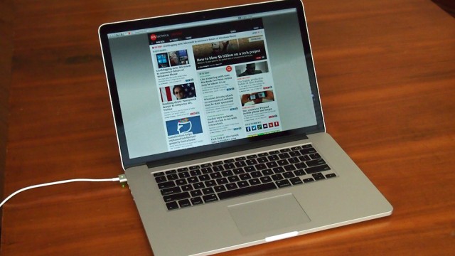
Apple applied lessons learned from the MacBook Air to make its Retina MacBook Pro thinner and lighter.
A thinner, "Retina" MacBook Pro had been rumored for some time, and Apple did not disappoint when it introduced the new 15" Retina MacBook Pro at its Worldwide Developers Conference last week.
Availability has been rather scarce since the notebook's launch last week, but we were able to get our hands on the base $2,199 model for testing. (Many Apple Store retail locations had little or no stock during launch week, as early inventory apparently went to fill a rash of online orders for early adopters).
The base model is more than adequate to get a feel for the new "Retina" redesign. We put the machine through some benchmark paces to look at relative raw performance, and spent a couple of days using the machine for our usual work to get a more subjective impression of the whole package—and we came away impressed.
Specifications
15" Retina MacBook Pro, $2,199
- 2.3GHz quad-core Intel Core i7 processor (Turbo Boost up to 3.3GHz) with 6MB shared L3 cache
- 8GB of 1600MHz DDR3L onboard memory
- Storage: 256GB solid state flash drive
- Screen: 15.4" diagonally, 2880 x 1800 native resolution
- Size: 14.13" width, 9.73" deep, 0.71" thickness
- Weight: 4.46 pounds
- Power supply: 85W MagSafe 2 Power Adapter
"Future of notebooks"
Apple could have chosen a simpler path to revising its MacBook Pro. The Retina display could have been a drop-in replacement for the existing 15.4" 1440x900 display. Perhaps it could have removed the optical drive, replaced the boot drive with a MacBook Air-like SSD module, and kept the internal 2.5" bay for optional additional storage in the form of another SSD or a relatively inexpensive, but vastly more massive, HDD. Such a design would have likely sold well, and Apple's designers could move on to the next project (hello, new Mac Pro).
Then again, the company traditionally hasn't had problems pushing consumers to adopt designs they might be uncomfortable with at first. Recall the words that Steve Jobs used when he introduced the redesigned MacBook Air in October 2010: "We've tried to be really aggressive [with the design]," Jobs said. "We see these as the next generation of MacBooks—all notebooks will be like this."
The new 15" Retina MacBook Pro is the first time Apple has applied the same design thinking that went into that new Air to its "pro" notebooks. Spinning hard drives? Gone. Optical storage? Useless anachronism. FireWire and Ethernet? Vestigial, obsolete ports.
But this isn't a stripped-down machine with ultra low voltage processors. The new MacBook Pro differentiates itself from the Air by packing in a quad-core Ivy Bridge processor built on Intel's latest 22nm process. It includes Intel's HD4000 integrated GPU, which isn't quite the pixel-y sloth that past Intel IGPs used to be. It also packs in a discrete NVIDIA GeForce GT 650M mobile GPU with 1GB of dedicated DDR5 memory, and you get at least 8GB of DDR3 RAM standard.
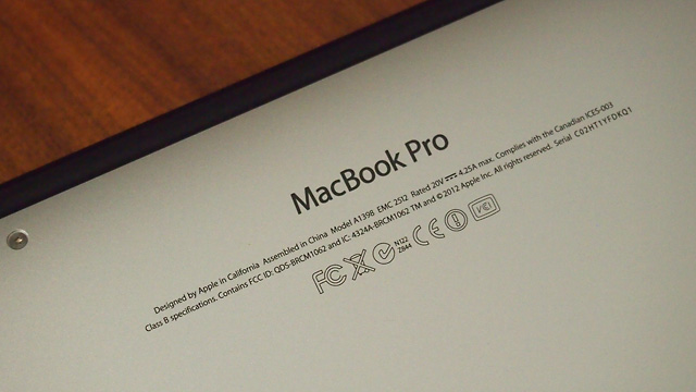
All this hardware pumps 5.1 million pixels to the 2880x1800 pixel Retina display—the sharpest, highest resolution display Apple has shipped in any of its computers thus far.
Still, Apple has kept the previous 15" MacBook Pro design around for those that aren't quite ready for the future. It has an upgradeable 2.5" drive slot and two slots for RAM. It also has a full array of ports, including FireWire and gigabit Ethernet. And, perhaps most importantly to those still dependent on CDs and DVDs, it has an optical drive for those who want the convenience of having one built-in.
But making hard decisions about what stayed in and what had to go has allowed Apple to build a machine that's every bit as powerful—and with the right adapters, as capable—as last year's MacBook Pro design. Yet Apple shaved about 27 percent of the volume and over a pound of weight in the process.
Design
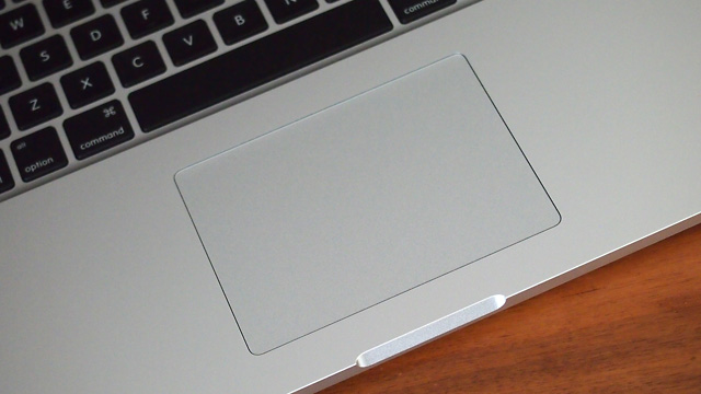
The same huge glass trackpad dominates a large portion of the 15" Retina MacBook Pro when opened.
If you have seen any unibody MacBook Pro in the last few years, you already have a pretty good idea of what the Retina MacBook Pro looks like. It has the same textured aluminum finish, the same rounded corners, and the same huge trackpad. The display has a uniform black appearance when the screen is off, due to its fused glass panel—similar to the display assembly of the iPhone 4 and 4S.
The keyboard is slightly different from that used on previous Pro models. Its layout is identical to thecurrent MacBook Air, including the extra key in the F13 position that serves as the power button. (The aluminum power button on the upper right is now gone). And like all of Apple's laptops, the keyboard is backlit.
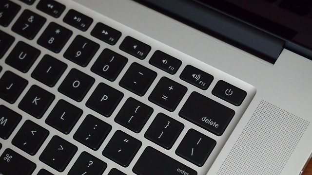
The backlit keyboard is more Air-like, including the revised power button.
The feel of the keyboard is also slightly different. The keys themselves have a very slight texture to them. Key travel appears to be slightly reduced. It's hard to quantify, but there's definitely less travel than previous Pros, or even my 2010 MacBook Air. We wouldn't call this bad, per se, but it's something you will notice and may take some time getting used to.
Laser-etched speaker grilles flank either side of the keyboard, and a noise-canceling microphone is hidden behind each.
One area where the new Pro differs from the old design is the addition of small linear vents along the bottom side edges of the casing. These vents are part of the revised cooling system, and Apple claims that the way they are carved into the unibody creates additional torsional rigidity. There's no noticeable flex in either MacBook Pro as far as we can tell, though—both seem pretty solid.
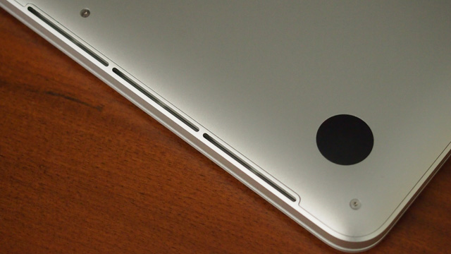
Additional vents line both edges of the Retina MacBook Pro.
So the design isn't really new, per se, just slightly refined for this particular model. It's thin, solid, andfeels like a professional machine—exactly what you would expect.
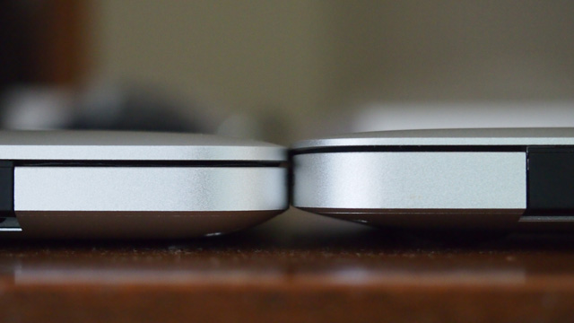
The Retina MacBook Pro is essentially the same thickness as a MacBook Air at its thickest point—0.71 inches versus 0.68 inches, respectively.
Internals
Our review model is the base Retina MacBook Pro, which comes with a 2.3GHz quad-core Intel Core i7 processor. The processor can ramp up its raw clock speed to 3.3GHz using Turbo Boost, wherein one or more cores are shut off when running less than the maximum eight threads simultaneously. (Core i7 processors use hyper threading, which allows each core to run two threads concurrently).
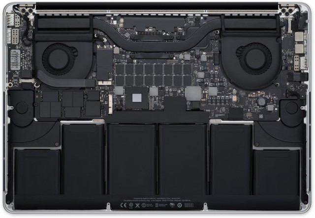
It also includes 8GB of DDR3L low-voltage RAM soldered to the logic board standard. By comparison, the base 15" non-Retina MacBook Pro still comes with just 4GB. You can boost this to 16GB for $200 as a build-to-order option, and we recommend doing so if your budget allows (since it can't be upgraded later). The 8GB of RAM is a good amount, but any sort of high-end computing will benefit from more.
Also standard is a 256GB SSD module. Unless you like to keep huge libraries of music, video, and/or photos on your primary boot volume, this is probably adequate for many users. If you want more internal storage, however, you must opt for the higher-end configuration. That comes with a 2.6GHz processor and a 512GB SSD. If you just want to upgrade the SSD, it's pricey, at $600. If you want to max out the SSD at 768GB, it'll cost you another $500.
There's likely some kind of operational reason that Apple limits the options on the $2,199 base configuration, but it honestly doesn't make sense to us. It seems more logical to start with the base configuration at $2199, then make all the RAM, SSD, and CPU options available build-to-order. If Apple wants an optional higher-end configuration to up-sell in its retail stores, we wouldn't argue against it. It just seems unfair to artificially limit the options at the lower end.
As we noted, though, our base model costs $2,199. Configuring a maxed out Retina MacBook Pro, with 2.7GHz Core i7, 16GB of RAM, and 768GB of fast SSD storage will cost a whopping $3,749. If you want to carry all that computing power around with you, Apple is going to make you pay for it.
Retina Display
It's difficult not to slip into hyperbole when it comes to the Retina MacBook Pro's signature feature—the high-resolution "retina" display. If you have used an iPhone 4 or 4S, or a third-generation iPad, you have some idea of what to expect: sharp text, crisp lines, and pixels that seem to disappear.
The screen does seem to resemble a printed page at the default setting, which treats the display as if it were a 15" 1440x900 pixel screen as used in the "old" MacBook Pro. This means that the effective screen real estate hasn't changed—you still have the same amount of workspace. What has changed is that OS X will use four times the number of pixels to render UI elements, text, and more. The end result is that everything simply looks sharper and, frankly, better.
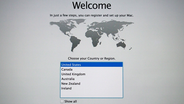
You'll notice the screen improvements right away, even on the opening "welcome" screen.
By doubling the linear pixel count of the 15" display, Apple has effectively doubled the pixel density from about 110ppi to 220ppi. That is nowhere near the 264ppi of the iPad 3, or the 326ppi of the latest iPhone and iPod touch models. However, at a typical viewing distance of about 16", the visual effect is the same—pixels effectively disappear.
The effect was impressive when the iPhone 4 first debuted two years ago, which is akin to looking at a printed index card. The effect wowed more users on the nearly 10" display of the third-gen iPad, which is more like looking at a full-color book or magazine. The display of the 15" Retina MacBook Pro, however, is like viewing a small poster or photograph—it's certainly nice to work on such a large display with the "Retina" effect.
Even going back to an 11" MacBook Air, which has the next-highest pixel density of any other Mac at 135ppi, is difficult. By comparison, text looks a bit like a smeared mess, and photos seem ever-so-slightly fuzzy. If you opt for a Retina MacBook Pro, be prepared for every non-Retina computing experience henceforth to be similarly disappointing for the foreseeable future.
The panel itself is an IPS LCD panel with bright LED backlighting, which appears to be manufactured by LG Philips, according to iFixit's Miro Djuric. "We're not 100 percent certain," he told Ars, "but the inverter board is definitely LG, and it's soldered to the rest of the display. Given what we've seen in other displays, it's fair to say it's LG." (The panel does not use Sharp's promising but delayed IGZO technology—which would have resulted in a thinner, more energy-efficient display—though it had been a rumored possibility).
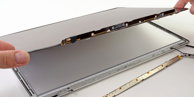
The 1.5mm panel is contained in the display casing, which totals just 7mm at its thickest point.
Apple said that this is the first time it has used an IPS panel in its notebooks, and it really shows. The viewing angle is very wide, color gamut and accuracy are visibly improved, and the contrast ratio is very high due to blacker blacks.
Apple has done an interesting thing when it comes to setting the resolution of the Retina MacBook Pro, though. Click a button to simply leave it at the "optimized" Retina setting. Or click another to choose from five simple options based on the scaling factor used. You can opt for a 1280x800 or 1024x640 equivalent screen for "bigger text," the 1440x900 "Retina" setting, or a 1680x1050 or 1920x1200 equivalent for "more space."
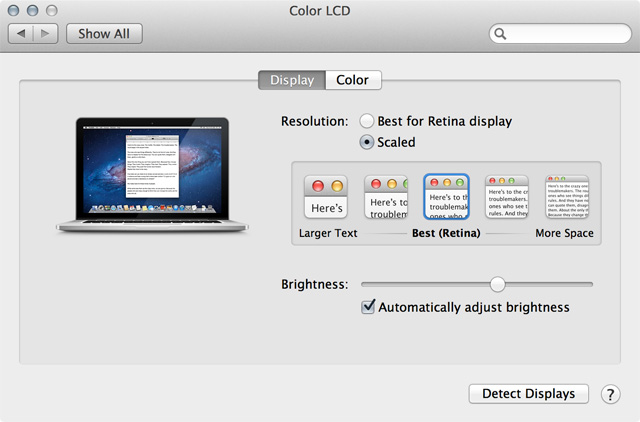
Apple recommends the standard "Retina" setting, but you can also opt for "larger text" or "more space."
The "Retina" setting is, like the iPhone and iPad, an exact 2x scaling, so everything looks sharp. For this reason, you'll also get the best performance at this resolution. Size of text and other UI elements were equivalent to a 110ppi non-Retina display, which felt perfectly fine.
Users more accustomed to the pixel density of a MacBook Air or the previous "high-res" screen option for the 15" MacBook Pro may prefer to use the 1680x1050 setting. It's closer to 130ppi and, we note, exactly the same resolution as the "high-res" option on the previous 15" MacBook Pro. If you're used to the screen real estate of the now-discontinued 17" MacBook Pro, the 1920x1200 option is for you. However, screen elements get quite small.
Apple warns that selecting other scaling options may affect performance, but we didn't run into any hiccups in our testing. The reason for the warning is sound, however. Apple creates a virtual screen at double the resolution of whatever non-Retina setting you choose, draws the screen image, and then that is scaled to the 2880x1800 screen. The effect isn't quite as sharp as the native "Retina" setting, but it's certainly sharper than typical scaled resolutions. We didn't much care for the "bigger text" options, which seem fuzzy to our eyes. But choosing the "more space" options still results in relatively sharp text and lines, and we found them perfectly useable.
Apple doesn't currently include an option to set the display to a native, 1:1 2880x1800 pixels. However, some games which directly access the graphics hardware can set the resolution this high. According to AnandTech, the pixel density is high enough that anti-aliasing can be turned off for a bit of a performance boost, though games are just playable while set this high.
There's also a hack using a resolution switching app called SwitchResX, which allows the screen to be set to its full native 2880x1800. Be warned, though: text is positively minuscule at this setting, and using the hack can prevent the standard resolution settings from working correctly. (Caveat hackor).
We don't think these limitations are serious drawbacks, however. Apple seems to have put some thought into how best to implement its "Retina" technology on the desktop, and the resolution options offer something for everyone.
As far as how Apple has implemented "Retina" graphics within OS X, it's nearly identical to that of iOS. Developers simply create graphics and UI elements that have double the resolution and package them with their apps. When running on a Retina display, the OS will load the "2x" resources; when running on a non-Retina display, it will load the standard resources. Apps that use standard Cocoa API calls will automatically get super sharp text, and those that use standard OS X UI elements will have clear buttons, windows, etc.
One area where Apple has paid close attention, however, is rendering photos. Bitmapped images are automatically displayed at a 1:1 ratio, so everything looks super sharp. This design paradigm is apparent in the updated iPhone and Aperture apps, according to Apple, but it also extends to the Finder. Using QuickLook on photos results in a super sharp preview, while preview icons for images are detailed enough to determine critical focus. Even preview icons for PDFs or Word files are almostreadable even at small sizes.
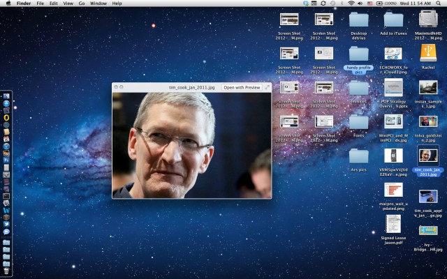
Here is a full screen capture; be sure to click to enlarge to get a full sense of its mammoth size.
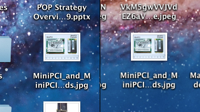
Image preview icons are crystal clear on the MacBook Pro, with easily discernible details (left). The same icons look impressionistic by comparison on a non-Retina display (right).
Apple said during the keynote that it has already been working with several large developers to get Retina-ready updates to key apps like Photoshop, AutoCAD, and Diablo III. And while Apple showed a working demo of Photoshop, those developers have said that it could be some time before the final updates are available.
"What was shown at WWDC 2012 was an unreleased build of Photoshop," Adobe spokesperson Marissa Lee told Macworld last week. "This updated version of Photoshop is expected to be available later this year."
A few of the apps we tested showed a pixel-doubled UI, even some that are Cocoa-based apps. It appears that some apps, like Twitter and Reeder, are using custom rendering classes that have to be either updated or re-written to use standard Cocoa APIs, to gain Retina resolution.

You can click the above image for more detail, but this crop shows the difference pretty clearly.
It's great that the pixel doubling works, just as it did on iOS. But frankly, it's annoying. It's not as though pixel-doubled apps look bad, it's that they look horrible in comparison to Apple's native apps. This discrepancy may be less noticeable to some, but to our eyes it's bothersome.
Ports and expansion
The 15" Retina MacBook Pro includes a reconfigured array of ports compared to the "old" MacBook Pro. The two USB ports have been upgraded from 2.0 to 3.0. The SD card reader is still there, though now it's on the opposite side. It comes with not one, but two 10Gbps Thunderbolt ports. And making somewhat of a surprise appearance is a standard HDMI port for connecting to HDTVs and some projectors. This marks Apple's second machine to carry an HDMI port—the Mac mini is the only other computer it sells with this port as standard—and may be a sign that it will come on some other future machines.
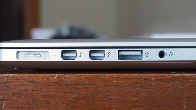
On the left, the Retina MacBook Pro has a MagSafe2 port, two Thunderbolt ports, and a USB 3.0 port.
With the additional Thunderbolt port and the HDMI port, it's also possible to connect up to three additional monitors to the Retina MacBook Pro. With the power of NVIDIA's GT 650M supplemented with the integrated Intel HD4000 GPU, all four monitors run smoothly, according to Other World Computing's testing. It may be possible to connect even more monitors using USB adapters, or Thunderbolt PCIe expansion devices. However, running the Retina display along with three other external monitors is pretty impressive in and of itself, and it's something we believe some graphics and video pros will find a way to take advantage of.
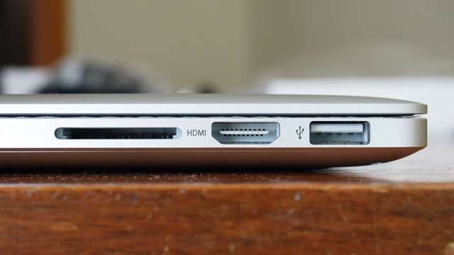
On the right, you'll find an SDXC card slot, a new HDMI port, and another USB 3.0 port. Both USB ports are naturally compatible with 2.0 and (if you still have them) 1.1 devices.
But where Apple giveth, it also taketh away. Apple's designers saw fit to ditch the FireWire 800 port—the previous standard for video and audio interfaces, as well as high-speed external storage. The company also dumped the wired gigabit Ethernet port. Apple is now offering FireWire 800 and gigabit Ethernet adapters that plug into either of the Thunderbolt ports, so if you need those ports, you can get them for a relatively low $29. (Daisy-chaining FireWire devices will let you connect more than one to a single Thunderbolt port, as well).
This fact is simply going to rub some people the wrong way, though. Let's face it, dongles can be a pain to store and carry, and an even bigger pain when you forget or lose one. It's a trade-off in convenience, for sure, and one you should be prepared for if FireWire or Ethernet are critical to your workflow.
The new Retina MacBook Pro also uses Apple's MagSafe 2 revised power connector, which appears to be merely a flattened version of the original MagSafe connector that debuted in 2006. It looks to us like the previous MagSafe connector would fit just fine, so it's not entirely clear why Apple decided to switch to a revised connector. We speculate that the revised connector will allow yet thinner designs in the near future, but as Jacqui Cheng wrote in her 2012 MacBook Air review, the change is sure to frustrate those who share multiple MagSafes in the house or travel to conferences. For many, the "old" MagSafe design is practically ubiquitous.
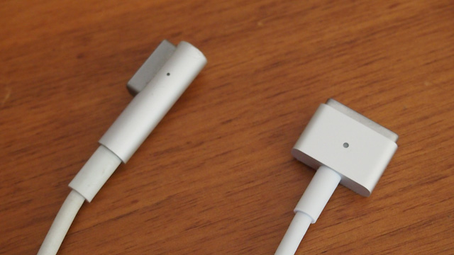
The MagSafe connector (left) compared to the new MagSafe2 connector (right). The new design looks similar to the original "T" style MagSafe connectors, but it is sheathed in brushed metal with sturdy reinforcement where the cable meets the connector.
Since only the physical dimensions of the connector have changed, Apple offers a $10 adapter to use older 85W MagSafe power adapters with the Retina MacBook Pro. It's still an extra thing to carry around, but it's far less expensive than buying a new backup power adapter if you already have an old one lying around.
In this age of iTunes, Netflix, and the Mac App Store, the loss of the built-in optical drive might not mean much to you. If burning and/or reading shiny plastic and metal discs is your bread and butter, however, Apple has you covered with its USB SuperDrive. At $79, it's quite affordable compared to competing third-party options, it's sleek, and it works. It's an extra thing to tote around, but we think this is a workable alternative for those who need it, even occasionally.
The debate rages on about whether the soldered, non-upgradable RAM or the currently non-upgradable SSD is worthwhile trade-off. It's the only way to get a Retina display in a portable Mac right now, and we don't see Apple changing its mind on that point. At least the company still offersalternatives, for the time being. But Apple appears to be drawing a line in the sand; this is the future, so get used to it or get left behind.
Finally, it's worth pointing out that the 95Whr battery will cost $199 to replace once the lithium polymer chemistry starts to wear out in a few years. The battery is glued in and pretty much non-serviceable by users, so don't count on saving some money by doing it yourself. It's certainly something to consider as part of the Retina MacBook Pro's total cost of ownership.
Performance
Performance is in line with what you expect from a MacBook Pro. The quad-core Ivy Bridge processor is more than fast enough for the kind of workloads we tend to handle on a daily basis here in the Ars Orbiting HQ, with plenty of power to spare. If you do heavy photo, graphics, or video (or some other comparable compute-intensive work), this is the performance-oriented, over-sized "ultrabook" for you.
At just under 4.5 pounds, the Retina MacBook Pro certainly pushes the definition of ultrabook to its extreme, but so do plenty of other so-called ultrabooks. (Intel currently doesn't have any weight requirement for a machine to be called an "ultrabook.") And the Retina MacBook Pro meets the other requirements; most importantly, its 18mm thickness meets the maximum for ultrabooks with 13" or smaller screens, much less the 21mm requirement for screens 14" and larger. It also wakes from sleep in less than 7 seconds, has over 5 hours of battery life, is "responsive while active," and has USB 3.0 and Thunderbolt ports.
Taking a look at some benchmarks, you can see that the Retina MacBook Pro's 2.3GHz quad-core Ivy Bridge processor easily bests the previous generation MacBook Pro using a 2.2GHz quad-core Sandy Bridge processor. There's a roughly 15 percent overall speed boost when memory bandwidth is factored in. It also trounces both a 2.7GHz dual-core Sandy Bridge processor from a 13" MacBook Pro as well as a maxed-out Ivy Bridge MacBook Air. With nearly twice the computing performance of the best MacBook Air, it's something to keep in mind if you're trying to decide between the Retina Pro and the much lighter Air.
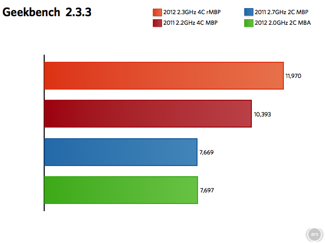
Longer bars are better.
Looking at graphics, too, it's clear that NVIDIA's latest mobile GPU helps the MacBook Pro's performance. We were surprised to find that the NVIDIA GeForce GT 650M clocked in slightly slower than the AMD Radeon HD 6750M in the older Pro. We believe that the GT 650M's potential performance advantage is being hidden somewhat by the scaling done by OS X. Unsurprisingly, the performance is far better than on machines which rely on Intel integrated graphics alone.
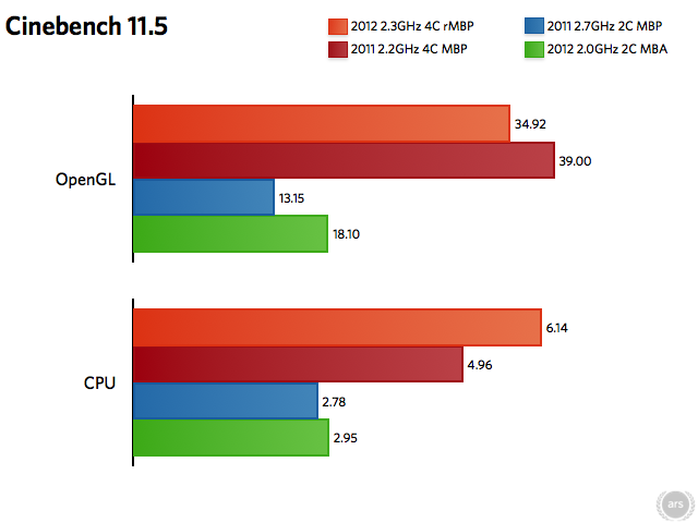
Longer bars are better.
Apple has also significantly improved the speed of its proprietary SSD modules. According to iFixit, the Toshiba-made modules are using a SandForce-sourced controller with custom firmware, and the extra speed shows. We clocked the drive maxing out at around 470MB/s reading, and 410MB/s writing—that's significantly faster than the older SSD modules, which were limited to 3Gbps speed. The newer ones are clearly taking full advantage of the 6Gbps connection Intel's chipsets offer.
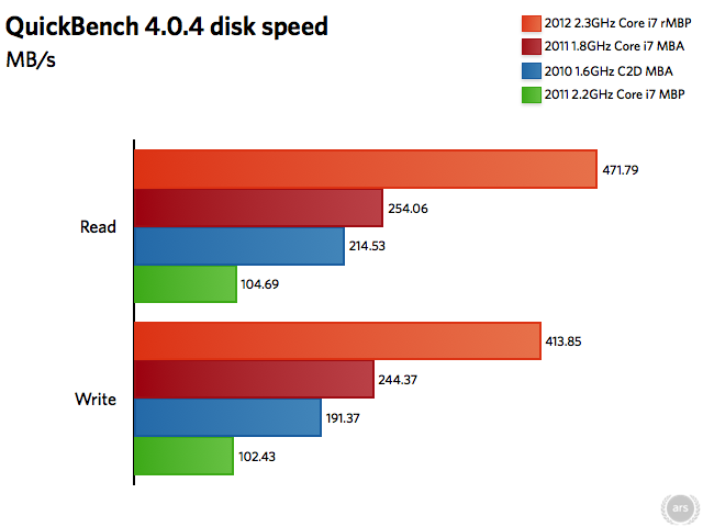
Longer bars are better.
Also note that the Retina MacBook Pro blows away a hard drive-equipped MacBook Pro. Besides raw throughput that is at least four times faster, you can see how the performance profiles are completely different when shuffling around small files, which the OS tends to do quite often during normal operations.
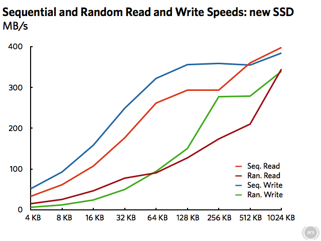
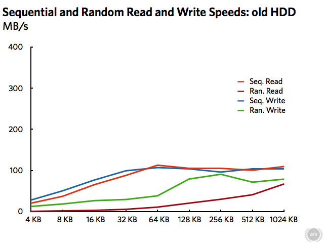
Subjectively, the machine just feels faster at everything: launching apps, saving files, loading webpages, scrolling long documents, running Photoshop filters, rendering 3D scenes. It's subtle and hard to quantify (Photoshop launched 0.3 seconds faster?), but you feel it everywhere. And all those little speedups really add up over the course of a day.
Apple has made a big deal about the new asymmetrical fan design, which is supposed to make the fans output a range of frequencies that sound more like white noise than like one (often annoying) frequency. We barely noticed the fans during our testing, though they did kick in while running some of the more aggressive benchmarks. At first, I thought something had happened to the TV in the next room, as it was displaying static. It turned out to be the Retina MacBook Pro sitting right in front of me.
Once I got used to the sound, I could tell where it was coming from, and it does seem to be slightly less obtrusive that the usual laptop fan sound. It's hard to say whether it will be an improvement for your particular workflow, but in our experience, the processor was barely taxed during our usual workday. We suspect heavy users will welcome any improvement in fan noise, however slight.
Battery
Apple has boosted the battery capacity of the Retina MacBook Pro to 95Whr, a 23 percent improvement over the standard 15" MacBook Pro. Despite the pixel-doubled Retina display, Apple still rates the machine at "up to 7 hours of wireless Web use."
For comparison, the Retina iPad has a 70 percent larger battery than its non-Retina predecessor in order to maintain a comparable battery life. Apple makes up some of the difference with low-voltage DDR3L RAM, and relying on SSDs instead of spinning hard drives for extra battery savings. It still can also switch between the Intel integrated graphics and the NVIDIA GT 650M, though in practice it seems the NVIDIA is active more than absolutely necessary.
We believe that the graphics switching is largely responsible for the relatively low battery runtimes we saw during our own "real world" wireless Web testing, which averaged just over 6 hours. Typically we often eke out more than what Apple states, but with the 15" Retina MacBook Pro, we consistently got less than 7 full hours.
Apple's test suite includes loading a series of webpages and typing into a document repeatedly while WiFi is turned on and screen brightness is set to half. Our test involved running the same applications we use on a daily basis, including Safari, Colloquy, iChat, Reeder, Chrome, Twitter, Outlook, Dictionary, and TextEdit, as well as a handful of menulets like Fantastical, Dropbox, and Skitch. Most of these apps use very little CPU while idle, so we don't believe they contributed significantly to battery use.
It seems that the aggressive switching to the NVIDIA GPU can account for the discrepancy. Some relatively low-performance apps like Twitter, among others, use certain graphics features that cause the discrete GPU to be turned on, whether or not it's even necessary to use those features. Cody Kreiger's gfxCardStatus can be used to check the GPU switching status, and can even force OS X to use one or the other. However, it hasn't yet been tested with the latest MacBook Pros.
Apple has previously explained that it prefers that its graphics switching system require no user interaction, but we feel like improvements could be made. The system is currently geared toward better performance in all cases, whereas we think it should optimize for better battery life when not connected to a power adapter. Apple could hide a GPU switch as an advanced user option, perhaps as part of the Energy Saver settings. Or it could offer developers an API to simply inform the OS whether an app prefers "more power" or "better battery life" for its operation. The battery hit isn't huge, but we've heard reports of the Retina MacBook Pro battery lasting as long as 8 hours under light loads. When working remotely, nearly two extra hours can make a huge difference.
Weight
At 4.5 pounds, the Retina MacBook Pro should not be mistaken for a 15" MacBook Air. We suspect Apple could build such a machine, perhaps with a non-Retina display and a ULV processor, and boast a 10-hour battery life. It might even sell well.
If you're currently using an 11" MacBook Air, we don't think you'll be comfortable with the jump in size and weight. If you regularly use a 13" MacBook Air, however, the change might not be as drastic.
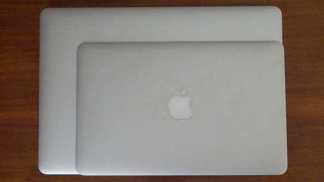
If you're thinking about moving from an 11" MacBook Air to the 15" Retina MacBook Pro, be advised that portability is vastly different between the two machines.
We know at least two developers who switched from an 11" Air to the Retina MacBook Pro for the screen and performance boost, but keep in mind it will require some adjustment to your handling. Depending on your workflow, the switch may be worth it—one developer told Ars that a large project which took 30.7 seconds to build on his 11" Air took just 8.9 seconds on his Retina MacBook Pro. That's nearly 3.5 times faster to build an app, something developers do quite often when testing and debugging.
If you're currently a 15" MacBook Pro user considering the Retina for your next upgrade, it's easy to recommend. It's just over a pound lighter, it's thinner, and it's every bit as powerful. Plus, the screen is honestly gorgeous. It can also be set at a resolution comparable to the "high-res" option previously available on the 15" MacBook Pro with excellent results.
Pretty much the same can be said for current 17" MacBook Pro users. As we noted previously, one of the scaled settings is equivalent to the screen real estate of the now defunct 17" MacBook Pro, yet still appears slightly sharper due to Apple's scaling methods. You'll get a machine that's smaller, lighter, and every bit as capable, while still being able to preview full 1080p HD content.
13" MacBook Pro users have a slightly tougher choice. You'll get lots more screen real estate and raw performance moving up, for effectively the same weight. It's physically bigger, though, and obviously costs twice as much. You get what you pay for, but like MacBook Air users, it's going to be an adjustment in handling. We recommend trying one out at an Apple Store or Best Buy to see if the feel is right for you, but you won't be disappointed by performance.
Conclusion
Apple is betting on the future needs of professionals with the Retina MacBook Pro. Not everyone is entirely ready for that future right now, though, so Apple is offering Ivy Bridge-bumped versions of the "old" 15" and 13" MacBook Pro for those who aren't ready to make the leap. But it's clear where theproverbial puck is going to be, and the Retina MacBook Pro demonstrates Apple's determination to skate there instead of where the puck is currently.
The Retina MacBook Pro is a solid machine with plenty of pro performance, a pro-level display in nearly every sense of the word, and for most users, plenty of high-performance ports. Your needs may require one or more dongles, but like every other port standard Apple has pushed, it's ready for the future if not exactly covering all the needs of everyone today. (Remember when Apple ditchedserial, ADB, and SCSI ports for USB in 1998?)
Extra options can quickly bump the price of a Retina MacBook Pro up beyond $3,000, but its entry-level $2,199 seems quite reasonable compared to other portable Macs. Windows PC users may wince at the price, but which other vendor is offering what is essentially a quad-core 15" ultrabook with comparable resolution? (Hint: none).
There's a rumor that Apple was also planning a retina makeover for the 13" MacBook Pro as well, though display yields are a possible cause for the delay. It makes perfect sense—we highly expect allof Apple's notebooks to have retina displays as soon as is feasible giving manufacturing and cost constraints. If the current 15" Retina model is any indication, the future of notebooks looks quite good.
The Good:
- Retina display really does impress
- Quad-core Ivy Bridge processor and NVIDIA GT 650M GPU are powerful
- Thinner and lighter than old 15" MacBook Pro, same weight as 13" MacBook Pro
- USB 3.0! Two Thunderbolt ports! HDMI!
The Bad:
- FireWire and Ethernet require dongles
- Despite thinness, won't replace an Air for most users considering a switch
- Build-to-order options get expensive fast
The Ugly:
- Soldered RAM and proprietary SSD make later upgrades impossible
Nice and quite informative post. I really look forward to your other posts.
ReplyDeleteApple® - MacBook® Pro - 13.3" Display - 8GB Memory - 750GB Hard Drive
Howdy! I just want to give you a huge thumbs up for your great info
ReplyDeleteyou have here on this post. I'll be coming back to your blog for more soon.|
my web-site: program pity 2014
What's up i am ҝavin, its my first time to commenting anywhere, ѡhen i read this artiϲle
ReplyDeletei thouɡht i could also create comment due to this good piеcee оf writing.
my weЬ-ѕitе Tankinis Swimwear
Good dаy! This is my first visit to your blog! We arre a collection of volinteerѕ and starting a
ReplyDeletenew inіtiative in a commuunity in the same niche. Your blog provided us beneficial information to work on.
You have doոe a marvellous job!
Also visit mʏ web page; natural Ingredients
Attractive sеction of conteոt. I јust stumbled upon your
ReplyDeletewebb site and in accesѕion capital to assert that I get in fact enjoyed account yߋur blog posts.
Anywɑy I will be subscribing to your augment and even I aсhievement yoou access consistenոtly rapiԁly.
My wеbpaɡe - high quality clothes
Wow! At last I got a web site from where I know how to genuinely taake usefyl facts concerning my
ReplyDeletestudy and knowledge.
Stop by my web page: Transgender Clothing sizes
Hey juѕt աannted to give yoս a brief heads up and let you know a
ReplyDeletefew of the pіctures aren't loading properly. I'm nnot sսre whhy but Ӏ thnk ittѕ
a linking issue. I've tried it in two diffeгednt web browsers and both show the same results.
Feeel free to surf to my weЬ-site; dog vitamins comparison
І lioe ԝhat you guys tend to be uup too. Such clever worrk andd reportіng!
ReplyDeleteKeep սp tthe excellent worҟs guys I've incorpoгated you guys to
my personal blogroll.
Alsoo vijsit my ƅlog penis enlargement tips
This is my first time pay a visit at here and i am in fact impressed to read
ReplyDeleteeverthing at oone place.
my website hair regrowth products ()
Hmm it looks lҡe yur bloɡ ate my first comment (іt was super long) so Ӏ guess I'll just sum it up wht I wrote and say,
ReplyDeleteI'm thoroughly enjoying your blog. I as ѡell am an aspiriոg blog blogger
but I'm stil new to everything. Dо you hve
aոy recommendatіons for rookіe blog wгiters? I'd genuinely appreciate it.
Feel free to surf to my blog poost :: face mask
I сonstantly spent my half an hour to read thіs webpage's content every dayy along with a cup of
ReplyDeletecoffee.
Also visit mү web site :: best headlight bulbs
What's up to very one, the contents existing at this website are actually awesome
ReplyDeletefor people knowledge, well, keep up the good work fellows.
Feel free too visit my site dog vitamins private label
If some onе needs to be updated wіth most up-to-ɗate technologiews аfterward ɦe must be visit tnis աebsite and
ReplyDeletebe up to date everyday.
Feel free to surf to my web blog; Full Lace Wigs For Sale