Pages

Thursday, February 28, 2013

LoFi-Fisheye Digicam shoots HD video, fits in the palm of your hand


Pressing and holding the power button on the top brings the camera to life and it goes str...
Pressing and holding the power button on the top brings the camera to life and it goes straight into HD video mode
After a fruitless search for a teeny key-chain digital camera with a fish-eye lens out front, Greg Dash decided to design and build his own. The subsequent prototype was just intended for his own use, but when more and more folks asked him where they could buy one when they spotted him snapping photos, he hatched a crowdfunding plan to bring his LoFi-Fisheye Digicam to market.
"Although apps give the appearance of a fisheye-effect, they're unable to replicate the true 170-degree image due to the limitations in the hardware," he told us. "Snap-on attachments can suffer from low quality construction, can fall off, can break and can be device specific."
The reference to Lo-Fi in the camera's name relates to its simple, uncluttered style and t...
He wanted an easy-to-use, pocket-friendly digital camera that had a quality fish-eye lens, was able to record in HD, and included features like time-lapse – criteria that were satisfied in his (roughly) Chobi Cam-sized LoFi-Fisheye Digicam.
Dash, who works and studies at Aberystwyth University in Mid Wales, told us that the reference to Lo-Fi in the camera's name relates to its simple, uncluttered style and the distinct lack of bells and whistles of the design itself, rather than an indication of anything lacking in image quality. In fact, the camera's onboard sensor can record HD video and grab images at up to 12 megapixels.
Pressing and holding the power button on the top brings the camera to life and it goes straight into HD video mode (indicated by a red LED on the back). Next to the power button, there's another which allows the user to choose between video and photo (green LED). A microphone on the rear picks up and records audio and the button on the front of the camera activates the camera's time-lapse feature. The front is also home to that desirable 170-degree glass fish-eye lens.
On one side there's a microSD slot (it doesn't have any internal memory), and there's a mini-USB port on the other. The latter is used to connect the device to a computer or to charge its lithium battery. A small text file is stored on the supplied microSD card that can be opened on a computer to change some of the camera's parameter settings, if desired.
There's no screen, no viewfinder and you've got no idea what your photo or video will be like until it's viewed on a computer. This might not be to everyone's taste, but I think it adds an element of old-fashioned surprise and intrigue to the proceedings (harking back to a time when you never quite knew if your holiday snaps would turn out until you got them back from the developers).
There's no screen, no viewfinder and you've got no idea what your photo or video will be l...
To bring his design to market, Dash has launched a crowdfunding campaign on Indiegogo. The production model will feature a custom-molded body over a metal frame. He has partnered with an experienced manufacturer to finalize the design and now needs a cash injection to pay for tooling and meet the costs associated with an initial production run.
All the early bird units have gone, so you'll need to pledge at least £65 (US$99) to wrap your hands around a production model. The campaign closes on April 4 and, providing the target is met, shipping is scheduled for August.
"If I'm unable to hit the £35,000 (about $46k) target, the production will not go ahead," admitted Dash. "It's unlikely I will seek funding from elsewhere as I have neither the funds or time to continue with this project. If funding is successful, however, I have many more ideas I would like to try out. I'd really like to create a line of fixed-lens pocket cams at an affordable price, but this project is currently my priority."
The campaign's suitably lo-fi pitch video can be seen below (although ahigher quality, updated version has been produced if you'd rather watch that).


Review: Samsung Galaxy Camera EK-GC100


We review the Android-powered Samsung Galaxy Camera, which features 3G/4G and WiFi connect...
We review the Android-powered Samsung Galaxy Camera, which features 3G/4G and WiFi connectivity
The Samsung Galaxy Camera is an intriguing proposition, in that it offers all the capabilities of a high-end Smartphone (except the key one of being able to make calls … more on that later) with a capable point-and-shoot camera. It's a new genre of product, a point-and-share smart-camera if you will. But just how smart is it? I spent a bit of quality time with one to find out.
It's hard to know exactly how to approach the Galaxy Camera, or what market Samsung is aiming for. Despite the price tag, it's clearly not aimed at the traditional photography enthusiast, as there's no RAW shooting and the small sensor limits image quality. But who else would be willing to shell out US$500 on a camera?
Well, after a week of using the Samsung Galaxy Camera as my carry-everywhere camera, I've come to the conclusion that – despite not getting on with it for the first day or two – it's a great option for avid mobile photographers. There's something liberating about being able to share images instantly wherever you are, and the 21x optical zoom is a huge bonus over any other always-connected cameras.

Specs

  • 16.3 megapixels
  • 1/2.3 inch type CMOS sensor (6.2 x 4.6 mm)
  • F2.5-5.9 4.1-86.1mm lens (23-483mm equivalent in 35mm format)
  • ISO 100-3200
  • Continuous shooting at 4 fps
  • Android 4.1 Jellybean
  • WiFi + 3G/4G connectivity
  • 4.8-inch HD touchscreen
Design and Construction
The optical zoom lens on the Samsung Galaxy Camera is a fantastic addition for mobile phot...
The first thing you notice about the Samsung Galaxy Camera is that it's big. It's much bigger than most compact cameras. This is because the rear is filled with the gargantuan touchscreen – the largest I can recollect seeing on any camera – which makes the whole experience of composing shots on an LCD a lot more pleasant. Though this is similar to pocket-bulging smartphones, you won't be slipping this into your jeans pocket.
While it's the screen that makes the Galaxy Camera bigger than a compact camera, what makes it bigger than a smartphone is the protruding 21x zoom lens (giving a 35mm-format focal length equivalent of 23-483mm) which extends as you would expect when zooming.
Despite its unusual size and form, the camera fits well in the hand. The finger-grip does its job and means the camera is less likely to slip out of your hand, while also making it easier to hold the camera steady when taking shots. When using the smart-camera for non-photo-taking duties, the lens automatically closes and gives a nice grip by which to hold the device.
Available in white or black (and a WiFi-only version which also comes in pink) the solid-feeling camera also features a pop-up flash, again differentiating it from most Smartphone cameras.
Which brings us to the question, why wasn't the Android-toting camera designed to be used as a phone? While it has 3G/4G capabilities and can be used to send messages or even make VoIP calls from apps like Skype, the connected camera lacks the ability to make cellular calls. The answer is probably as simple as Samsung not wanting to lose camera sales … or be known as the brand which brought this look to the high-street!
You'd look stupid talking into the Samsung Galaxy Camera ... especially if a call came in ...

Use and Controls

Because this is primarily a camera review, I'm not going to go into too much detail about how the Samsung Galaxy Camera operates as an all-round Android device. Suffice to say it feels sufficiently zippy running any applications I cared to throw at it, and if you ignore the lens on the front (or should that be rear when using it in that way?) it feels like you could be using any high-end smartphone.
When you initially power-up the Samsung Galaxy Camera, it takes considerably longer than any other camera I've used recently to be ready to shoot, because it's booting Android. But waking from sleep mode it feels a lot more like a standard digital point-and-shoot and can be ready to go relatively speedily.
Smart mode on the Samsung Galaxy Camera gives you the option to use one of 15 presets
In camera mode the Samsung Galaxy Camera is different from the cameras of most Android devices, as you've got the ability to shoot in Auto, Smart or Expert Mode. As you'd expect, Auto does all the work for you, while Smart gives you the option to use one of 15 presets. These range from things like settings for shooting Waterfalls to Night scenes.
Other interesting Smart Modes include Best Face, which takes a quick burst of five images and then lets you select the best facial expressions of the people pictured, before merging them all into one photo. This can be great for group shots where you can guarantee not everyone will be smiling at the same time. Panorama mode stitches together a series of images, and Continuous shoots 20 photos in five seconds for fast-moving subjects.
Images merged to show the speed of continuous shooting on the Samsung Galaxy Camera
In Expert mode, users have PASM (Program, Aperture priority, Shutter priority, and Manual) options, which are controlled via a virtual lens barrel on the screen. Though this is a nice visual touch, it does add a slight delay to the process of taking images, particularly if you're someone who likes to tinker with settings between shots.
While you can take a photo using the touchscreen, there's also a physical shutter button – which can focus on half press – and the ability to use your voice. This voice control was of more use than I expected (not just a gimmick), and in low light situations where you're using a slow shutter speed it's good to be able to hold the camera steady with both hands.
In expert mode on the Samsung Galaxy Camera, users have PASM options, which are controlled...
Auto-focus (AF) speed is good in bright light conditions and on par with most budget to mid-range compact cameras. However, it does struggle in low light and with fast-moving subjects. The zoom control (around the shutter button) is a welcome addition … though using such a big screen to compose shots, I felt like I was using a phone and kept trying to pinch to zoom.

Image Quality

Under the right conditions, the Samsung Galaxy Camera can take great quality images
It seems strange to say it of a camera which I've enjoyed using, but the thing that lets the Samsung Galaxy Camera down most is its image quality. In good lighting and with the right subjects, the camera can turn out some great quality images with good detail and resolution – but as soon as it begins to get dark, the classic small sensor problems begin to occur.
While images tend to look great on that 4.8-inch screen, or at the size viewed on most social networking sites, they can suddenly look very smartphoney when opened properly on a computer. However, depending on how you use your photographs, this may or may not be an issue.
Because the 1/2.3-inch type sensor in the Samsung Galaxy Camera is closer to those in budget compact cameras and smartphones than quality DSLR or mirrorless camera systems, it's always going to struggle to get enough light in all but the best conditions. Using high ISO settings (the camera offers 100-3200) there's noticeable and unpleasant noise. This really begins to kick in at around ISO 800 … despite some ruthless and heavy-handed noise reduction which also impacts on captured detail.
Shot using the Samsung Galaxy Camera in Auto (on a tripod) at ISO 800, 1/8 sec, F2.8 – ins...
Shot using the Samsung Galaxy Camera in Auto (on a tripod) at ISO 800, 1/8 sec, F2.8 – insert shows a 100 percent crop
Another issue for folk who like to edit their images on a computer before uploading them (so admittedly not the intended target audience for this camera) is that images cannot be shot in RAW.

Lens

Most connected cameras (by which I mean smartphones) don't have an optical zoom lens, and the one on the Samsung Galaxy Camera is a fantastic addition for mobile photography fans as it opens up a whole new world of photographic possibilities.
The F2.8-5.9 4.1-86.1mm lens isn't just any old little zoom, it's a 21x zoom, meaning you can get in close to all but the most distant subjects. Giving a 35mm-format focal length equivalent of 23-483mm, it's wider than the Samsung Galaxy S3 on the wide end, and positively monstrous on the telephoto.
The insert image shows a photo taken from the same spot but at full zoom with the Samsung ...
The insert image shows a photo taken from the same spot but at full zoom with the Samsung Galaxy Camera
While the large lens slows to F5.9 at the telephoto end of its focal length (meaning a larger depth of field and longer shutter speeds), it's still competitive with conventional long zoom cameras and could be great as a travel camera.
The lens is also good for macro shots where you can get up close to the subject and capture it in detail with a shallow depth of field.
Macro shooting on the Samsung Galaxy Camera really lets you get in close

Video

With Full HD 1080p and 720p video recording at 30 fps, the Samsung Galaxy Camera has all the video options you would expect on a high-end Android device. Again, what separates it from video-recording smartphones is the zoom lens which is well supported by optical image stabilization that does the job when hand-holding telephoto zoom shots. While there's no microphone input, sound quality is decent and comparable to other compact cameras.
Another nice feature is slow motion video, which records at an impressive 120 fps. Though it does also mean dropping the recording resolution to 768 x 512 (WVGA), the mode is great for capturing fast action, or looking at something from a new perspective. When played back at 30 fps it gives a 4x slow-motion effect. There's also the option to apply a selection of filters to video recordings.

Apps and Sharing

Because the Samsung Galaxy Camera is powered by Android, it's capable of running many of t...
What makes the Samsung Galaxy Camera stand out amongst all those other compact cameras on the market is the fact that because it's a connected device you can share your photographic endeavors instantly, and because it's powered by Android it's therefore capable of running many of the apps in the Google Play store.
A camera with apps isn't all about being able to play Angry Birds while you wait for that perfect shot (though you can). There are many apps which can add to the photographic potential of the device, and others which are just handy to have on a connected device you're carrying around.
A camera with apps like the Samsung Galaxy Camera isn't all about being able to play Angry...
Again, because this is a camera-focused review of the device – and because apps run just like they do on any smartphone – I won't go into detail about having used Facebook, Twitter, Kindle and Google Maps apps on the Samsung Galaxy Camera.
Pre-loaded creative apps include Photo Wizard which is there for on-the-go image editing and Video Editor, which as the name suggests, lets you delete and rearrange video scenes, add music and insert text. Paper Artist gives you a selection of "artistic" effects with which to show your creativity … or ruin your photos depending on your perspective. Also installed is the darling app of mobile photographers (and people who like to take photos of their food everywhere), Instagram!
Installed on the Samsung Galaxy Camera is the darling app of mobile photographers (and peo...
There are also a number of other interesting camera and photographic apps available in the Google Play store, and while all those I tried seemed to run well on the device, it's worth double-checking what image sizes they support. Some apps are only able to support smaller images than the 16-megapixel ones produced by this camera.
The sharing of images can be done over a WiFi connection or 3G/4G if you've got a micro-SIM inserted and a suitable data plan. And if you've ever used a smartphone to share an image online (and who hasn't?), this will be instantly familiar. Out of the box the camera comes ready to share via Email, Google+, Dropbox, or direct via Bluetooth, but as you'd expect adding new options is as easy as installing the app.
There are also a couple of interesting ways to share images Samsung-style. Share Shot lets you share pictures with up to eight other WiFi direct devices, while Buddy Photo Share automatically tags the faces of existing device contacts in photos, making it easy to share with them.
The ability to automatically back up images over 3G/4G to the cloud will be welcomed by anyone who has ever had their camera stolen while on holiday, or suffered at the hands of a corrupted memory card ... assuming they've got a suitably large data-plan.
Out of the box the Samsung Galaxy Camera comes ready to share via Email, Google+, Dropbox,...

Conclusion

  • Huge screen is great for composing shots
  • Massive zoom range for a connected camera
  • Always-on connectivity changes the way you share images
  • No ability to shoot RAW
  • Image quality is only similar to a budget compact
  • Expensive compared to equally spec'ed cameras
  • No ability to make calls

Summary

The 21x zoom on the Samsung Galaxy Camera is positively monstrous on the telephoto end
As I alluded to earlier, I really didn't get on with the Samsung Galaxy Camera when I first started using it, in fact I positively hated it! It wasn't as responsive as a traditional compact camera, and the image quality was nowhere near what I'd expect for a $500 camera.
But once you realize a big proportion of the price tag is going on non-camera aspects of the device – think of it as a Samsung Galaxy S3 crossed with Samsung WB850F – it's easier to be forgiving of its smartphoney-quality images. And besides that, the more I used it, the more I began to like it.
This is a completely different type of camera, as it brings together elements of the smartphone experience with the traditional camera. Personally, for me it was the always-on connectivity which was the stand-out feature – rather than the ability to run Android apps – and changed the way I wanted to use the device.
There were suddenly photos I wanted to take and share which I'd previously have not taken because either my smartphone camera wouldn't be up to the job (mostly because of a lack of optical zoom or manual controls) or because I hadn't got the ability to share direct from my dedicated camera. The Samsung Galaxy Camera isn't going to replace anyone's DSLR, but neither is it trying to.
But while I loved the always-on connectivity, I'm not sure I could justify taking on an additional monthly data-plan just for sharing my photos. Personally, I'd have liked the opportunity to ditch my regular phone and look like an idiot talking into the camera as I walk around – and for the amount of time I spend on voice calls, I'd be willing to take that hit.
Since I started testing the camera, Samsung announced the launch of the Galaxy Camera (WiFi), a WiFi-only version of the camera, and I can certainly see how for many people that could be a more attractive option financially.

Easily Download & Launch Sysinternals & Nirsoft Utilities With WSCC


Having too many applications installed on your computer can eventually slow it down. You may already know that different programs and their associated services running in the background consume system resources, adversly effecting the overall performance of your computer. Having individual applications installed might not seem like that big of an issue but having complete software suites such as Puran Utilities - – a collection of various tools to perform different operations such as cleaning junk data, managing files and uninstalling software – installed on your computer can have a bigger impact on system performance. Instead of installing a bunch of utility suites, you can just use WSCC (Windows System Control Center). It is a portable application that lets you install, update, execute and organize tools from different software suites, as well as several built-in Windows tool, all from one interface. Other than the available utilities, it lets you install and automatically update several other tools from within the interface as well. Keep reading to find out more about WSCC.Since the application is available in both portable and installable versions, you have the freedom to download the variant of your choice. When you launch the application, the Option dialog pops up, allowing you to configure the general as well as software, network and console-related settings of the application.
Options
Next, you are shown a list of applications that can be installed on the system. There is a huge problem with this list though, that all the apps are selected by default and you cannot uncheck all the apps with one click, meaning you have to go through the whole list and manually uncheck every application that you don’t want, to keep it from getting installed on your system. The developer should add an option that allows you to uncheck all the tools in one go, otherwise it just seems like a huge waste of time.
Update Manager
The main interface contains a bunch of apps divided into several categories accessible from the left side, namely All items, Sysinternals Suite, NirSoft utilities and Windows. There are further categories the main ones to help you quickly locate tools that can be used for a particular function.
WSCC 2.1.1.0
Each tool is listed with a description that explains its exact purpose. Clicking the icon in front of the description launches the tool.
OpenWithView
If you are looking for a particular tool, or tools that can do a particular job, you can search the whole library by entering your query in the provided search field at the top-right region of the main interface.
WSCC Search
WSCC works on both 32-bit and 64-bit versions of Windows XP, Windows Vista, Windows 7 and Windows 8.

Review: Exchange and SharePoint 2013 ready for cloud—yours or Microsoft’s Onsite or in Office 365, there's no real difference to users or administrators.


The Office 365 component parts were first released two years ago. It was an effort to stem the tide of Google Apps and other Web-hosted alternatives to Microsoft’s on-premises and privately hosted Exchange and SharePoint products. They were simplified versions of their perpetually licensed namesakes: designed to run
in Microsoft’s Azure cloud service, based on the same core technology, but substantially different in terms of how they were managed and deployed.Today, Microsoft flips the switch on the latest generation of its Office 365 Enterprise hosted collaboration service. At the same time, Microsoft will release for purchase the software products that make up Office 365—Office 2013 Professional, Exchange 2013, SharePoint 2013, and Lync 2013.
Combined with Web versions of Office applications, Office 365 has been both more and less than its Google Apps competition. It blends perfectly with Microsoft’s desktop Office tools and even comes with Office 2013 Pro Plus licenses in its $20-a-month “Plan E3” form. But Office 365’s strengths are less impressive when you look at how it trails Google’s live collaboration and social features. For full disclosure, Ars is an Office 365 shop—but we use Google Docs, GTalk, and a number of other Google Apps tools to fill in gaps we perceive in Office 365.
That may change with the latest incarnation of Office 365 and the Exchange and SharePoint platforms. The differences between Microsoft’s hosted versions of Exchange and SharePoint and the on-premises counterparts have virtually disappeared. Office 365 has gained some real enterprise-strength management features like data loss prevention and e-discovery (at least in its premium plans). And the on-premises versions of the core of Office 365—Exchange Server 2013, SharePoint 2013, and Lync Server 2013 (which will be reviewed separately by Peter Bright)—have all been tweaked for better use in a virtualized world. Regardless of whether you buy a perpetual license and install Exchange and SharePoint on a server in your LAN closet or data center, set up a hosted mail service with a service provider, or subscribe to Office 365 Enterprise, you'll have essentially the same set of administrative tools and the same user and administrative experience.
But perhaps most importantly, the latest versions of the Exchange and SharePoint platforms strike an important balance. The IT department has the power to tightly manage how information flows into, out of, and through an organization, but the platforms also give users the ability to wing it. The new Office 365, Exchange, and SharePoint allows users to collaborate socially, to build ad-hoc solutions, and to self-provision new features and applications through both public and private “app stores” (depending on how much leash the company wants to give them).
We set out to determine just how well the new service and servers strike this balance. We tested on a local installation of Exchange and SharePoint, then used an Office 365 implementation of the same services among Ars colleagues—as well as a known bad actor we’ll call Packetrat, who was out to break the rules.

Exchange 2013 and Exchange Online

There are a number of things Exchange 2013 changes from the user perspective, both for on-premise and in Office 2013. Even if you’re not using Outlook 2013 as your mail client, there are elements of Exchange that will change how you interact with your inbox—even how you think of an inbox.
Most of what users will notice is centered on what shows up in their mailboxes. Now, it’s not just mail. Exchange 2013 and Exchange Online offer more than shared folders and SharePoint integration; there’s a whole new model for in-mailbox applications hosted on the Exchange server.
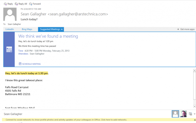
The Suggested Meeting app in Outlook finds a time in an e-mail and suggests a calendar entry automatically.
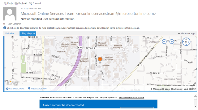
Called “Apps for Outlook,” these HTML and JavaScript based applets are exposed within e-mail messages in the Outlook 2013 client as well as the new Outlook Web Access Web client. The apps detect content patterns in e-mail messages and other content, then retrieve data from Web services based on that data. Exchange comes with three installed by default—a Bing Maps tool, an “action items” finder that flags e-mails for follow-up, and an appointment suggestion applet. Each of these looks for content patterns in messages (addresses for maps, dates and times for appointments) to generate their content. A number of other applications are already available through Microsoft’s Office website, including ones that tie in services such as LinkedIn and Twitter.
 The Bing Maps application, in Outlook Web Access, finds an address and offers to show you where it is.
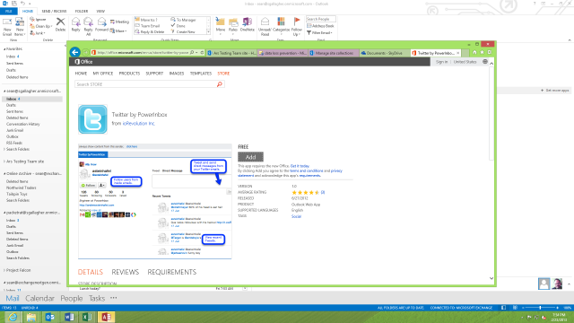
Which apps show up in Outlook are determined by the Exchange administrator, but there is a growing collection of free and paid applications available through the Office website (directly accessible through the administrative interface). And internal developers can build their own apps for deployment through Exchange as well, adding them either by pulling them in as a file or pointing to their URL. Developers can build mailbox apps using Microsoft’s “Napa” Web-based developer tool for Office 365 and then share its URL to be used on any Exchange server. Once an application is added, it’s available to everyone as an option unless it’s disabled. If desired, apps can be made mandatory as well.
 Office.com's Apps for Outlook app store includes apps for Twitter, LinkedIn, and other services.
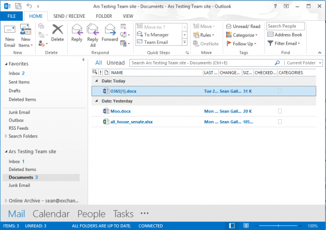
There’s also more integration with SharePoint through a new feature called Site Mailboxes. You can configure a mailbox that’s associated with a specific SharePoint “team page” or other collection within the collaboration server. That mailbox includes an e-mail address that people can send messages to as well as access to the documents in the site’s library. (Those documents are accessible directly from within the Outlook client, though not through Outlook Web Access). Lync Server 2013 also integrates into the Exchange mailbox. It can archive chat sessions in the mailbox store and store Lync contacts there as well.
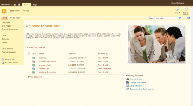
A view of a SharePoint Team site mailbox, with its shared documents, in Outlook.
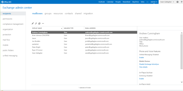
The other changes in Exchange may be subtler to users, but they’ll be immediately apparent to administrators. If you’re installing Exchange 2013 locally, the first thing administrators will notice is what's gone: the Exchange Management Console and Exchange Control Panel management interfaces. They’ve been replaced by Exchange Administration Center (EAC), a Web-based administrative console shared across all the versions of the Exchange platform. This is the same interface administrators use for Exchange Online, the cloud tenant version offered on its own or as part of Office 365.
 The Exchange Admin Center, the new Web-based console for managing Exchange 2013 and Exchange Online.
There's still support for PowerShell-based administration commandlets (both for on-site and Online versions of Exchange), so automated provisioning and scripted administration of Exchange servers is as powerful, so to speak, as ever. But as far as day-to-day administrative tasks go, it's all done from a browser. This is the case regardless of whether your Exchange server is under your desk, in a rack in your own data center, running as a hosted instance with a service provider, or a tenant in the Office 365 cloud.
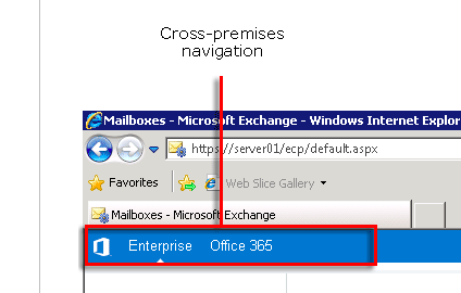
EAC also integrates management across both on-premises and hosted services for companies that opt for a “hybrid” Exchange deployment, allowing administrators to move from Enterprise to Office 365 tenant management with a single click in the header.
An EAC console administering both an on-premises Exchange 2013 Enterprise install and an Office 365 tenant allows navigation from local to cloud with a click on the tab.
Another thing missing from the new Exchange is support for older versions of the Outlook client. Exchange 2013 requires its Outlook clients support auto-discovery of the server; this is in part to help streamline cloud deployments of Exchange. Clients also have to support “Outlook Anywhere” access—remote procedure calls via HTTP—to connect to Exchange 2013 instead of using TCP-based RPCs as in older versions of Exchange. In theory, it’s a good thing—unless you have clients still running Outlook 2003.
Those changes are in part because of a major architectural shift in Exchange. Functionality used to be split across multiple server elements to allow for better scaling out of Exchange. Now it's been consolidated into two components: the Mailbox server and the Client Access server. The Mailbox server handles all of the heavy lifting, including the mailbox database, mail transport services, and unified messaging and client access protocols. The Client Access server role, on the other hand, is lightweight. It's intended to act as a proxy and allow for load-balancing of connections. It also handles incoming requests from HTTP, POP, IMAP and SMTP.
The result is that it’s a lot simpler to deploy Exchange in larger organizations. Servers no longer need to have a fully qualified domain name for clients to connect to them; you can have load-balancers pass connections to whichever Client Access server is available. There’s less need for configuring namespaces for different services; whole rafts of Client Access servers can be hidden behind a small number of host names.
EAC might seem like a downgrade for some administrators. There were a number of things you could do from the MMC-based Management Console that you now have to rely on PowerShell to do. But the EAC is an upgrade for those already using Office 365, with more administrative and reporting features exposed. Two of those features are compliance and policy management tools new to Exchange as well. However, they’re exclusive to the Enterprise version of the on-premises server and the enterprise-level plans of Office 365: data loss protection and e-discovery.
Exchange had data retention policies for some time. But the new e-discovery features make it a lot easier to find content in mailboxes—or in Lync instant messages or SharePoint sites—that needs to be held and prevent it from being deleted. All you need is the right query to find it. SharePoint 2013 also has its own e-discovery capability for content not explicitly connected to Exchange.
Exchanges’ e-discovery tools allow for “in-place” preservation of content that matches up with a specific keyword within a group of mailboxes—usually someone working on a specific team requiring regulatory oversight. The e-discovery tool allows any matching e-mail or other messages (including voicemails and other content stored in the Mailbox server) to be retained either indefinitely or for a set period of time based on the needs of the company

A quick test—the tale of Packetrat

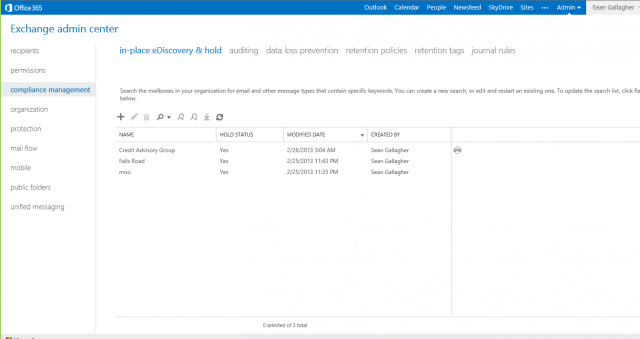
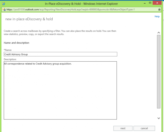
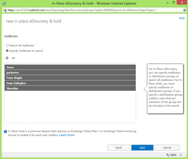
Let’s say we’re tracking a project called "Credit Advisory Group." The e-discovery administrator is asked to set up an in-place e-discovery search checking the mailboxes of those involved in the project for the keyword “credit," then holding them for 90 days. You can designate someone as specifically being an e-discovery administrator, or this can be passed off to a legal department if you’ve got one.
 Setting up an e-discovery policy in Exchange 2013 is as easy as creating a search query.
 Any administrator given e-discovery rights can create a new in-place e-Discovery query, starting with its description.
 You can perform an all-encompassing "in-place e-discovery," but to perform an actual hold on content, you need to specify user and asset mailboxes to search.
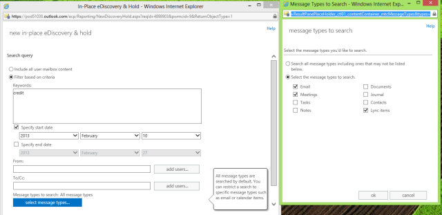
 You can also narrow e-discovery searches by keywords, date ranges, addressees, and types of messages—including shared documents, Lync chats, and scheduled meetings.
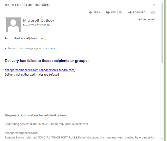
Now, the admin previews the results, which are opened in Outlook Web Access. And they discover something unexpected: an employee has been sending e-mails filled with credit card numbers.
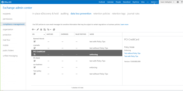
Fortunately, another wrinkle in Exchange's new policy enforcement capabilities is data loss prevention. The enterprise versions of Exchange 2013 and Exchange Online come out of the box with a set of templates to enforce compliance with common policies and regulations, such as preventing the leaking of personal identifying information via e-mail. You can also create custom DLP rules based on search strings or common patterns for information and then scale the response from a simple warning that the user can override to completely blocking the message and reporting it to the appropriate person in the company.
 The Data Loss Prevention feature of Exchange 2013 and Exchange Online comes with a number of ready-made pattern recognition templates you can build policies around.
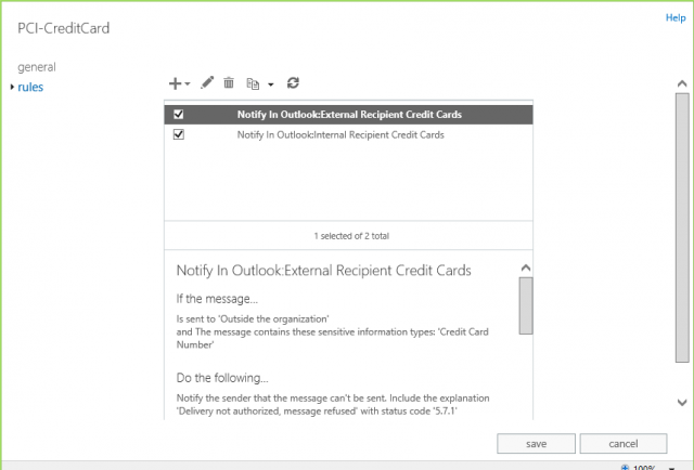
You can create rules based on the templates, and you can add your own customized rules based on your organization's policies.
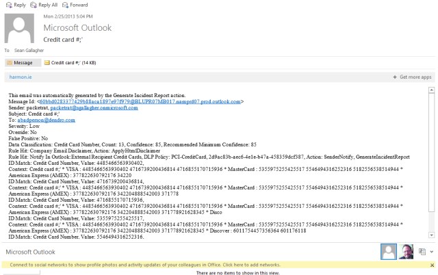
 Here, our bad actor has his message blocked from being sent out of the organization by a PCI rule.
 The offending message has been sent to his boss to raise the alarm about a violated policy.
These features will make cloud-based e-mail somewhat more palatable for more regulated or secretive companies. There are a few minor setbacks for the truly paranoid, however: Outlook Web Access in Exchange 2013 no longer supports S/MIME encrypted content, for example. But on the whole, there's a lot more security capability out of the box for Exchange (and particularly Exchange Online) in this incarnation of the platform.

SharePoint 2013 and SharePoint Online

SharePoint has been many things to many people over its lifecycle. It started off as sort of a knowledge and document management solution, then picked up aspects of Web server, Wiki, and blogging tools over the past few iterations. Now, Microsoft has turned it into something closer to a social networking tool by adding features that seem plucked from the corporate social networking service Yammer (which Microsoft acquired last summer).
 Out with the old...
The SharePoint Web service has been given a significant makeover to make it more Windows 8-like, with bright colors and lots of touch-friendly whitespace on its pages. And there are also more ad-hoc collaboration capabilities thrown onto SharePoint for good measure, such as the integration of the OneNote note collecting and organizing application into SharePoint’s “team sites” or the deeper integration with Exchange and Outlook.
Office 2013 also turns SharePoint into a corporate SkyDrive, allowing users to directly synchronize folders from their desktop to a personal storage space on the SharePoint service or to a team document library—or both. The team sites can be used as collaborative file stores by team members like a network file share—except that retention policies can be applied to the contents of the shared SkyDrive-esque folder, and the contents can be searched for e-discovery.
The social features of SharePoint sound like they were lifted from Twitter and Facebook. At the top right corner of every SharePoint page, there are buttons to share and follow it. Sharing allows users to invite others to view or contribute to a page, creating an ad-hoc collaboration around it. Following a page means you get alerts about changes in its status; you can also “follow” people’s activities, specific subject tags, or individual documents. You can even tag pages or documents to associate them with topics; those tags can then be used for search and to drive cross-site publishing of content.
There’s also the Newsfeed app within SharePoint, a “micro-blogging” feature allowing you to post in Twitter-like short format about activities and documents you’re working on. You can broadcast these to everyone via SharePoint’s general Newsfeed page or limit them to a more select audience by posting Newsfeed entries on team pages and other sites within SharePoint set up with the feature. You can also mention other users of the site with an @ in front of their name, and SharePoint alerts them of the mentions.
SharePoint 2010 already had user profile pages and personal home pages. But now the profile pages have taken on a much more Facebook-like nature. Also from the Facebook side of the social metaphor, SharePoint borrowed the concept of “liking.” You can use a like to approve of a comment or answer to a question on a Community site, a new construct in SharePoint that has aspects of a Facebook group page or the Quora question-blogging site. The Community site tracks the level of participation of users, and it allows you to award them badges based on how useful their contributions are.
The big difference, of course, between Community sites and other social media is that companies can apply retention policies to them to ensure they’re in line with corporate governance requirements. And everything in SharePoint can be trolled for e-discovery through SharePoint’s new eDiscovery Center site template, which allows content to be held in place and shared with legal teams through a secured SharePoint site.
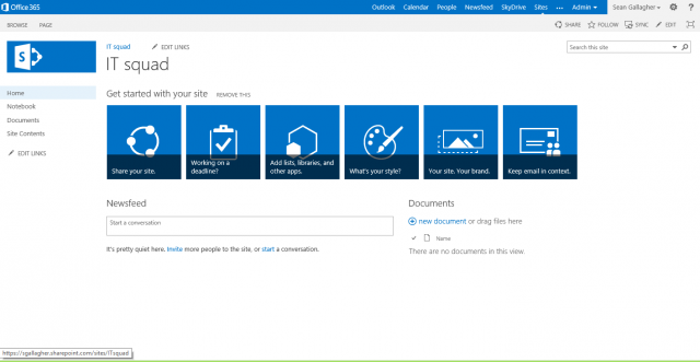
The SharePoint Team site has also gotten a tune-up. As mentioned earlier, project sites can be directly integrated into Exchange through a site mailbox; a shared calendar for a project team is also created and automatically added to team members’ Outlook calendar lists. Team sites can be customized with Web "parts" from other site templates, such as the project management lists shown here:
 A brand new SharePoint 2013 team site, waiting to be customized. 
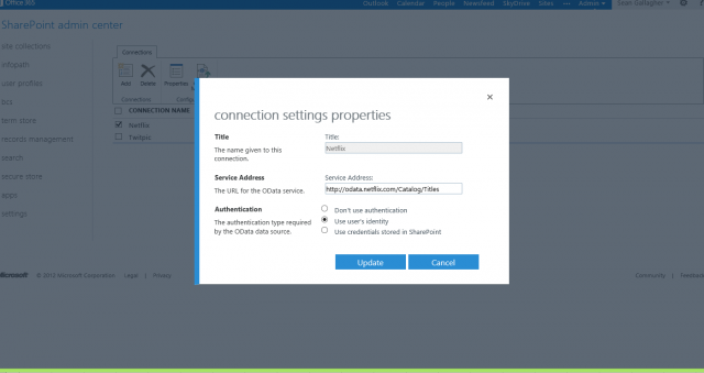
There are a number of underlying architectural changes and additions that make SharePoint 2013 an increasingly interesting development platform. Like Exchange, SharePoint 2013 has its own app store now for Web service plugins, and you can develop a whole new class of SharePoint applications using Microsoft’s Web-based ”Napa” developer tools based on CSS3, HTML, and JavaScript. Really, you can develop from any other platform using open Web standards if it can leverage the same hooks. There’s also support for Open Data (OData) provider connections through SharePoint’s Business Connectivity Services (BCS), which can be used to create dashboards and reports pulled from live data.
 You can configure OData sources in SharePoint's Business Connectivity Services to feed structured data from lots of sources, (including, apparently, Netflix).
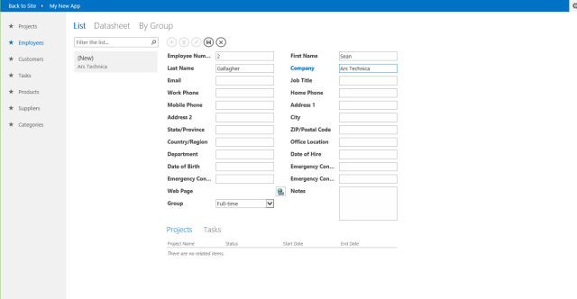
But perhaps the most interesting development tool for ad-hoc app creation related to SharePoint is Access 2013. The database tool, long a favorite of those hoping to end-run around long enterprise app development queues, now offers the ability to publish Web applications to SharePoint and the Azure cloud service. For a small organization looking to create a simple shared database application for a product catalog, project management, or similar non-transactional tasks—and possibly even some transactional ones—the addition of Access app publishing makes SharePoint a much more attractive part of Office 365 for small and midsized businesses.

The Next Generation

There are some eggs broken with this re-imagining of Exchange and SharePoint that some organizations may miss, especially trailing-edge late adopters who still have copies of Outlook 2003 in circulation. And taking full advantage of Exchange and SharePoint 2013 means adopting Office 2013. That’s assumed with the Office 365 full premium plan, since it comes with subscription licenses for the desktop suite as part of its price tag.
As a result, some may hang back a bit longer on older versions of the products. But the changes are a net positive for most organizations, especially smaller ones looking for a way to straddle between the server onsite and cloud services. And while the subscription model of Office 365 may not make a lot of sense for many consumers, it's perfectly logical for small and mid-sized organizations that don’t fit into Microsoft’s volume licensing model.
It’s clear the real mission of Exchange and SharePoint 2013 is to pull Microsoft’s existing customers closer to the cloud precipice, providing them with a smooth path toward either migrating to Office 365 or some other hosting arrangement with the Online products (maybe even creating their own private clouds). When taken in combination with Lync, they reveal Microsoft’s long-term vision of creating a business version of the Outlook.com/SkyDrive/Skype consumer cloud services—offering businesses all the applications and communication they need for a monthly fee per user that isn’t too far removed from their existing phone bill. The goal is turning IT into a utility not far removed from former Sun CEO’ Scott McNealy’s vision of “application dial tone.”
Microsoft is no stranger to the power of bypassing IT—it was a strategy that made the Office platform so dominant in the workplace and then in turn in the consumer market. Tools like Excel, Access, and even Word gave power users the ability to bypass corporate IT to solve problems. This paved the way to world domination for Microsoft’s server platforms—Exchange, SQL Server, and SharePoint—in the process. The problem is that Google and others are moving just as fast, and in some respects have out-Microsofted Microsoft in the game of bypassing IT and following the Pareto principal (delivering 80 percent of the results for 20 percent of the cost). While there’s definitely value in the latest versions of Microsoft’s collaboration platforms, the question is whether they’re worth spending nearly twice as much for.