I've been using Office 2013 for a few months now. There's nothing particularly wrong with it. (Before Office 2013 I was using Office 2010. There was nothing particularly wrong with that, either.) The most obvious difference from older versions, the new theme, might not be to everyone's taste. I like it well enough, though frankly, I don't really notice it anymore. I think in many ways that's the way things should be.
What I cannot fathom, however, is why Office 2013 exists. Or rather, why it exists in its currentform. Just what Microsoft has been doing in that two and a half years, I couldn't tell you, because Office 2013 doesn't feel like it's had two and a half years of work on it.
Office 2010 and 2013 are very similar. That's alarming, because the environment into which they were released has changed substantially. Office 2010 was released to manufacturing (RTM) on April 10, 2010; Office 2013 was completed two and a half years later, on October 11, 2012.
That Office 2010 RTM date came a week after the launch of the iPad. The iPad didn't change everything, but it did usher in an important new class of device: the tablet. Tablets are of considerable importance to Microsoft, both threat and opportunity, and the company had plenty of time to adapt its popular productivity suite to take advantage of the new environment. Microsoft has made bold strides to bring Windows into the tablet era. Office should have been a part of that vision, but it isn't; indeed, I'm not sure the Office team even recognizes the vision.
A reactionary stopgap
That's not to say there's nothing new in the new version. There is, of course, the greater cloud integration, Outlook's built-in support for Exchange ActiveSync (which means that it can support Hotmail accounts directly, without needing a plugin), and a new (and currently extremely limited) extensibility model that uses JavaScript instead of Visual Basic for Applications.
I'm now making use of the Hotmail support, but the plugin I used in Outlook 2010 got the job done, so the improvement is barely perceptible. The other stuff? I doubt I'll ever need it. Office 2013 feels like a service pack, not a whole new major revision of the software. Microsoft got the basic functionality nailed down years ago, so it's not surprising that Office versions all seem kind of similar. But that doesn't mean that Office doesn't deserve further development.
In its day, Office 2007 introduced a major UI overhaul with the ribbon. Office 2010 completed the UI overhaul, adding a lot of spit and polish in the process. Both of these were substantial updates in their own ways. Office 2013, however, feels like Microsoft is scratching around for things to do but couldn't really think of any.
Office may be mature, but it sure ain't perfect. There are all sorts of little things I wish Office did better or differently, such as providing consistent text formatting options across the major parts of the suite or making charts easier to manipulate in Excel (I can't be the only person who sometimes wants to save charts as images, can I?). But I'm resigned to the fact that these things will probably never change, because Microsoft has no serious competition in the desktop office suite market.
But that "desktop" qualifier is significant. Office on the desktop has a strong market position. The desktop apps somewhat perversely mean Microsoft has a strong online offering, too, because if you outgrow the Office Web Apps (which you quite likely will), you can easily switch to the desktop software. Other online apps, such as Google Apps, have no comparable migration path. The Office 2013 JavaScript extensibility and cloud integration strengthen the Web offering somewhat, but not in a game-changing way.
The big gap with Office is its support for tablets. Nowhere is the Office team's paucity of ideas more evident than in Office 2013's one other new feature: touch mode. Touch-oriented tablet devices like the iPad or even the Surface are a great conundrum for Office. The Office apps, for all their foibles, are feature-packed and complex, and Microsoft's challenge is to make that power available and accessible to finger-based tablet users.
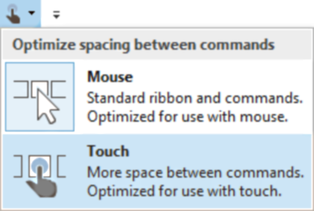
Microsoft's solution to this problem? Make the ribbon a bit bigger. Outlook 2013 goes one step further; in touch mode, it also places a quintet of buttons down the right hand edge of the screen to make them thumb accessible. Beyond that, you're hard-pressed to find any adaptation to the constraints imposed by fingers. I'd call the changes skin deep, but they're not even that thorough. Microsoft hasn't done anything about Office's multitudinous dialog boxes, for example, to make them touch friendly.

The touch mode ribbon is reasonably touchable, but it only covers a fraction of Word's functionality.
The Office apps (except perhaps for OneNote) are simply not touch apps, even though Microsoft is bundling them on a touch computer, the Surface. The lack of Office apps in the "Metro" style is disappointing, but I can understand it. The WinRT platform is very different from the traditional desktop platform, so it's no surprise that Microsoft hasn't been able to produce Metro Office just yet.
But Microsoft doesn't need WinRT to implement touch Office. What it needs is an idea of how to translate Office's complexity into touch, and what's on display in Office 2013 is an overwhelming lack of ideas about how to do this. The touch revolution has been a long time coming. Even if the Office team initially thought it was just a smartphone "thing," the iPad in 2010, and Apple's iWork apps for iPad, should have disabused them of that notion.
Yet it seems to have caught them off-guard. The Office touch mode feels like a reactionary stopgap. It doesn't provide any solution for the problem of devising touch interfaces for complex apps. It doesn't even provide any insight into what that solution might be.
Bad for Office, bad for Microsoft
This failure to pay anything more than lip service to the notion of touch computing hurts the company as a whole. Windows 8 and, in particular, Windows RT are both undermined by the lack of support from the Office team.
Windows 8 is a genuinely viable touch platform, and if it had an effective touch Office then it would offer something unique among touch platforms and something that reinforced the value of Windows—and touch Windows—in particular. Office is still, for a great many users, an important piece of software. If it had done well, Microsoft would have proven Windows 8 as a do-it-all platform and Surface as do-it-all devices; tablets that are just as at home playing Angry Birds as they are polishing documents and preparing presentations.

Even switching from mouse mode to touch mode is annoying, as it requires the manipulation of icons designed for mice.
Instead, Microsoft is delivering the opposite message. To use Office comfortably, you have to abandon any tablet pretensions and stick with a mouse/trackpad and keyboard—at which point you might as well stick with your existing Windows 7 laptop and buy an iPad for tablet duty.
The Office team has a long history of subverting the Windows team's ambitions. This is true both in the details—the Office team has a habit of ignoring Windows UI guidelines and eschewing the standard Windows look and feel, even when the standard functionality is superior to Office's—and in broad strokes. With the exception of OneNote, the Office team never made any concessions to improve touch or stylus usability, hence hindering Microsoft's Tablet PC push during the 2000s.
Historically, this might have been justifiable by virtue of the small Tablet PC market (though I think this attitude downplays Office's importance and its ability to drive computer sales), but that argument no longer cuts the mustard. The touch tablet market is proven and thriving. Producing a viable product for a new generation of Windows tablets is the least the Office team should be doing.

This is not a touch-first user interface.
Instead of doing anything credible to bring Office into the world of touch, however, we are stuck with a new theme and some slightly tighter cloud integration. How two and a half years of development could have been prioritized in this way is beyond me.
It's possible the long-rumored Office for iOS will show just how Redmond plans to bring Office to the touch-using masses. Should these apps ever ship, they will be true touch applications, delivering to competing platforms precisely what the Office team was unable or unwilling to give Windows.
There is a long-standing perception that Microsoft is a company made of disparate groups that are antagonistic toward one another, focusing only on their own interests and not on those of the company as a whole. Such a move would only reinforce that view.
No comments:
Post a Comment
Let us know your Thoughts and ideas!
Your comment will be deleted if you
Spam , Adv. Or use of bad language!
Try not to! And thank for visiting and for the comment
Keep visiting and spread and share our post !!
Sharing is a kind way of caring!! Thanks again!