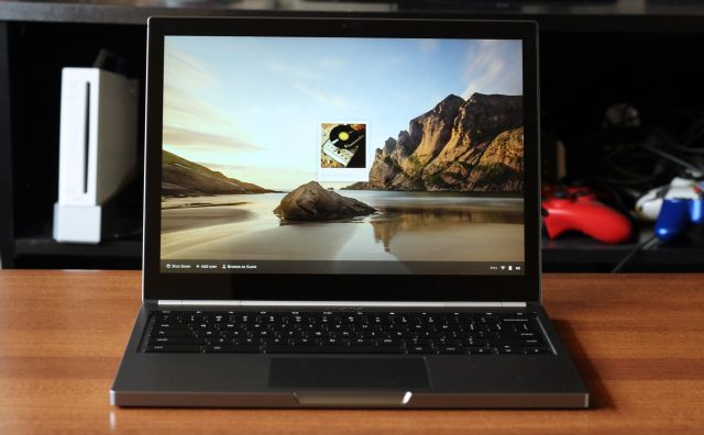
Google's new Chromebook Pixel: the best laptop you don't need.
Just one month ago, the Chromebook Pixel was little more than a poorly sourced rumor. (And personally, while I didn't quite dismiss it out of hand I came pretty close.) Google was releasing a high-end Chromebook with a touchscreen? And that touchscreen would boast a better pixel density than either of the Retina MacBook Pros? The rumor definitely didn’t fit in with the latest (and by all accounts, most successful) wave of Chromebooks, which have turned heads not least because they're cheaper than any Chromebooks have been so far.
And yet, here we are: the Chromebook Pixel is real, it’s on my desk, and it starts at $1,299. For the kind of hardware we’re talking about—state-of-the-art Intel processors, a high-density touchscreen, and build quality to rival the best from both the Windows and Apple ecosystems—that price tag isn’t unreasonable. However, the Pixel is still running Chrome OS. Whether your Chromebook costs $199 or $1,299, that operating system still has all of the same features: it relies on constant Internet connectivity, it seeks to replace traditional desktop apps with Web apps, and it’s mostly just a Web browser running on top of a lightweight Linux distribution.
The question is, does this combination make sense? Are the professionals and power users who are willing to spend that kind of money on a computer the same kind of people who can live within Chrome OS’ limitations?
Body and build quality
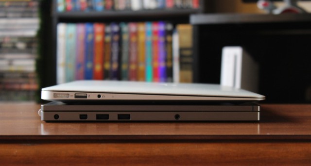
The Chromebook Pixel underneath a 13-inch MacBook Air. Overall, the Pixel is just a little on the plain and boxy side, but that’s actually a bit of a statement in a sea of logo-stamped PCs.
| SPECS AT A GLANCE: GOOGLE CHROMEBOOK PIXEL | |
|---|---|
| SCREEN | 2560×1700 at 12.85" (239 ppi) |
| OS | Chrome OS |
| CPU | 1.8GHz dual-core Intel Core i5 |
| RAM | 4GB 1600MHz DDR3 |
| GPU | Intel HD 4000 Graphics (integrated) |
| HDD | 32 or 64GB solid-state drive |
| NETWORKING | Dual-band 802.11n, Bluetooth 3.0, USB Ethernet dongle, optional LTE |
| PORTS | 2x USB 2.0, mini DisplayPort, card reader, headphones |
| SIZE | 11.72 × 8.84 × 0.64" (297.7 x 224.6 x 16.2 mm) |
| WEIGHT | 3.35 lbs (1.52 kg) |
| BATTERY | 59Wh |
| WARRANTY | 1 year |
| STARTING PRICE | $1,299.99 |
| PRICE AS REVIEWED | $1,449.99 |
| OTHER PERKS | Webcam, 1TB of Google Drive storage for three years, 12 free GoGo Inflight Internet sessions, 100MB of Verizon Wireless data per month for two years (LTE model only) |
The body of the Pixel is one solid gray anodized aluminum rectangle. It lacks the curves or tapering that define many Ultrabooks, and it’s a consistent 0.64” thick throughout. This is about a tenth of an inch thinner than Apple’s 13-inch Retina MacBook Pro and, at 3.35 pounds, the Pixel is also just a bit lighter than that laptop (which weighs 3.57 pounds all told). This means the Pixel is neither Ultrabook-thin nor Ultrabook-light, but it’s still pretty easy to sling in a bag and carry around, even if you’re used to something a bit lighter.
The all-aluminum construction is very solid, and the palm rest and keyboard don’t bend or flex even a little under pressure. The laptop is all clean, straight lines with just a couple of exceptions: the indentation in the front that’s used to lift the lid (an action that doesn’t budge the laptop’s base), and the rounded hinge (which protrudes from the back of the laptop). There’s also the standard array of ports: two USB 2.0 ports, a mini-DisplayPort, and a headphone jack on the laptop’s left side, and an SD card slot and (optional) SIM card slot on the right.
Google even went so far as to hide normal computer-y things from view—the speakers are hidden underneath the keyboard rather than behind cutouts, there are no visible screws, and the system’s air vent (located at the back of the laptop near the hinge) is also essentially invisible. The device’s two Chrome labels, one on the hinge and one above the keyboard, are understated and don’t use the colorful Chrome logo as seen on other Chromebooks.
The device’s sole visual flair consists of three horizontal strips near the top of the lid—two of these, on the left and right sides of the lid, are cutouts for the Pixel’s wireless antennas. The strip in the middle is a lightbar that can flash in different colors. When the machine is powered on or put to sleep, the strip briefly flashes blue, red, yellow, and green; when the computer is in use the light is a solid (but gently pulsating) blue. It’s a unique take on the traditional power LED, and it’s a touch that further emphasizes the attention given to the Pixel’s design.
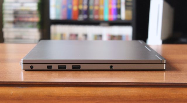
Even the Pixel's ports eschew unnecessary labels. On the left side, you've got a power jack, mini-DisplayPort connector, two USB 2.0 ports, and a headphone jack.
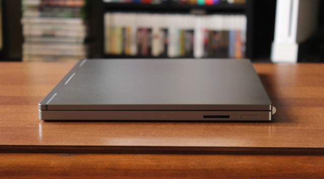
There's an SD card reader and SIM card slot on the right side of the laptop.
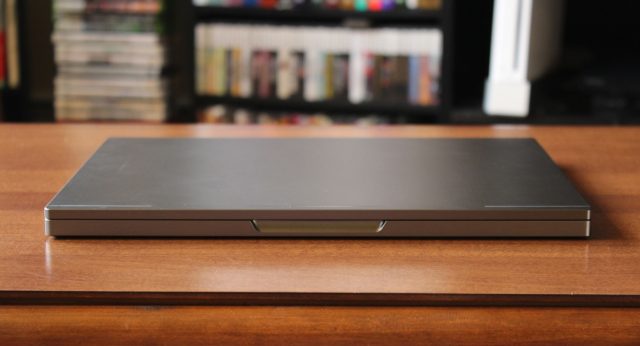
The front of the laptop is broken only by the indentation for lifting the lid.
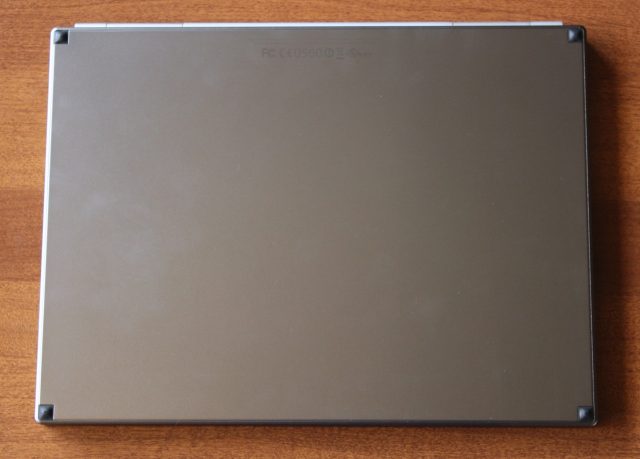
The underside of the laptop is even plainer—only some rubber feet and regulatory logos here.
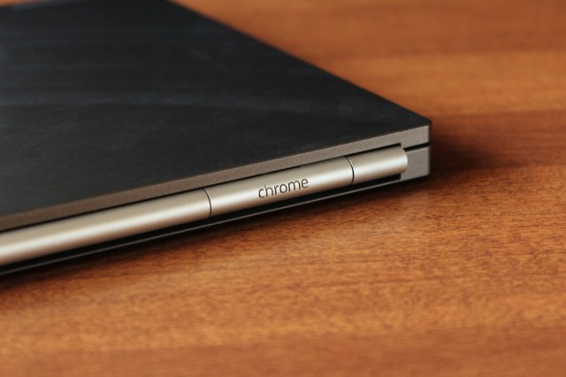
The laptop's slightly protruding hinge also doubles as a wireless antenna and a heatsink.
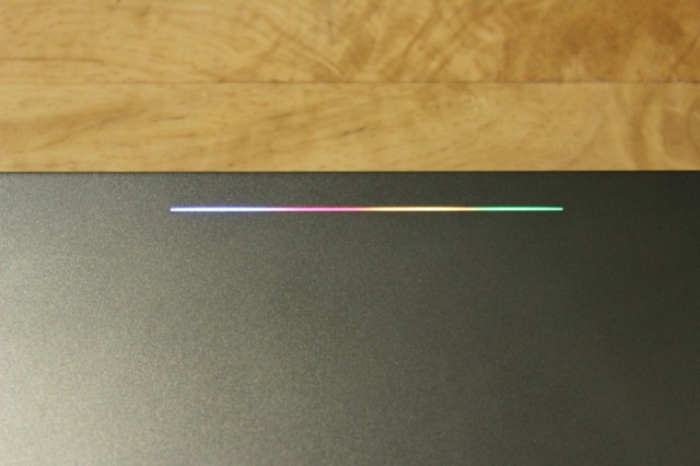
The Pixel's lightbar. To really see it in action, tap out the Konami Code on the keyboard.
We found that the Pixel actually runs a bit warm under moderate use—running Pandora in one tab while typing within Google Drive in another was enough to make the laptop’s fan kick on. The back-left corner of the laptop (where we suspect the CPU is) gets pretty toasty, especially if the computer is resting on a cushioned surface rather than a flat one.
The speakers under the keyboard get pretty loud without sacrificing clarity, though as expected in a laptop there’s not much bass to speak of. Google has also hidden a second microphone under the keyboard to help cancel noise from the keyboard during video chats, though Google told us the software to help with this wasn’t quite ready yet and would ship with a future update. The webcam itself is competent but unremarkable, perfectly usable for Google Hangouts (but not Skype or other services without an extension in the Chrome Web Store).
The screen
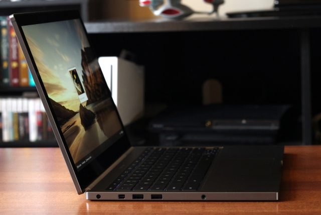
We've never been able to say this about a Chromebook before, but this screen has excellent color and viewing angles.
The build quality is good, but Chromebook Pixel’s screen is the star of the show, its raison d’etre.Every Chromebook we’ve reviewed up until now has used a screen commensurate with the devices’ prices. Low-cost, low-quality panels with poor color and viewing angles have been the order of the day.
The Pixel is different from these panels in four important ways: the first is quality, and both the color and viewing angles on its touchscreen are excellent. They're fully up to the level of Apple’s Retina MacBook Pros or the better Windows 8 Ultrabooks we’ve seen in recent months (we’ll cherry-pickDell’s XPS 12 and Lenovo’s IdeaPad Yoga 13 as good examples). The display also gets quite bright, though the brighter settings will sap the machine’s battery life fairly quickly (more on that later on).
The second difference is touch—the Pixel’s display is also a ten-point capacitive touchscreen not dissimilar from those currently shipping in high-end Windows 8 laptops. Like those displays, both the screen and its bezel are coated by a sheet of glass that looks nice but is extremely glossy and reflective.
Despite sporting a touchscreen, Chrome OS doesn’t yet do much to take advantage of it. No UI elements from the operating system have been tweaked to be more finger-friendly, and there definitely aren’t any touch gestures meant to simplify navigation (as exist in Windows 8 and many other smartphone and tablet operating systems). Even within the Chrome browser itself, the only thing you can really do with touch is scroll. Pinch-to-zoom is supported by some Web apps (Google Maps is probably the most prominent), but not universally. We suspect that Chrome OS’ list of touch features will grow over time, especially if the Pixel inspires other Chromebooks to pick up touch support (and it will probably be a boon to games like Angry Birds on the platform). But at the moment a touchscreen is in no way integral to the experience.
The third difference is the one that gives the Pixel its name: its screen uses a 12.85-inch 2560×1700 panel. At 239 PPI, this is even a bit denser than the 227 PPI of the 13-inch Retina MacBook Pro. The comparison to Apple’s laptops is especially apt because the two operating systems take a similar approach to increasing screen density. They both choose to quadruple the resolution of a common display resolution and scale all of the text and graphics to 200 percent their normal display size, as opposed to the incremental (and sometimes messy) 140 percent and 180 percent scaling that Windows favors.
Because they take the same approach, the Chromebook Pixel’s display shares all of the same virtues and shortcomings as the displays in the Retina MacBook Pros (and, for that matter, the Retina iPadsand high-density Android tablets like the Nexus 10). Text, graphics, and applications that have been optimized for 200 percent scaling look crisp and clear, while images and apps that haven’t been optimized look just a little fuzzy.

A screenshot showing off the differences between text, optimized images, and non-optimized images. Note the blurriness of the icons for Twitter and the Ars Wiki, and compare to the sharpness of the text and the Google icons.

Here's a photograph of a non-optimized image, a chart from one of our earlier Chromebook reviews. The image isn't out of focus—look closely and you can clearly see individual pixels—but fine details in low-resolution images will seem a bit soft and blurred.
In Chrome OS, Google has done most of the heavy lifting to get the built-in applications (and its own Web apps) looking good on the high-density display. Step outside of Google’s bubble and you’ll find that the majority of sites and apps still haven’t been optimized for these dense displays. None of this is Google’s fault, and text in particular does look excellent on the screen, but the benefits aren’t universal.
Finally, the fourth major difference: the aspect ratio. Most computers (and many phones and tablets) use a 16:9 aspect ratio, at least partly because this aspect ratio is widely used in TV shows and movies (and televisions themselves). Among those who use their computers primarily for computing, though, the loss of aspect ratios like 16:10 and 4:3—the sacrifice of vertical pixels in favor of horizontal pixels in a world where the vast majority of scrolling happens up-and-down and not side-to-side—has been a bit less than welcome. Google has used a 3:2 pixel ratio in this Chromebook, and this could also be rendered as 15:10, or just a little less wide than a 16:10 display given the same number of vertical pixels. Google's stated goal with this nonstandard aspect ratio is to reduce the amount of vertical scrolling you have to do. It's definitely a nice step up from the 1366×768 panels you usually see in low-end Chromebooks.
Google also mentioned to us that 3:2 is the same aspect ratio used by many DSLRs, which in their opinion should make the Pixel better for editing photos. There are two things wrong with this supposition: first, by virtue of being a Chromebook, most of the software that professional (and even amateur) photographers use to organize and edit their images isn’t going to be available on the Pixel. Second, you still have to make room for the user interface of said imaging program. You often won’t be manipulating the images in full-screen mode anyway.
All things considered, the Pixel’s screen is excellent. But it will be held back somewhat until high-density screens (and sites and apps designed to take advantage of them) become the rule rather than the exception.
Keyboard and trackpad
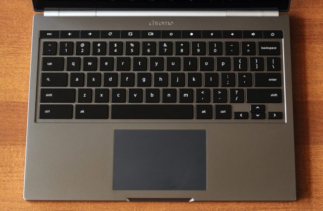
The Pixel's keyboard and trackpad look, work, and feel great.
Continuing in the same vein as the rest of the hardware, the keyboard and trackpad in the Pixel feel like they belong in a $1,300 laptop. Chromebooks do make some unconventional layout decisions—no “Windows” or “Command” key (depending on what ecosystem you’re coming from); no dedicated caps lock key (though the Search key can be configured to act as a caps lock key in the browser’s settings); and no dedicated Delete key (holding down Alt and pressing Backspace will do the trick). These are probably the most noticeable changes, but otherwise it’s a pretty standard chiclet keyboard right down to the half-height arrow keys.
The plastic keys are all perfectly square and flat, and they're only very lightly textured. Key travel on the main keys is satisfying—comparable to the 13-inch MacBook Air’s keyboard, but perhaps a little deeper—and they make a slightly more audible clacking sound as you type. (I find this more satisfying than the Air’s, though I realize this will come down to personal taste). The row of function keys, situated at the top of the keyboard, has slightly more resistance to it than the main keys, and individual keys are also a bit wider than the standard keys. These things aren’t really good or bad—they're just different.
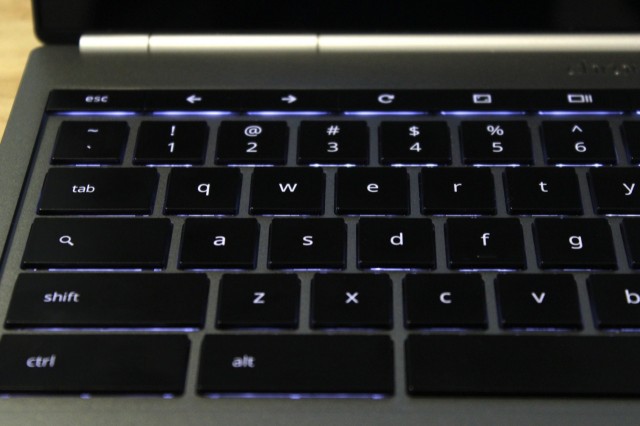
The Pixel's keyboard backlight does a good job adjusting its brightness based not just on the ambient light, but also on what you're doing.
The keyboard’s backlight is nice and even and does a pretty good job of getting brighter and dimmer based on the ambient light wherever you’re working. It also adapts to what you’re doing—for instance, it will be brighter when you’re typing than it is when you’re watching a video, even if the ambient light is the same.
Moving on to the trackpad: the Pixel uses a black clickable glass trackpad with a matte texture that Google says has been “analyzed and honed using a laser microscope.” Whatever they’re doing, it feels nice.
It’s clear from using it for a few days that the Pixel’s trackpad benefits from the tight integration between the hardware and software sides of Google’s house. Past Chromebooks have typically shipped with “good enough” trackpads that occasionally mis-interpret gestures, have issues with palm rejection, or are otherwise tweaky. But in our week or so with the Pixel, we had no major issues with either the sensitivity or the general performance of the Pixel’s trackpad.
The problem here (if “problem” is even the right word) is the same one we had with the touchscreen—the Pixel has a lovely and accurate trackpad, and the software doesn’t do a whole lot to take advantage of it. The fact that clicking and dragging, pinching to zoom, and two-finger scrolling all work predictably and without issue is a good start. But with a trackpad as good as this one, it feels like the operating system needs some more complex multitouch gestures. Google is positioning the Pixel as a Chromebook for professionals—anything it can do in the software to aid multitasking is going to appeal to that audience in particular.
Software
I won’t spend much time on Chrome OS here, since using the operating system is still fundamentally the same as it has been since Google added the new Aura interface last year. What I can relay to you are the frustrations you’re likely to run into if you’re a professional trying to use the computer—a valid perspective, since these are the people Google is trying to court with the Pixel.
In theory, I ought to be able to do most of my work in Chrome OS without issue. When I’m at my desktop or my standard laptop, I’m certainly in Chrome most of the time. At first, it was a question of replacing applications I preferred to use with versions that would run in a browser. This was inconvenient but relatively painless—the OS X Messages app was traded for in-browser GChats, banging out text in TextEdit became banging out text in Google Docs, TweetBot was traded for the Twitter website, the Spotify Web client was found with a minimal amount of digging, and hanging out in the Ars staff IRC channel with LimeChat became hanging out with our internal Web client.
It was just a couple of apps that really made it difficult to use the Pixel all day without jumping back to my MacBook Air. The first was Keynote, the application we use for most of our charts and graphs. While Google Drive could feasibly be used to replace its functionality, converting all of the templates we use (or creating new ones) would be non-trivial.
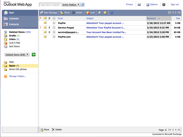
Chrome OS and the Outlook Web App can't get along, which makes it harder to stay caught up on my fake PayPal spam.
The second, and most crucial, was Outlook. While our Office 365 setup includes a Web client, this client inexplicably refuses to load in its most feature-rich mode in Chrome OS (despite loading without issue in Chrome on either Windows or OS X). Instead, it falls back to a very basic client that doesn’t even support niceties like conversation view or AutoComplete for addresses in my address book. I could, with some effort, keep up with my messages and appointments, but it’s much less pleasant than even the rich version of the Web client (to say nothing of the full desktop client).
The problem with Chrome OS isn’t that you can’t do most of your day-to-day tasks in a Web browser, but if you’ve spent any time getting used to a certain set of tools, you’ll probably need to trade them in for Web-based ones. And the real sticking points are those applications that have no easy Web-based replacements. If you rely on even one piece of desktop software to get your work done, the absence of that client in Chrome OS will make the Pixel that much less plausible as a primary computing device. This isn’t a role that Chrome OS normally has to fill. And this is normally fine—Google has found some success positioning Chromebooks as tertiary computing devices or machines that you’d hand off to your kids. But neither of these, in my opinion, should describe any computer that you’ve paid $1,299 for.
In the same way that some people buy Android phones and root them to make up for their software deficiencies, there will be a small contingent of people who buy the Pixel with the intent to run alternate operating systems on it. This isn't an impossible prospect—the folks at Liliputing have already gotten a few different Linux-based operating systems up and running—but the operating system the computer comes with just doesn't do the hardware justice.
Internals and performance
On the inside, the Chromebook Pixel is an amped-up version of the most recent Intel Chromebooks. Instead of an older Sandy Bridge-based Celeron CPU, though, it uses a modern Ultrabook-class 1.8GHz dual-core Ivy Bridge CPU and its accompanying Intel HD 4000 GPU. The extra CPU speed isn’t strictly necessary for Chrome OS, which is perfectly happy to run on the older and slower processors, but the HD 4000 is probably the slowest GPU we could recommend to drive a display of this resolution.
For the performance problems the Pixel does have, it’s difficult to say whether they come down to a struggling GPU or just a lack of optimization on Chrome OS’ part. There’s some occasional jerkiness when scrolling (particularly when scrolling quickly), but other transitions and animations within the operating system are perfectly smooth. Games like Angry Birds and Cut the Rope operate smoothly (and worked nicely with the touchscreen, to boot). It’s another area where it’s difficult to say what will change with future updates and what will stay the same, since the Pixel is still so new. Suffice it to say that general performance is zippy, but you may run into edge cases where things are a little choppier.
Since our standard PC benchmarks don’t run on Chrome OS, as usual we’ll run a few quick Javascript benchmarks just to show where the Pixel falls among other Chromebooks. A 1.8GHz Core i5 (probably either a Core i5-3427U or Core i5-3337U) is pretty standard fare in Ultrabooks these days. The fact that the lightweight Chrome OS is fast and responsive on it should come as a surprise to no one in particular.
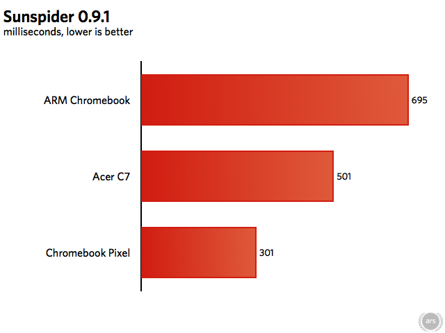
Samsung's ARM Chromebook uses a 1.7GHz Exynos 5 Dual 5520, and the Acer C7 uses a 1.1GHz dual-core Intel Celeron 847.
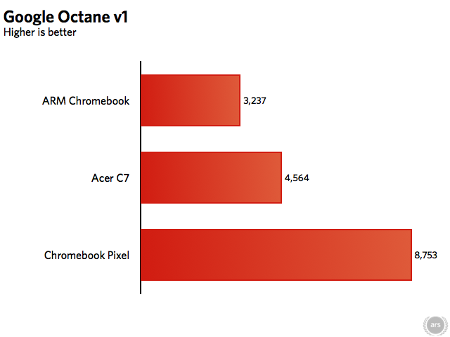
The Ivy Bridge processor blows the cheaper Chromebooks out of the water, but it's definitely worth noting that the other two systems don't feel slow. Booting and waking from sleep still only takes a few seconds on each system, and launching Chrome and other apps is still quick. The Core i5 is quicker, but this isn't an operating system that really pushes hardware to its limits (remember, Chrome OS updates are still going out to the first run of Atom-based Chromebooks at the same time as these newer models).
As for the rest of the hardware, it generally gets the job done: a 32GB or 64GB SSD provides local storage (though, since this is Chrome OS, you may not find yourself using much of it); 4GB of RAM gives the browser some breathing room; and dual-band 802.11n, Bluetooth 3.0, and an optional LTE modem provide wireless connectivity. The oddest decision Google has made here is the inclusion of USB 2.0 ports despite the Ivy Bridge chipset’s native support for four USB 3.0 ports. If a professional did want to use the Pixel but wanted to attach some fast, local storage, USB 2.0’s relatively pokey 480Mbps of transfer speed would definitely be a bottleneck. It’s especially puzzling in light of the fact that Samsung’s ARM Chromebook does include a USB 3.0 port, giving the $249 device a feature that the $1,299 version doesn’t have.
Google obviously wants you to use the included three-year subscription for 1TB of Google Drive storage instead of anything local, but especially when traveling you may not always be able to access that information when you need it. It’s one of the core contradictions of the Chromebook Pixel—it’s hardware targeted at professionals and power users, but it doesn’t support the things that these kinds of people often need.
Your $1,299 will buy you the fastest internals of any Chromebook available, but the problem is the same as it was with the touchscreen and the trackpad: the hardware is there, but the operating system really isn’t doing a whole lot to take advantage of it.
I asked Google whether Chrome OS would eventually evolve to take advantage of the extra oomph, but the company is staying on target. Chrome OS is meant to be fast and simple and always-connected. If you want to run heavy-duty desktop apps or use large amounts of local storage, the Pixel is going to be limited to the Chrome Remote Desktop plugin, the same as any Chromebook. In short, the hardware has improved, but the computing model is the same whether you’re spending $199 or more than ten times that amount.
Battery life
When I’m using any mobile device (whether it’s a phone, tablet, or laptop), battery life is the hardware aspect that I’m thinking about the most. My eyes are constantly flicking up to that battery indicator from whatever I’m doing, and as it drains I desperately turn down the screen brightness and disable whatever wireless interfaces I can. It's all in the hope of squeezing a few more minutes of uptime out of that battery.
The Pixel’s battery life isn’t bad, but it’s no better than average in a laptop. It's definitely on the lower end of the scale compared to many Ultrabooks and the MacBook lineup. In mixed usage (Web browsing, listening to music in Pandora, and writing in Google Docs) with the screen’s brightness set to 50 percent, we got only four hours and 44 minutes of runtime out of the battery. We got more than seven hours of battery life out of Samsung’s ARM Chromebook with the screen brightness maxed, and that machine costs less than one-fifth what the Pixel does. You undoubtedly give up other things when you move to that inexpensive machine, but uptime isn’t one of them. This is probably the biggest knock against the Pixel’s hardware.
Well, it's an idea.
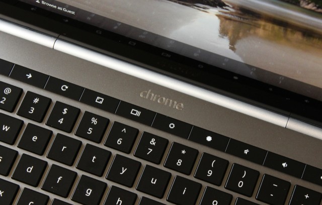
The Chromebook Pixel is some truly stunning hardware held back by an OS that's too light for its own good.
Back when the Chromebook Pixel rumors first surfaced, we asked whether the idea made sense. This remains the most salient question about the laptop now that it’s actually in our hands. The answer is... complicated.
As a technology enthusiast, I love it when a company as big as Google does something as unexpected as the Chromebook Pixel. There's nothing wrong with slow, steady improvements and predictable hardware iterations, but part of the lure of technology for me (and, I'm sure, for many of you) is the draw of new, cool stuff, regardless of whether that technology seems necessary or even sensible at first glance.
As a reviewer, though, that love of the new and the unexpected can only carry something so far. The most basic question we need to answer in a review is "should I buy this?" For the Chromebook Pixel, the answer is almost certainly "no, unless you're passionate enough about Chrome OS that you instantly disagree with me."
For most, the Chromebook Pixel presents a fundamental and unavoidable conflict between hardware and software. The Pixel is a gorgeous piece of hardware, and everything about it looks and feels high-end, from the show-stealing screen to the speedy internals to the quietly competent keyboard and trackpad. This hardware comes with a necessarily higher price tag, but compared to the only other laptops that are playing in the same ballpark—the two Retina MacBook Pros and, to a somewhat lesser extent, the MacBook Air line and the best of the Windows 8 Ultrabooks—that $1,299 starting price is actually pretty competitive. The craftsmanship on display here makes me more excited for things like Google Glass or hypothetical Google-designed Android phones and tablets (rather than ones designed in concert with Google's partners, as is currently the case in the Nexus lineup).
The problem is Chrome OS. Don't misunderstand me—I actually quite like Chrome OS. For consumers, I think it's the lean, fast, stable, secure, constantly evolving, crapware-free operating system that netbooks always wanted. When combined with the Chrome OS management console, I think it presents an outstanding value for price-conscious schools looking to introduce technology into their classrooms. The core issue is that there's nothing Chrome OS can do on the $1,299 Pixel that it can't do on the $199 Acer C7. The build quality is unquestionably better and the screen is certainly superior, but in terms of what it can do the gap is much narrower.
This problem is further magnified by the fact that Chrome OS (as of this writing) doesn't even appear to be particularly well-optimized for this hardware in the first place. There's a touchscreen, but UI elements haven't been modified for finger-friendliness, only select apps support pinch-to-zoom (and other gestures), and scrolling is sometimes jerky (though it's unclear whether that's due to software issues or the Intel HD 4000 GPU, which is going to struggle a bit at this resolution). The trackpad is large and accurate, but gesture-based navigation on the level of OS X or even Windows 8 is largely absent. Like the noise-canceling mic under the keyboard, we may just need to wait for software fixes to rectify these issues. Sadly, early adopters will still need to deal with them.
The Pixel seems better positioned as a means to an end rather than as a product that is itself intended to reach a mass-market audience. Google wants the touchscreen to inspire OEMs and software developers to incorporate touch and screens with higher pixel densities. Google wants the high-end materials and price to coax its Chromebook partners out of the low-price, low-quality corner they've backed themselves into. The company wants to make the Chrome OS tent bigger.
As a way to accomplish any or all of these goals, the Chromebook Pixel is a plausible solution and it makes me excited to see more Google-designed hardware going forward. As something you should run out and buy today? If you're not a Chrome OS die-hard, it still doesn't make sense.
The Good
- Top-shelf hardware and build quality
- Striking and minimalist design
- Excellent high-density touchscreen with great color, contrast, brightness, and viewing angles
- The keyboard and trackpad are a pleasure to use
- Fast internals
The Bad
- Runs a bit hot
- No USB 3.0 ports
- As of this writing, the touchscreen, the trackpad, and the CPU are all under-utilized by Chrome OS
- The Internet is still catching up to high-density displays
The Ugly
- The hardware is worth $1,299, but Chrome OS isn't. That much money will buy a high-quality PC or Mac with a more versatile operating system.
This is such a great resource that you are providing and you give it away for free. I love seeing blog that understand the value. Im glad to have found this post as its such an interesting one! I am always on the lookout for quality posts and articles so i suppose im lucky to have found this! I hope you will be adding more in the future...
ReplyDeleteWall Lights
Reading this review years later, on a chromebook pixel I just was "given." And if ya can't get someone to give u one, u can always get on ebay or amazon and probably snatch one for 250-300 bucks. Thats about what they go for... Down about 1g from the original retail price. Its kinda funny. I actually am becoming a google-diehard after years of being a microsoft-diehard. Its hard to say but its true. My intentions at first were to load a fresh copy of Win10 Pro on it right away. But to tell the truth its kinda growing on me.... the simplicity, the exterior look of it is just awesome. Holds up in 2018 maybe ahead of everything to be honest. The super boxy, petite, back-lit keyboard, no logos. And u can buy any extension these days for the usb 2.0 ports so thats no issue. You can also buy an extra 256-512gbs on an SD card if u want more local space. I'm pretty happy with this thing actually lol... Not to mention the sound is f$%king nice! Better than the predecessors even... Gimme this over a sh!!ty Mac anyday.
ReplyDelete