Pages

Sunday, April 28, 2013

Samsung’s Ativ Tab 7 reviewed: Kickstands can kick it It's a strong tablet and decent Ultrabook. Color us enamored.


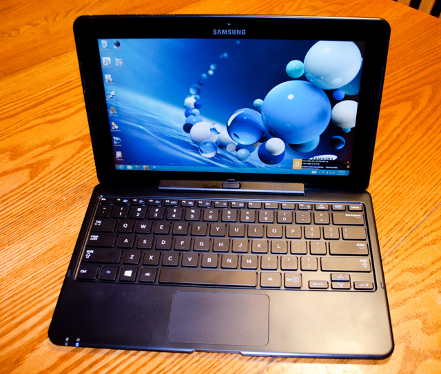
The Samsung Ativ Smart PC 700T1C tablet doing its convincing impression of a touchscreen Ultrabook.
When I met with Microsoft in January to get an advance look at the final Office platform, the Office team was eager to make sure I had "the full Windows 8 experience" with a device that showed off all that Office 2013 could do. But for various reasons, they couldn't let me run it on their own Surface Pro hardware. Instead, they handed me what one person close to Microsoft said was the next best thing available: the Samsung Ativ Tab 7 (previously known as the Samsung Ativ Smart PC 700T).
Ars briefly looked at the Tab 7—a novel combination of tablet and Ultrabook—when Samsung first unveiled it. But this was the first time we were able to use one for longer than a guided tour.  When I asked if I could review the tablet I had in hand, Samsung quickly consented.
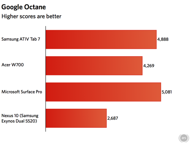
After kicking the loaner system's tires, I believed I had found the first Windows tablet that I actually would consider buying myself. "You had me at 'keyboard/dock,'" was my first impression—and that impression remained long enough for me to think my MacBook Air was getting an inferiority complex. In benchmarks, Samsung's system tested solidly faster than the Surface Pro as tested by Peter Bright and the Acer W700.
But a funny thing happened on the way to this review. In the middle of testing, I discovered that the machine didn't match the specifications I had been provided. A few e-mails and phone calls revealed the tablet to be a ringer—a custom version built only for Microsoft internal use, with a faster CPU and loaded with Windows 8 Pro. So we had to go back to square one with a street-ready tablet.
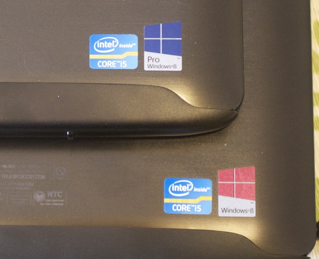
The 700T1C-A01US (the one you can buy), partially eclipsed by the 700T1C-MS1US (the one you can't but Microsoft can).
The good news is that while it's not the relative rocket that Microsoft's special-order unit is, the Ativ Tab 7 that you can buy is still competitive in performance with the Surface Pro and touchscreen Ultrabooks in the under-3-pound weight class—and it plays equally well as a tablet or Ultrabook. While its industrial design may not be as show-stopping as what Microsoft sought to achieve with the Surface, the Ativ Tab 7 remains a better choice for tablet users who still want to have some vestiges of notebook computer functionality—like a keyboard that doesn't require you to hold the screen up with a kickstand. Still, I kind of wish the Microsoft private-label machine I first used was the one available to the public.

The fine art of Surfacing
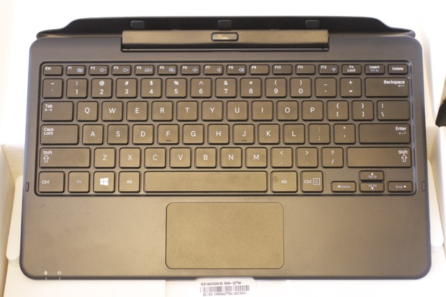
The Tab 7's dockable keyboard releases from the tablet with the button at top-center. It about doubles the weight of the tablet when docked, but it still comes well within the Ultrabook weight class as a unit.

SPECS AT A GLANCE: SAMSUNG ATIV TAB 7
SCREEN1920×1080 11.6-inch (190 ppi), 400 nit, 10-point capacitive touchscreen
OSWindows 8 64-bit
CPU1.7GHz Intel Core i5-3317U
RAM4GB 1600MHz DDR3 (non-upgradable)
GPUIntel HD Graphics 4000 (integrated)
HDD128GB solid-state drive
NETWORKING802.11a/b/g/n, Bluetooth 4.0 (NFC optional); Also supports WiDi (wireless display connection).
PORTS1 USB 3,0, 1 Micro HDMI, 1 Micro SD, headphones, keyboard dock port; additional 2 USB ports in keyboard.
SENSORSAmbient Light Sensor, accelerometer, magnetic compass, gyroscope
SIZE11.6 × 7.5 × 0.5" (294.6 × 190.5 × 12.7 mm)
WEIGHT1.89 lbs. (minus keyboard)
BATTERY4-cell 49 Wh Li-polymer
WARRANTY1 year
STARTING PRICE$1199.99
OTHER PERKS5.0MP camera, 2.0MP webcam, volume rocker, screen orientation lock button, stereo speakers, built-in microphone.
Under the hood, the Ativ Tab 7 and the Surface Pro have a lot in common. The top-end Surface Pro and the Tab 7 both have the same amount of storage, memory, and CPU. The similarity extends to the sticker price: the Tab 7's is slightly more expensive at $1,199.99 when compared to a comparable Surface Pro at $1,128.99.
Like the Surface and Surface Pro, the Ativ Tab 7 converts from stylus and touch-driven tablet to a more notebook-like experience when it's docked with its keyboard. But the keyboard is different from the Surface's click-on keyboard in many ways—the Tab 7's keyboard is a docking station that physically latches onto the tablet, supporting the screen while in use. It also has a hinge, so you can close the Tab 7 like a traditional laptop.
The keys have acceptable travel on them, making typing a less violent experience to the fingers than many accessory keyboards for tablets. And the keyboard's touchpad supports multitouch gestures, though I found them to be a little wonky.
That's not where the keyboard's differences end. The Tab 7's keyboard—which comes standard with the tablet—also acts as the power source when docked, and it includes two additional USB ports, bringing the total available to three. This is a major improvement over the Ativ Tab 7's predecessor, the Sandy Bridge-based Samsung 700T tablet, which was available with a dock and a Bluetooth keyboard. The only loss in the upgrade is the Ethernet port included in the older 700T's dock, which could be replaced with a USB Ethernet adaptor.
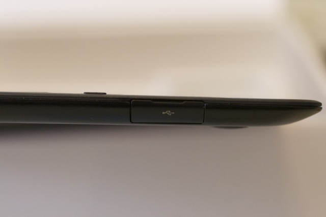
There's a USB port on either side of the docking keyboard.
The Tab 7's screen is a full diagonal inch bigger than the Surface Pro's, though it has the same 1920×1090 HD resolution and supports 10-point multitouch. Even though it's larger, it doesn't appear any less clear than the Surface Pro's.
Without its keyboard, the Tab 7 is a hair thinner and slightly lighter than the Surface Pro. It feels solid in the hands, though the back has a slight give to it that might be cause for concern about its durability. It remained relatively cool and quiet during testing, unlike many tablets I've handled, and I noticed very little fan noise compared to what we experienced with Microsoft's tablet.
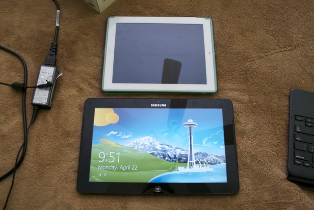
A size comparison between the Ativ Tab 7 in tablet mode (alongside its power supply) and an iPad 2.
Another design element setting the Tab 7 apart from the Surface Pro is its Wacom-based digitizer pen. Unlike the Surface Pro and several earlier Samsung tablets, the Tab 7's "S-Pen" is integrated into the design of the tablet. Functionally the same as previous generations of Samsung styli, the Ativ Tab 7's S-Pen is about the size of a golf pencil and is flattened on two sides. While a little less ergonomic than some styli, the S-Pen is a lot less likely to disappear in the bottom of a computer bag (though drop it on a floor with black carpeting and all bets are off). This is a significant edge over the Surface Pro's iffy magnetic pen clip.
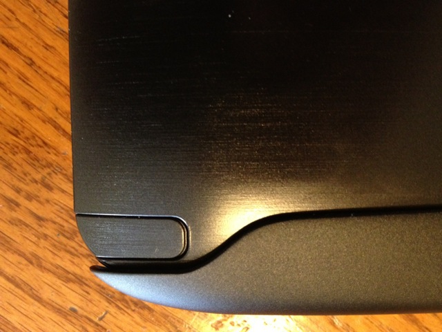
The S-Pen, stored securely in its slot in the body of the Ativ Tab 7.
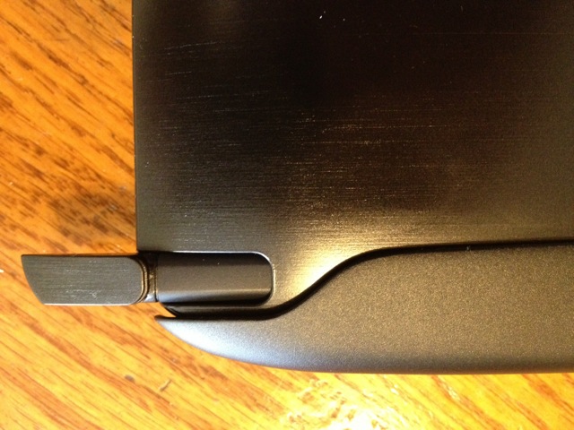
The S-Pen fits into its garage snugly and needs the encouragement of a thumbnail to come out.
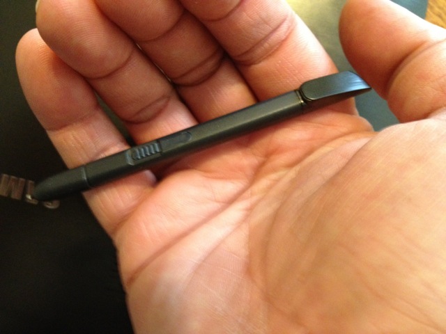
However, it's a little small in hands better suited to an oversized keyboard.


The S-Pen isn't the only thing carrying the S-moniker on the Ativ Tab 7. Samsung has loaded up the tablet with a collection of S-apps, some of which are Windows 8 versions of the apps Samsung has developed for its S Note Android device. They include S Note (a lightweight alternative to Microsoft OneNote), S Camera (a Samsung version of the Windows 8 camera and video app that adds a few extra features), S Gallery (a photo gallery), and S Player (a consolidated music, video, and image player). Some of these duplicate the functionality of other apps already in Windows 8 (and even some third-party apps that Samsung preloads on the tablet, such as Evernote).
There are some other Samsung-provided apps and utilities in the Desktop environment as well, including Easy File Share—a peer-to-peer file sharing system like Apple's AirDrop that only works with other Samsung devices that have the app. Samsung also loads up the Tab 7 with the company's own software updater to distribute Windows updates and other patches. Unless you've bought into the whole Samsung ecosystem, some of these apps end up being nothing more than storage clutter.
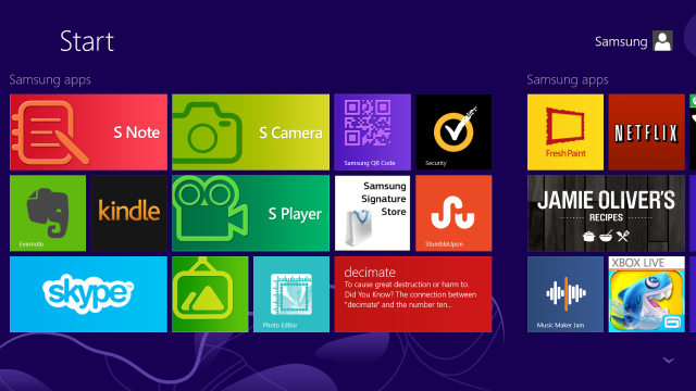
Just a portion of the apps preloaded by Samsung onto the 700T.
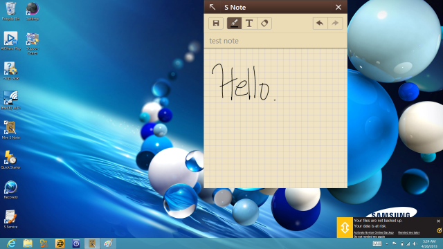
The "mini-S Note" applet available in the desktop mode of Windows 8 is a scratchpad for photos, scribbles, and handwriting-recognition notes.
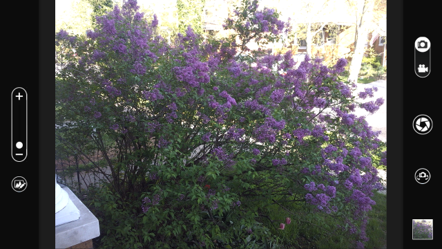
 The S Camera app in action. The 5-megapixel back camera is not exactly going to replace your point and shoot, but as tablet cameras go it's a decent one.
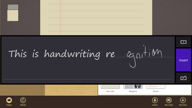
Handwriting recognition in the S Note app is good, even with my scrawl—but that's more a function of Windows 8 than the app itself.
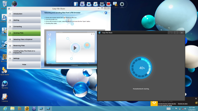
The "Easy File Share" app runs in Windows 8's Desktop and allows you to drop files to other Samsung PCs.

Internals and performance

Like the Surface Pro, the Ativ Tab 7 is powered by a 1.7 GHz Intel "Ivy Bridge" Core i5-3317U CPU. It comes equipped with 4 gigabytes of RAM and a Lite-On 128-gigabyte SATA SSD for storage—of which 106 GB are available for storage—putting it at the top end of what most tablets sport (including the Surface Pro and Acer's W700). It's still a bit limited for full daily use without an external drive, though.
Unfortunately, there's no way to really boost the Tab 7's performance beyond its factory fittings, as the RAM is non-upgradable. And if you're trying to do anything beyond the normal bell curve with Office, for example, that can become a problem—running a large-ish Pivot Table in Excel 2013 and importing a 500-megabyte, comma-delimited dataset into Access 2013 caused the Tab 7 to go close to catatonic.
The similarity of the Ativ Tab 7 to the Surface Pro and the Acer W700 extends to performance, as you'd expect. On Geekbench 2.4, the Tab 7 actually lagged slightly behind what we've seen from the other Ivy Bridge tablets, though in stress testing its score was more on par with them.
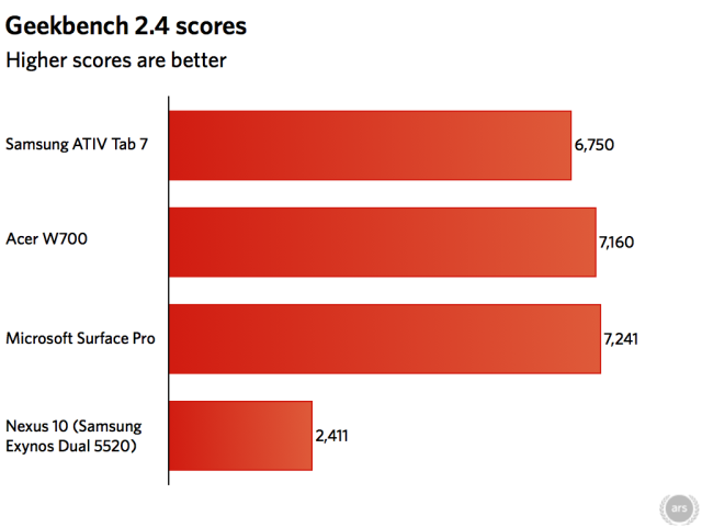
The Ativ Tab 7 came in slightly behind the Surface Pro in terms of overall performance.
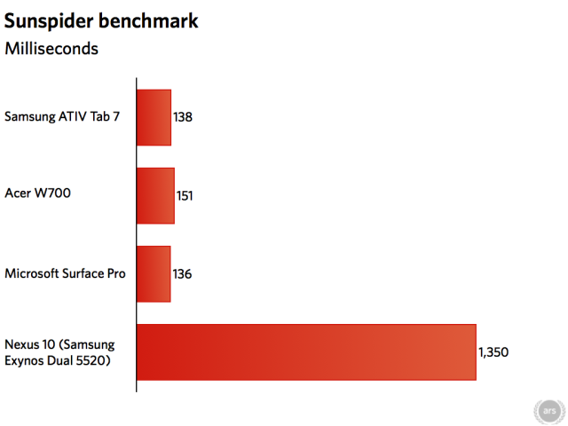
On browser tests such as Sunspider and Google Octane, however, Samsung's latest performed on par or better than the other Windows 8 Ivy Bridge tablets we've tested.
Battery life was also pretty much on par with competitors. I ran a looping Netflix video test and other tests that required the Ativ Tab 7 to keep its screen active, getting about 3 hours and 15 minutes of life untethered out of it. That's on par with what Peter Bright got out of the Surface Pro, and it's symptomatic of the issues that come with a more powerful processor in a tablet.

The best of both worlds?

Performance and battery life aside, all those similarities with other tablets are easily set aside when you add in the Tab 7's biggest distinguishing feature—the keyboard dock. Just in terms of pure usability, Samsung's tablet is a winner in comparison with other Windows 8 tablets for those who don't want to have to go back to a desktop PC or notebook for more keyboard-focused tasks (like Office, for instance). At the same time, it's not much more expensive than the other Windows 8 tablet competitors, and it's in the same price range as comparable Ultrabook PCs with touchscreens.
Of course, the Ativ Tab 7 would be a bit more compelling if it had a processor closer to the performance of some touchscreen notebook PCs—like, for example, the Core i5-3427U Processorthat was in the Microsoft-only tablet that I began this review with. While it was only 100MHz faster than the part in the generally available Tab 7's processor, the custom system was 15 percent faster in benchmarks.
The weakest link in terms of day-to-day performance on the Ativ Tab 7 is the same one that plagues all of the current tablets—its 4GB RAM ceiling. But given the tradeoffs available, it's still the best device I've seen so far for Windows 8. Where the design of the Surface Pro fails, the Ativ Tab 7 succeeds. I'm not sure if I like Windows 8 yet, but if I had to use it every day, I'd want to do it with this device.
The Good:
  • Keyboard dock makes it into a serviceable Ultrabook with more expansion
  • Quiet and light
  • No kickstand or folding case—stands on its own with keyboard

The Bad:

  • Performance is average for the tablet field, and it lags behind some Ultrabooks
  • Some of the Samsung apps require other Samsung products to be useful
  • Stylus, while clever, is a bit too small for the big-handed

The Ugly:

  • Non-upgradable RAM limits its usefulness as a workhorse machine

Chrome Office Viewer: this is how Google goes head-to-head with Microsoft One day, Google will use this to attack Windows and Office together. But not today.


Google has released a beta version of an extension for its Chrome browser that lets you read Word, Excel, and PowerPoint documents directly within the browser. The Chrome Office Viewer, which requires the use of Chrome's beta or dev channels, has long been available as part of Chrome OS on Chromebooks. Now it's available on regular PCs.
With the extension installed, the desktop browser, both in OS X and Windows, acts like its Chrome OS counterpart. Office documents open directly in the browser whether originating from links or the hard disk. Just like in Chrome OS, this support is read-only at present. In use, it's very similar to Chrome's built-in PDF support. It has the same toolbar with its limited set of features. You can zoom, print, and save, and that's about it.
The plugin is a hefty thing. The download is a couple of dozen megabytes, and it uses Google's Native Client, which provides a sandboxed environment for native code extensions. It runs offline, which means that it can be used to view files without uploading them to a service such as Microsoft's Office Web Apps or Google's own Drive and Docs.
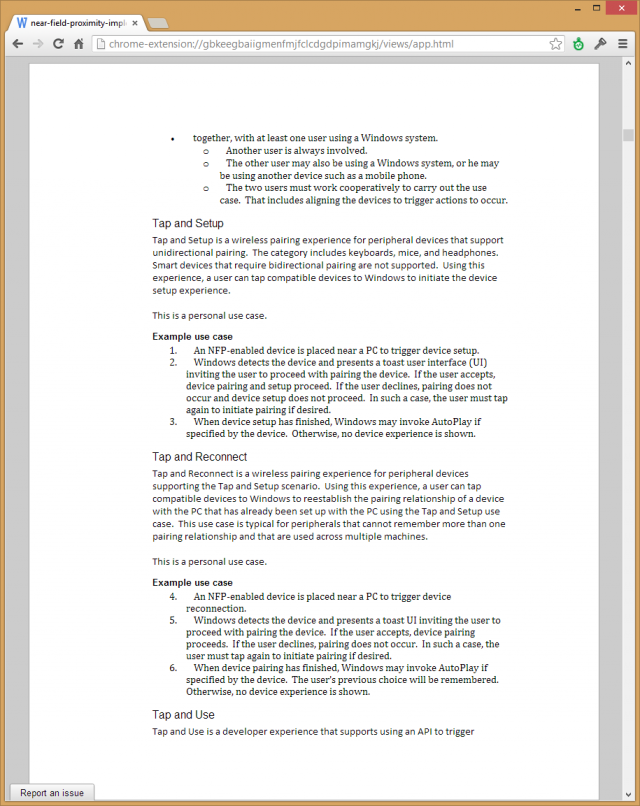
The extension is labeled beta, and it's a justified moniker. The output quality is currently pretty poor. We tried it with a fairly simple Word document, and many parts were shown incorrectly. Headers and footers were omitted, list numbering was broken, fonts were incorrect, and certain pieces of formatting such as borders and shading were missing.
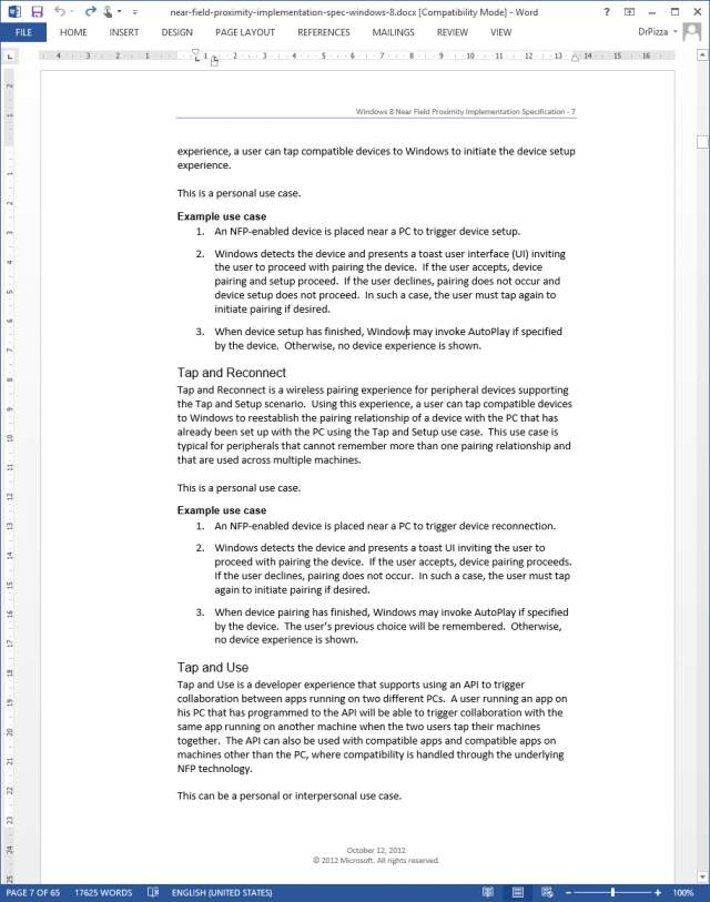
A document in Word. Notice that it uses a sans-serif typeface throughout, it has a header and footer, and two separate numbered lists.
The Chrome Office Viewer uses a serif typeface for some of the text, numbers the separate numbered lists contiguously, omits the headers and footers, and paginates differently.
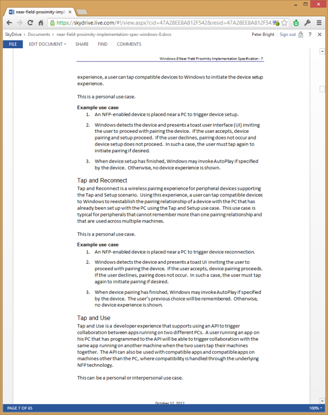
Both the Office Web Apps, free to anyone who has a SkyDrive account, and Google Drive apps, likewise available at no cost, provided a more authentic rendering of the document. The Office Web Apps go a step further, too, allowing editing as well as reading (Google Docs can't directly edit Office documents, though it can convert them to an editable form). Third-party Chrome extensions can even let you automatically use the Office Web Apps to open linked Office documents.
Even if offline access is important to you, there are better options. There's Office itself of course, and if you don't want to pay for Office, OpenOffice also provides greater accuracy.
 The Office Web App gets these things all right.
Google Drive's Office viewer doesn't get the document quite right—the pagination is different—but the fonts, numbering, and headers/footers are all handled correctly.
As such, the extension is currently of limited value. Its offline capabilities are important for Chromebooks because they can't run real applications. For online users and OS X, Windows, or Linux users, there is better software out there.
What makes the extension more interesting is the direction that Google may be heading. If it were to pick up editing capabilities, it would be transformed into an Office competitor. A somewhat limited one, especially given the fidelity issues that it currently has, but a viable alternative for simple tasks.
Google has the expertise to develop the extension in this way, too. Last year it bought Quickoffice, which makes office productivity software, with editing, for iOS and Android. Poke around the extension, and you'll find that it actually contains native Quickoffice code. Turning the Chrome Office Viewer into just plain Chrome Office could require little more than providing a user interface for Quickoffice's existing editing features.
This would not only transform the Chrome Office Viewer, it would help Chromebooks evolve beyond novelty machines. Currently they are convenient for checking out a Web page while watching TV, but they could become laptops that can fill a wide range of productivity tasks, both on- and offline. And then, for the first time, Google could challenge Microsoft directly in both the operating system and office productivity markets.

BlackBerry Z10 Review


The BlackBerry Z10 is the first handset to use the new Blackberry 10 OS and is a fully touch-screen device. It can be viewed as the start of something new for BlackBerry. Something that they’re hoping can bring them back among the top of the smartphone market.
BlackBerry Z10 01
Aside from having a full touch-screen, the Z10 now also runs on a regular data plan, removing the Blackberry Internet Service (BIS). Those who have always gotten confused with BIS versus the data plan won’t have to worry about understanding that thing anymore (I remember having to explain the difference of the data plan and the BIS to a lot of people in the past).
So let’s check out what this smartphone has to offer and if it can propel BlackBerry to the top.

Design and Functionality

I like the way how this handset was very faithful to the design of the Playbook. It has the same subtle curved edge and a soft matte finish. The back had the same rubbery texture as well, with a silver Blackberry emblem in the middle.
BlackBerry Z10 02 BlackBerry Z10 03
It felt solid and light. One can easily grip it. It didn’t feel cheap at all and its lightness doesn’t feel fragile, unlike those other smartphones that I can’t seem to take seriously because of their plastic properties.
BlackBerry Z10 04 BlackBerry Z10 05 BlackBerry Z10 06
The top side of the unit has the Power/Lock button and the jack for earphones. The right side has the volume control buttons that also function as media play, pause, next, screenshot buttons. You can find the micro USB slot and the HDMI on the left side of the unit.
BlackBerry Z10 07 BlackBerry Z10 08 BlackBerry Z10 09
You can swipe from all sides of the bezel. From the lock state, swiping from the bottom unlocks the phone. While your phone is unlocked, swiping from the bottom (or flicking up) will also bring you to your opened apps or multitask screen. Swiping from the top reveals the settings and connectivity screen (you can also put the phone to sleep this way). Swiping from the left shows the Blackberry Hub, Notifications, BBM, Messages, your email accounts – all communication needs since it is after all a business phone. It is only after you surpass the multitask state that you can swipe to the right and see the menu for all your apps.
This swipe-from-all-sides thing was a little hard for me to get used to and at times it was frustrating. I guess in time, you’ll eventually get the hang of it. If you’re a Playbook user, it’ll probably be easier to learn the gestures.

Display

BlackBerry Z10 10
The 4.2-inch LCD display was bright and very rich. It was beautiful to look at and to browse with, especially because the display is just the perfect size for me. It didn’t feel like it was cramped up nor was it too big to use. I can’t help but to remember the beautiful display of the Playbook. Watching HD videos is enjoyable with this smartphone. With HDMI, you can easily watch your videos (or give a presentation) on the big screen.

Touch-screen

I’m not much of a fan of the Blackberry not having a physical keyboard. To me, a physical keyboard and the Blackberry just goes hand in hand. Since most of the smartphones nowadays are full-touch screen, I can’t say that the Blackberry Z10 did a bad job with the full-touch keyboard.
BlackBerry Z10 11
The word suggestions were accurate and although at first I wasn’t too keen on the idea of having word suggestions (I’m not one for predictive text either), they turned out to be really handy and easy to use.

Camera

The camera is such an important feature in a smartphone. The 8mp camera of the Z10 is impressive under broad daylight. Here are some sample photos:
BlackBerry Z10 sample photo 1 BlackBerry Z10 sample photo 2 BlackBerry Z10 sample photo 4
Can’t say much about night shots though. I’m not too happy with the output with the flash on but that’s something common with other phones.
BlackBerry Z10 12
There’s also the TimeShift feature which lets you capture burst shots to produce the output that you want by combining elements from the different sequence of photos. This idea is not new as most flagship phones these days have something like it as a built-in camera feature.

Security and Setting up

There were some things with setting up and security that I came across with that just really got my attention. I didn’t really get over it:
  • I owned a Blackberry Curve before and I was very impressed at the way BBM has this feature of backing up the contact list via email automatically so if I switch phones, all I had to do was to restore a backup from my email. I haven’t turned on the BIS of my old Blackberry Curve for a few months but I’m pretty sure that all of my three emails have a backup of my BBM contact list. So here I was looking forward to seeing my old contact list with the Z10, but for some reason, the smartphone couldn’t seem to detect any backups from all of my three email addresses. I don’t know if there are compatibility issues there but it sure was a let down.
  • It’s only here in the Z10 that I encountered a 1:1 ratio with the Blackberry ID and the phone environment. Meaning, if I want to log out of the current Blackberry ID and change it to another, it would mean wiping the phone of all its contacts, calendar, apps, etc. Mind you, it takes a while to wipe the whole thing.
  • I had to set the phone into Development mode for Sideloading (more on that later) and for some reason, that automatically set the phone to ask for a passcode when I locked the phone. When I needed to unlock it, it asked for a passcode that I didn’t know of (ulk), and failure to key in the passcode… will result to a phone wipe.
  • I wasn’t too happy with the idea that for me to access the memory/HDD of the unit, I would need to install the Blackberry Link first. What if I need to retrieve some files using another computer? I wish it was just plug-and-play.

Sideloading

I think those who plan on purchasing a Blackberry should understand the concept of sideloading first before they make any decisions of purchasing one. I heard of rumors before the release of the Z10 that it will allow Android apps to be installed into the smartphone (Ding ding ding! In simpler terms, this means I could have Instagram installed the Blackberry! Yes it is a big deal for me).
BlackBerry Z10 Instagram
Sideloading is a way to install Android apps into the Blackberry. This is a big advantage especially when Blackberry doesn’t offer the official app in the Blackberry App World. You can get some apps such as Instagram, Google Maps, Kindle, Gmail into your Blackberry through sideloading. What’s disappointing with this is that you will need a computer unit , download/install some software, and make sure you have an app compatible to the Blackberry 10 OS in order for it to work. Also, there’s a big chance that the available app for sideloading is not the latest app. This reminds me a lot of jailbreaking with IOS.
You can see the step-by-step instructions to do sideloading here. I am ashamed to say that a tech-enthusiast like me took almost 3 hours to get Instagram sideloaded into the Blackberry.

Verdict

I’d like to welcome BlackBerry (not RIM anymore) back into the smartphone world. The Blackberry Z10 is a good release and I’m sure BBM fans are happy with this upgrade. This may not trump the leading smartphones out there – there are a number of things that can still be improved on, but it just means that BB is back and will give consumers another choice in the market for a good smartphone. Next order of business for them is to bring in more popular apps into BlackBerry App World.
BlackBerry Z10 13
The BlackBerry Z10 retails for Php29,990 although it’s also available on a postpaid plan from Globe, Smart, and Sun. Globe has the advantage as they’re the only carrier that offers the LTE version of the Z10.
BlackBerry Z10 Specs:
4.2-inch LCD capacitive touchscreen, 768 x 1280, 355 ppi
Dual-core 1.5 GHz Qualcomm MSM8960 Snapdragon (Krait)
Adreno 225 GPU
BlackBerry 10 OS
2GB RAM
16GB internal storage, microSD up to 32GB
8 MP autofocus rear camera with LED flash
2 MP 720p front camera
HSDPA 21 Mbps, HSUPA 5.76 Mbps; LTE
Bluetooth 4.0 with A2DP, NFC
Li-Ion 1800 mAh battery
130 x 65.6 x 9 mm
135g
SRP: Php29,990